


Shell
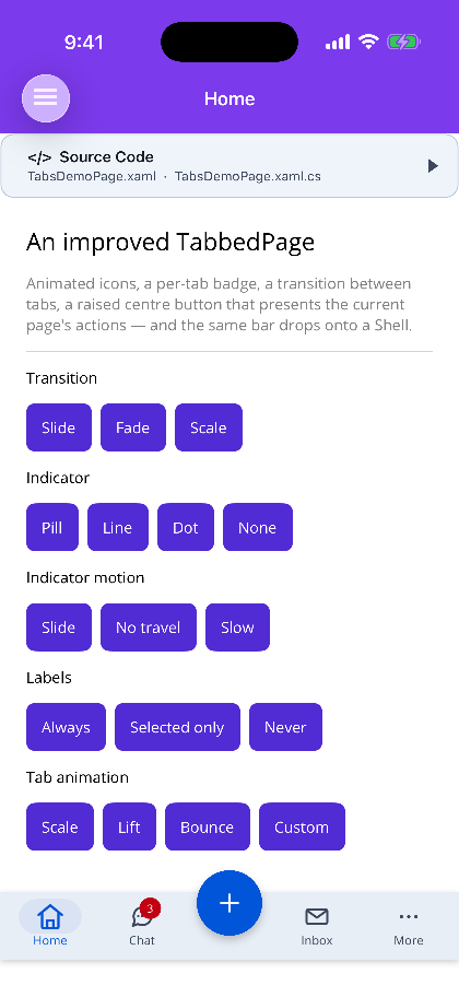
ShinyTabBarBehavior replaces a Shell’s native bottom tab bar with a ShinyTabBar without changing a line of the Shell’s structure or routing.
Shell keeps doing everything it is good at — routes, deep links, lazily built ShellContent, and a navigation stack per tab. The behavior takes over only the chrome.
<Shell xmlns="http://schemas.microsoft.com/dotnet/2021/maui"       xmlns:x="http://schemas.microsoft.com/winfx/2009/xaml"       xmlns:shiny="http://shiny.net/maui/controls"       x:Class="MyApp.AppShell">
    <Shell.Behaviors>        <shiny:ShinyTabBarBehavior>            <shiny:ShinyTabBar IndicatorStyle="Pill">                <shiny:ShinyTabBar.CenterButton>                    <shiny:TabCenterButton Icon="plus" />                </shiny:ShinyTabBar.CenterButton>            </shiny:ShinyTabBar>        </shiny:ShinyTabBarBehavior>    </Shell.Behaviors>
    <TabBar>        <Tab Title="Home" shiny:ShinyTabs.Icon="home">            <ShellContent ContentTemplate="{DataTemplate local:HomePage}" Route="home" />        </Tab>        <Tab Title="Inbox" shiny:ShinyTabs.Icon="mail" shiny:ShinyTabs.Badge="12">            <ShellContent ContentTemplate="{DataTemplate local:InboxPage}" Route="inbox" />        </Tab>        <Tab Title="Me" shiny:ShinyTabs.Icon="user">            <ShellContent ContentTemplate="{DataTemplate local:ProfilePage}" Route="me" />        </Tab>    </TabBar></Shell>
Bar is the behavior’s content property, so the bar needs no property element.
What it does
Section titled “What it does”- Hides the platform bar — once, on the Shell.
Shell.TabBarIsVisibleis inherited down the whole hierarchy, so setting it there beats racing each navigation to the page. - Mirrors the Shell’s own tabs into the bar.
- Docks the bar over whichever page is showing.
- Turns a tap back into a
CurrentItemchange — which is exactly what Shell’s own bar does, so routes, each tab’s saved navigation stack andNavigatedall behave unchanged.
Per-tab chrome
Section titled “Per-tab chrome”| Set on the Shell element | Why there |
|---|---|
shiny:ShinyTabs.Icon |
A motion icon name. A ShellContent has nowhere else to say it — Icon on a BaseShellItem is an ImageSource, which the bar also honours as IconImage. |
shiny:ShinyTabs.Badge |
Readable before the page exists, which is what a lazily built tab needs. |
shiny:ShinyTabs.BadgeColor |
|
shiny:ShinyTabs.Title |
Overrides Title. |
Changing any of them at runtime reaches the bar — the behavior watches the Shell elements, so a badge bound to a view model updates the tab without the page being open.
Set on the page instead, ShinyTabs.Badge wins for the tab that page is showing, and ShinyTabs.Actions / MenuContent supply the centre button’s menu.
The menu resolves from the most specific element outward: the page, then its ShellContent, then the Tab, then the ShellItem, and finally the centre button’s own content. The first element that declares MenuContent/MenuContentTemplate supplies the content, and the first with any Actions rows supplies the rows — a page’s rows replace the ShellContent’s, they never merge. Rows declared on a ShellContent bind against its BindingContext (the Shell’s, unless you set one), and the button follows edits to any of those collections and every tab switch live.
<ShellContent ContentTemplate="{DataTemplate local:InboxPage}" Route="inbox"> <shiny:ShinyTabs.Actions> <shiny:TabActionCollection> <shiny:TabAction Text="New message" Icon="edit" Command="{Binding ComposeCommand}" /> </shiny:TabActionCollection> </shiny:ShinyTabs.Actions></ShellContent>Which tabs
Section titled “Which tabs”TabSource decides which level of the Shell becomes the tabs:
Auto (default) |
The sections of the current ShellItem when there is more than one; otherwise the Shell’s top-level items. This is where MAUI’s own bottom bar takes them from, so an existing Shell needs no restructuring. |
Sections |
Always the sections of the current ShellItem. |
Items |
Always the Shell’s top-level items. |
Hiding the bar
Section titled “Hiding the bar”HideOnPush (default true) hides the bar on pages pushed onto a tab’s stack, which is what Shell does with its own. shiny:ShinyTabs.IsTabBarVisible="False" on a page hides it for that page — a full-bleed media page, a checkout flow.
Transitions
Section titled “Transitions”Transition runs on the incoming page only. Shell owns the page swap itself, so by the time Navigated reports the change there is no outgoing page left to animate. Fade is the default; None or a zero TransitionDuration disables it.
Step 1 — Add the marketplace:
claude plugin marketplace add shinyorg/skillsStep 2 — Install the plugin:
claude plugin install shiny@shinyOne plugin installs all 39 Shiny skills. Your agent loads only the skill relevant to what you're building, so there's no cost to having them all available.
Step 1 — Add the marketplace:
copilot plugin marketplace add https://github.com/shinyorg/skillsStep 2 — Install the plugin:
copilot plugin install shiny@shinyOne plugin installs all 39 Shiny skills. Your agent loads only the skill relevant to what you're building, so there's no cost to having them all available.