Client v5: BLE, BLE Hosting, HTTP, Jobs - Linux, MacOS, & Blazor Support! Full AOT, RX on BLE only & MANY other features! Power up!
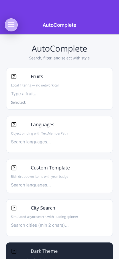
AutoCompleteEntry
A text input with debounced search, dropdown suggestions, busy indicator, and custom item templates. Supports both local filtering and remote search via a command/callback. Fully styleable on both MAUI (bindable properties) and Blazor (CSS custom properties).


Frameworks
.NET MAUI
Blazor
Basic Usage
Section titled “Basic Usage”Local Filtering
Section titled “Local Filtering”Provide an ItemsSource without a SearchCommand — the control filters items locally as the user types:
<shiny:AutoCompleteEntry Text="{Binding SearchText}" Placeholder="Search fruits..." ItemsSource="{Binding AllFruits}" SelectedItem="{Binding SelectedFruit}" TextMemberPath="Name" />Remote Search
Section titled “Remote Search”Set SearchCommand to trigger an async search. Bind IsBusy to show the spinner during loading:
<shiny:AutoCompleteEntry Text="{Binding SearchText}" Placeholder="Search..." ItemsSource="{Binding Results}" SelectedItem="{Binding SelectedResult}" SearchCommand="{Binding SearchCommand}" IsBusy="{Binding IsSearching}" TextMemberPath="Name" DebounceInterval="400" Threshold="2" />Properties
Section titled “Properties”| Property | Type | Default | Description |
|---|---|---|---|
Text | string | "" | Current text value (TwoWay) |
Placeholder | string? | null | Placeholder text |
PlaceholderColor | Color? / string? | null | Placeholder color |
ItemsSource | IList | null | Suggestion items |
SelectedItem | object? | null | Selected item (TwoWay) |
SearchCommand | ICommand / EventCallback<string> | null | Async search trigger |
TextMemberPath | string? | null | Property name to display from complex objects |
ItemTemplate | DataTemplate / RenderFragment<object> | null | Custom dropdown item rendering |
IsBusy | bool | false | Show/hide loading spinner (TwoWay) |
DebounceInterval | int | 300 | Debounce delay in milliseconds |
Threshold | int | 1 | Minimum characters before searching |
MaxDropDownHeight | double | 200 | Maximum dropdown height (px) |
TextColor | Color? / string? | null | Input text color |
FontSize | double | 14 | Input font size |
FontFamily | string? | null | Font family (MAUI only) |
FontAttributes | FontAttributes | None | Bold/italic (MAUI only) |
DropDownBackgroundColor | Color? / string? | White | Dropdown background |
DropDownBorderColor | Color? / string? | LightGray | Dropdown border color |
CornerRadius | double | 4 | Dropdown border radius (MAUI only) |
SpinnerColor | Color? / string? | Grey | Loading spinner color |
ShowAllOnFocus | bool | false | Show all unfiltered items when the input is focused (local filtering only) |
Events
Section titled “Events”| Event | Args | Description |
|---|---|---|
ItemSelected | object? | Fires when a suggestion is selected from the dropdown |
Styling
Section titled “Styling”<shiny:AutoCompleteEntry FontSize="18" FontFamily="OpenSans" FontAttributes="Bold" TextColor="Black" PlaceholderColor="DarkGray" DropDownBackgroundColor="#F9FAFB" DropDownBorderColor="#6B7280" SpinnerColor="DodgerBlue" CornerRadius="12" MaxDropDownHeight="300" />MAUI Custom Item Template
Section titled “MAUI Custom Item Template”var autoComplete = new AutoCompleteEntry{ TextMemberPath = nameof(Product.Name), FontSize = 16, CornerRadius = 8, ItemTemplate = new DataTemplate(() => { var grid = new Grid { ColumnDefinitions = { new ColumnDefinition(GridLength.Star), new ColumnDefinition(GridLength.Auto) }, Padding = new Thickness(8, 6) };
var name = new Label { FontSize = 14 }; name.SetBinding(Label.TextProperty, nameof(Product.Name));
var price = new Label { FontSize = 12, TextColor = Colors.Grey }; price.SetBinding(Label.TextProperty, nameof(Product.PriceDisplay));
grid.Add(name, 0, 0); grid.Add(price, 1, 0); return grid; })};Blazor Usage
Section titled “Blazor Usage”<AutoCompleteEntry Text="@searchText" TextChanged="v => searchText = v" Placeholder="Search..." ItemsSource="@results" SelectedItemChanged="OnSelected" SearchCommand="OnSearch" IsBusy="@isBusy" TextMemberPath="Name" DebounceInterval="400" Threshold="2" FontSize="16" TextColor="#333" DropDownBackgroundColor="#fff" DropDownBorderColor="#ccc" SpinnerColor="#3B82F6" InputClass="my-input" DropDownClass="my-dropdown"> <ItemTemplate Context="item"> @{ var p = (Product)item; } <div style="display:flex;justify-content:space-between;"> <span>@p.Name</span> <span style="color:#888;">@p.PriceDisplay</span> </div> </ItemTemplate></AutoCompleteEntry>
@code { string searchText = ""; bool isBusy; IList? results;
async Task OnSearch(string query) { isBusy = true; results = await MyApi.SearchAsync(query); isBusy = false; }
void OnSelected(object? item) { if (item is Product p) { /* handle selection */ } }}Blazor-Only Properties
Section titled “Blazor-Only Properties”| Property | Type | Default | Description |
|---|---|---|---|
CssClass | string? | null | CSS class applied to root element |
InputClass | string? | null | CSS class applied to the input element |
DropDownClass | string? | null | CSS class applied to the dropdown |
AdditionalAttributes | IDictionary<string, object>? | null | Unmatched HTML attributes passed to root element |
CSS Custom Properties
Section titled “CSS Custom Properties”Override these on a parent element or the component’s root to theme without parameters:
| Variable | Default | Controls |
|---|---|---|
--shiny-ac-text | inherit | Input text color |
--shiny-ac-ph | #9CA3AF | Placeholder color |
--shiny-ac-dd-bg | #fff | Dropdown background |
--shiny-ac-dd-border | #D1D5DB | Dropdown border |
--shiny-ac-spinner | #9CA3AF | Spinner color |
--shiny-ac-font-size | inherit | Input font size |
--shiny-ac-dd-max-h | 200px | Dropdown max height |
Example — dark theme a section without touching individual components:
.dark-section { --shiny-ac-text: #f0f0f0; --shiny-ac-ph: #888; --shiny-ac-dd-bg: #1e1e1e; --shiny-ac-dd-border: #444; --shiny-ac-spinner: #60A5FA;}AI Skill
Section titled “AI Skill”Step 1 — Add the marketplace:
claude plugin marketplace add shinyorg/skills Step 2 — Install the plugin:
claude plugin install controls@shiny Step 1 — Add the marketplace:
copilot plugin marketplace add https://github.com/shinyorg/skills Step 2 — Install the plugin:
copilot plugin install controls@shiny