


Timeline


A vertical rail of markers with arbitrary content beside each one — the wizard’s three-state marker turned on its side and made item-driven. An activity feed, an order’s progress, an audit trail, a changelog.
<shiny:TimelineView ItemsSource="{Binding Events}" ActiveIndex="2"> <shiny:TimelineView.ItemTemplate> <DataTemplate> <VerticalStackLayout Spacing="2"> <Label Text="{Binding Title}" FontAttributes="Bold" /> <Label Text="{Binding Detail}" FontSize="13" Opacity="0.75" /> </VerticalStackLayout> </DataTemplate> </shiny:TimelineView.ItemTemplate></shiny:TimelineView><TimelineView TItem="Delivery" ItemsSource="events" ActiveIndex="2"> <ItemTemplate> <div class="entry-title">@context.Title</div> <div class="entry-body">@context.Detail</div> </ItemTemplate></TimelineView>Where the timeline has got to
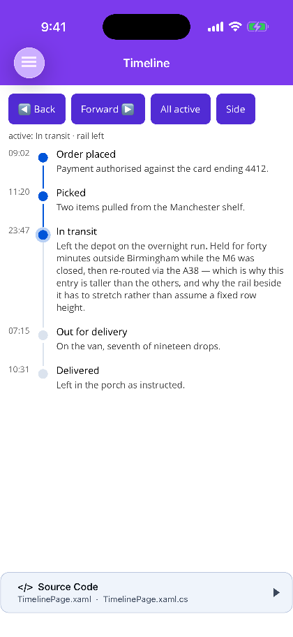
Section titled “Where the timeline has got to”ActiveIndex says how far along it is. Nodes before it are complete, the one at it is current
and draws a ring, everything after is pending. The connector fills to match, so the rail reads as a
progress bar rather than as a set of unrelated links.
It defaults to -1, meaning nothing has happened yet — a timeline handed no position should not silently claim its first entry is done.
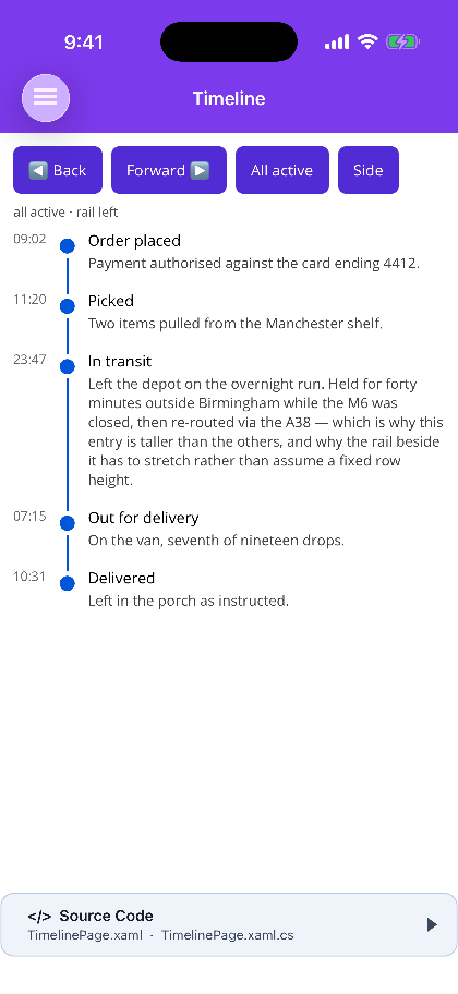
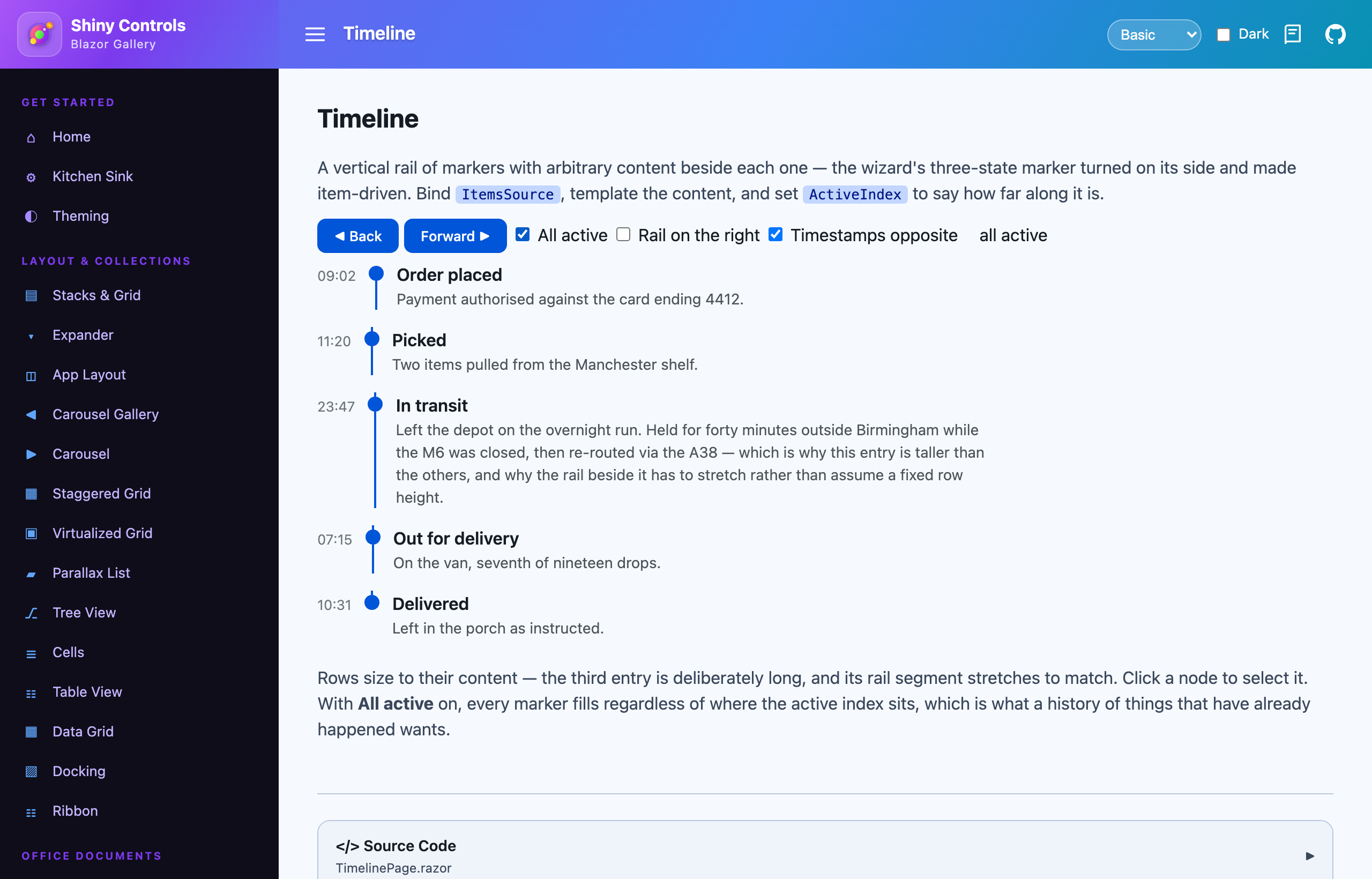
AllActive fills every node whatever the index says, for a history of things that have all already
happened, where a trailing pending tail would be saying something untrue. It wins outright rather than
being merged with the index, so switching it on does not need the index moved to the end — nor moved
back again to switch it off.
Rows size to their content
Section titled “Rows size to their content”Each node is one row whose height comes from whatever the item template produced, and the rail’s connector stretches to fill it. A node with a paragraph beside it simply makes its own segment longer.
That is why the rail is built per row rather than drawn as one line behind the stack: a continuous line would have to be measured against a total height nothing knows until after layout, and content beside a timeline is arbitrary and self-sizing by definition.
The marker sits MarkerOffset below the top of its row so it lines up with the first line of text
beside it. Centring it on the row instead would drift further out of alignment the taller the content
got — which is the normal case here, not the exception.
Templates
Section titled “Templates”| Binds to | For | |
|---|---|---|
ItemTemplate |
the item | the content beside the marker |
MarkerTemplate |
a TimelineNode |
a marker carrying an icon, a number, a per-item colour |
OppositeTemplate |
the item | content on the far side of the rail — a timestamp, a duration |
The two are deliberately different. Everything that decides how a marker is drawn — its state,
whether it caps either end of the rail — is a property of the node’s position and none of it exists on
the item. Content beside a timeline is ordinary content and should not have to reach through a wrapper
to say {Binding Item.Title}.
Left unset, the marker is a themed dot, which is what most timelines want.
Layout
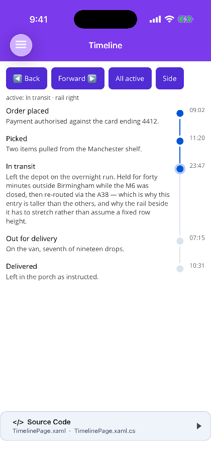
Section titled “Layout”RailPosition puts the rail on the Left (default) or the Right; the opposite content moves to the
other side with it. ItemSpacing is the gap between one node’s content and the next — the rail runs
through it unbroken, because the gap belongs to the row rather than to the space between rows.
| Blazor | MAUI | |
|---|---|---|
| Item-driven with templates | ✅ | ✅ |
| Live collection changes | ✅ | ✅ INotifyCollectionChanged |
| Node click / tap | ✅ NodeClicked |
✅ NodeTapped |
| Virtualization | ❌ every item is realised | ❌ every item is realised |
Not virtualized on either host, and that is the deliberate trade: the thing that makes a timeline useful is that every row can be a different height, which is exactly what a recycling list is worst at. A timeline of thousands of entries wants paging by the app.
Screenshots
Section titled “Screenshots”MAUI (iOS)
| Rail left, active at index 2 | AllActive |
RailPosition="Right" |
|---|---|---|
 |
 |
 |
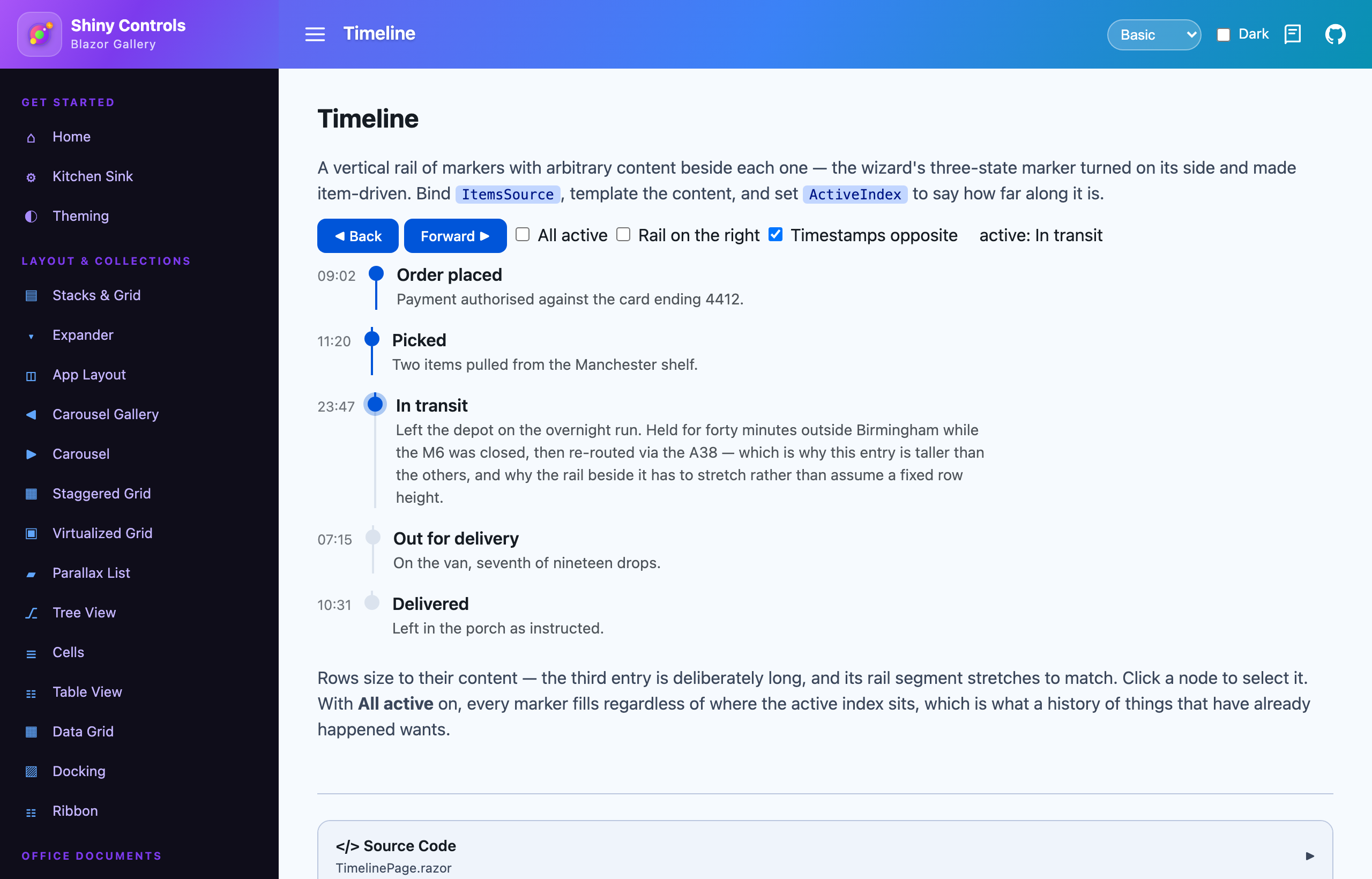
Blazor
| Rail left, active at index 2 | AllActive |
RailPosition="Right" |
|---|---|---|
 |
 |
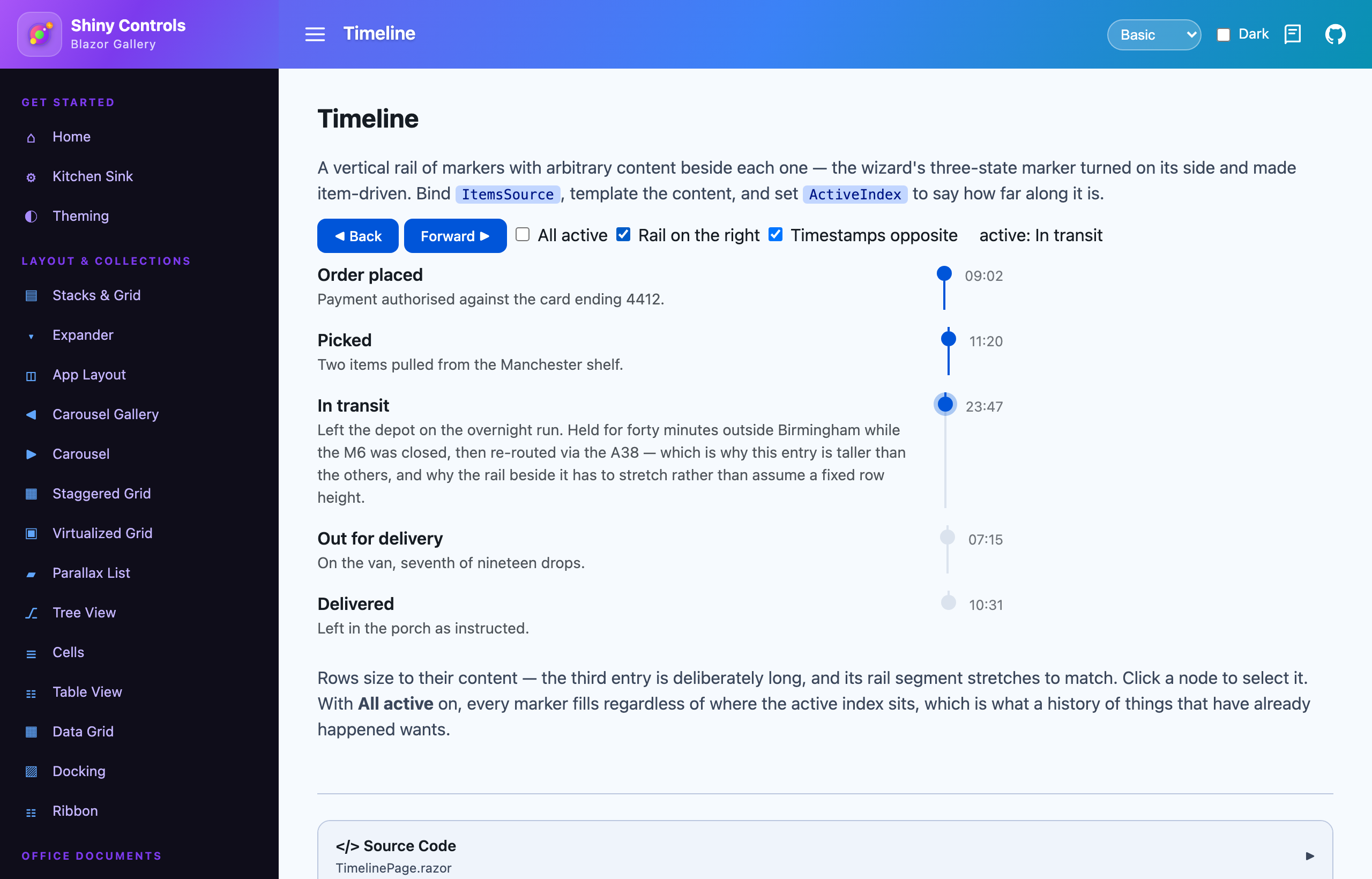 |
The third entry is deliberately long in both samples: its rail segment stretches to the row rather than assuming a fixed height.
Theming
Section titled “Theming”MAUI routes the rail through ShinyThemeKeys.Color.Primary and SurfaceContainerHighest, so a theme
pack swapped at runtime moves it. Blazor uses --shiny-color-primary and
--shiny-color-surface-container-highest. Setting ActiveColor or PendingColor pins the colour and
takes it out of the theme.
The marker is built from BoxView rather than Border on MAUI for a specific reason: a BoxView’s
fill is a Color and a Border’s is a Brush, and a colour token assigned to a brush property
is silently dropped — which shows up as a control that simply never follows the theme.
See also Wizard for the same markers in a horizontal, step-driven form, and Theming.