


Expander & Accordion - Blazor Usage
The Blazor components mirror the MAUI ones — same concepts, same property names where the platform allows. This page covers what is different.
Screenshots
Section titled “Screenshots”Blazor
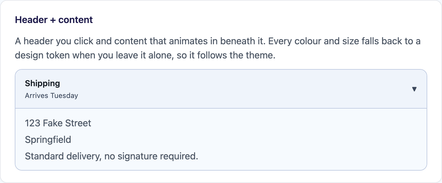
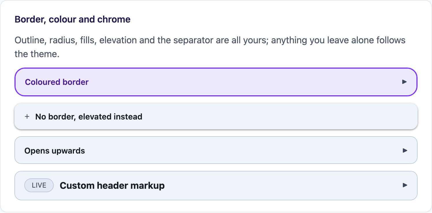
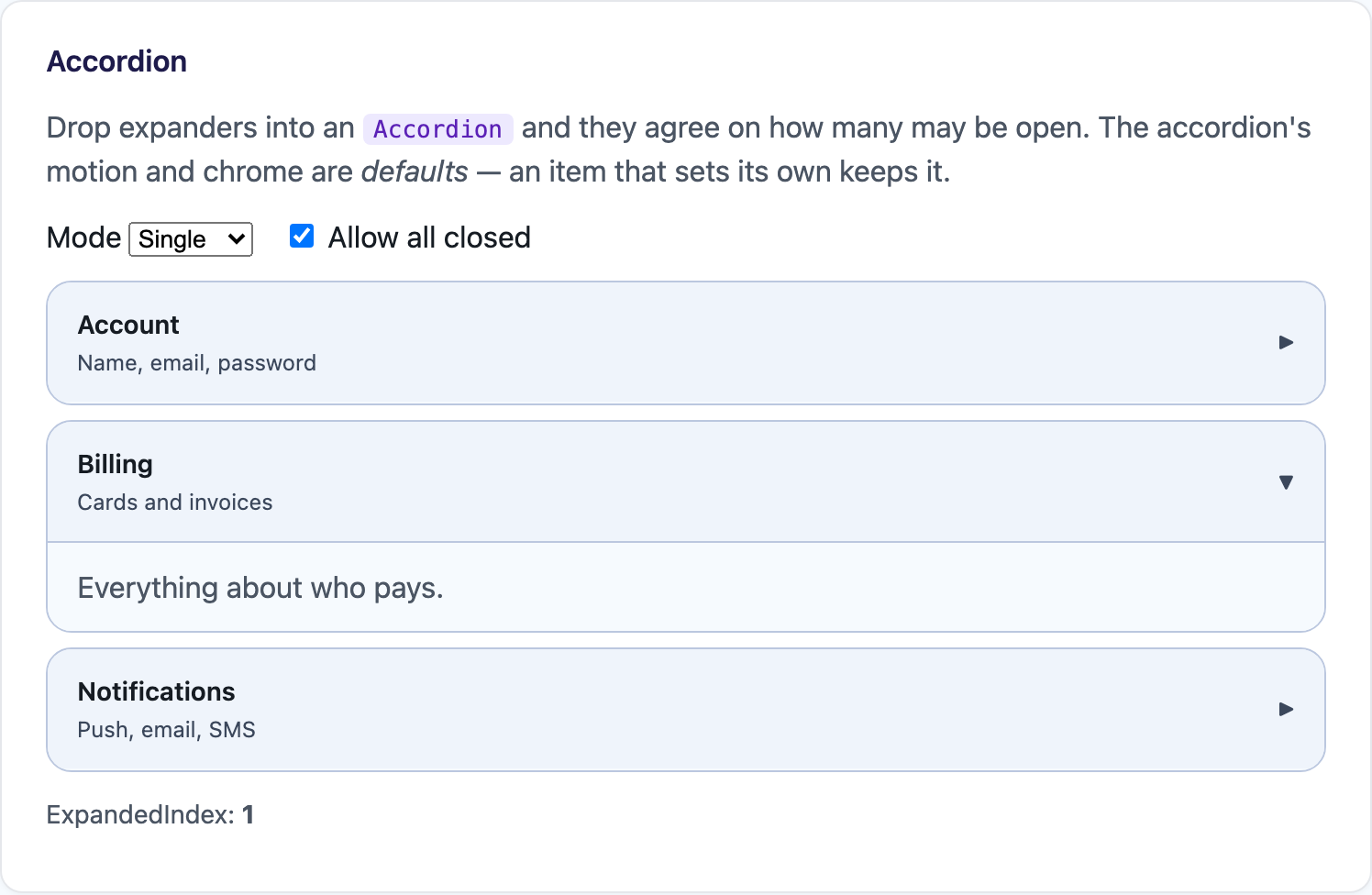
| Header + content | Chrome variants | Accordion |
|---|---|---|
 |
 |
 |
Quick Start
Section titled “Quick Start”<Expander HeaderText="Shipping" HeaderDetail="Arrives Tuesday"> <p>123 Fake Street</p> <p>Springfield</p></Expander>With a header of your own, both slots have to be named:
<Expander> <Header> <strong>Custom header markup</strong> </Header> <ChildContent> <p>Body.</p> </ChildContent></Expander>Motion
Section titled “Motion”Animation is the same flags enum, written the C# way:
<Expander HeaderText="Everything at once" Animation="ExpanderAnimation.Height | ExpanderAnimation.Slide | ExpanderAnimation.Fade" SlideFrom="ExpanderSlideFrom.Top" AnimationDuration="250" AnimationEasing="cubic-bezier(0.2, 0, 0, 1)"> <p>…</p></Expander>AnimationDuration is an int of milliseconds and AnimationEasing is a CSS timing function.
The reveal is pure CSS — the panel is a grid transitioning grid-template-rows between 0fr and 1fr —
so there is no measuring, no JS interop, and content that changes size while open still lays out normally.
prefers-reduced-motion: reduce disables the transitions.
Chrome
Section titled “Chrome”The chrome parameters take CSS strings rather than typed colours and doubles, and the two fills are
named HeaderBackground and ContentBackground rather than …BackgroundColor:
<Expander HeaderText="Coloured border" BorderColor="#7C3AED" BorderThickness="2px" CornerRadius="18px" HeaderBackground="#EDE9FE" HeaderTextColor="#4C1D95" ContentPadding="16 20"> <p>…</p></Expander>Padding parameters accept bare numbers as pixels, so "16 20" means 16px 20px. Leave a parameter unset
and the component falls back to the matching --shiny-* design token, which is what lets a theme swap
reach inside it.
@bind-IsExpanded for two-way binding; OnExpanded and OnCollapsed for the transitions.
ExpandAsync(), CollapseAsync() and ToggleAsync() drive it from code.
<Expander HeaderText="Advanced" @bind-IsExpanded="showAdvanced" OnExpanded="LoadAsync"> <p>…</p></Expander>Accessibility
Section titled “Accessibility”The header is a role="button" element carrying aria-expanded and aria-controls, focusable with Tab
and activated by Enter or Space. A collapsed panel is inert and aria-hidden, so nothing inside it can
be tabbed into or read out.
Accordion
Section titled “Accordion”<Accordion SelectionMode="AccordionSelectionMode.Single" AllowCollapseAll="false" @bind-ExpandedIndex="index" CornerRadius="14px"> <Expander HeaderText="Account">…</Expander> <Expander HeaderText="Billing">…</Expander></Accordion>The rules are identical to MAUI: SelectionMode, AllowCollapseAll, two-way ExpandedIndex,
ExpandedIndexes, ExpandAll(), CollapseAll(), ExpandItem(index), and motion/chrome parameters that
are defaults reaching only the items that did not set them themselves. OnItemExpanded and
OnItemCollapsed carry the expander, its model, its index and the new state.
Data-driven lists
Section titled “Data-driven lists”A plain @foreach of expanders is the natural Blazor form, and the models stay strongly typed. Set Item
so OnItemExpanded can hand the model back, and @key so the list diffs cleanly.
<Accordion SelectionMode="AccordionSelectionMode.Single" LoadContentOnDemand="true" OnItemExpanded="@(e => Track((Faq)e.Data!))"> @foreach (var faq in faqs) { <Expander @key="faq" Item="faq" HeaderText="@faq.Question" HeaderDetail="@faq.Category"> <p>@faq.Answer</p> </Expander> }</Accordion>There is also an Items parameter with ItemHeader / ItemContent templates for when the shape is only
known at runtime. Its templates are RenderFragment<object>, so the @foreach above is the better choice
whenever you have a type to name.