


Expander
A header you tap and content that animates in beneath — or above — it. Use it for FAQ lists, settings
groups, filter panels, “show advanced options”, or anywhere an IsVisible / @if toggle would otherwise
appear.
Stack several inside an Accordion and they agree on how many may be open at once.


Screenshots
Section titled “Screenshots”MAUI (iOS)
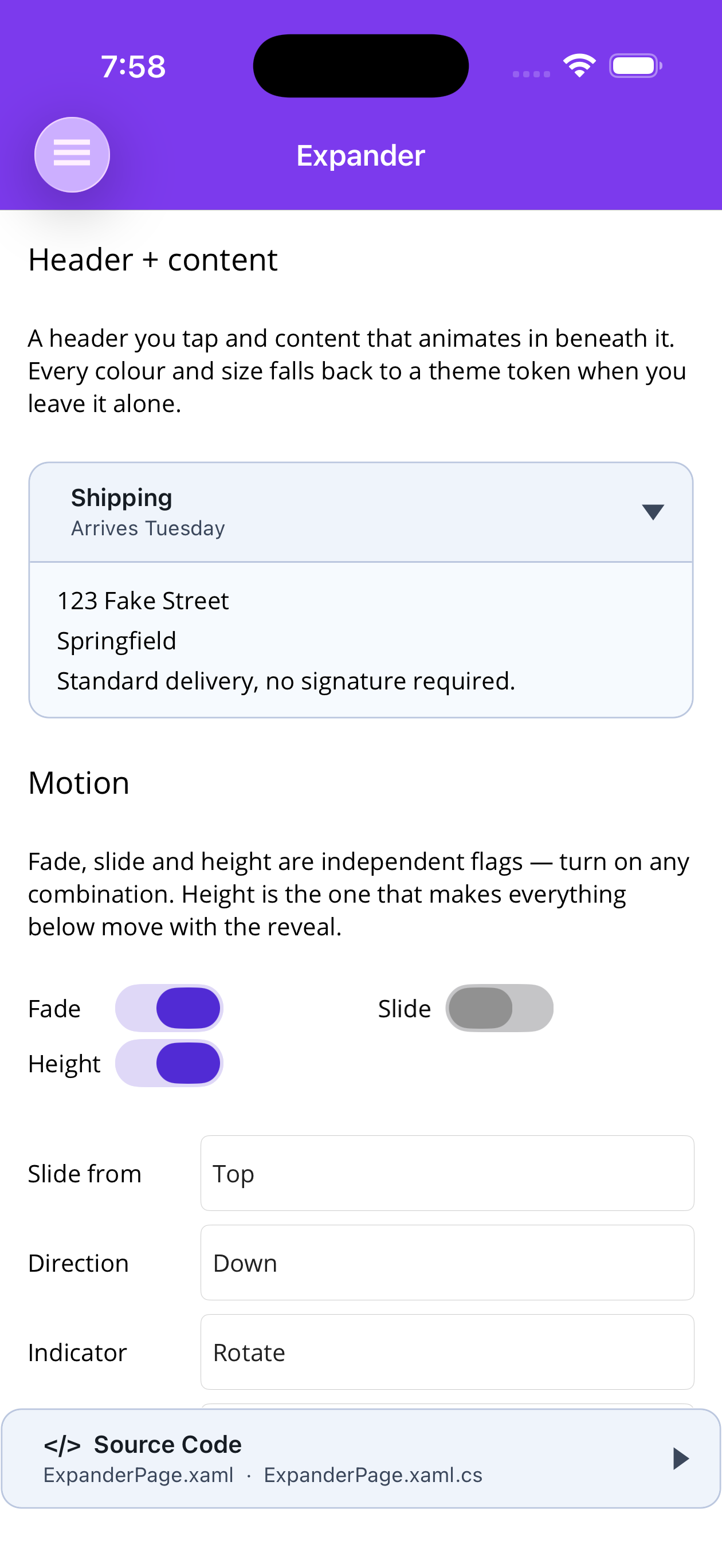
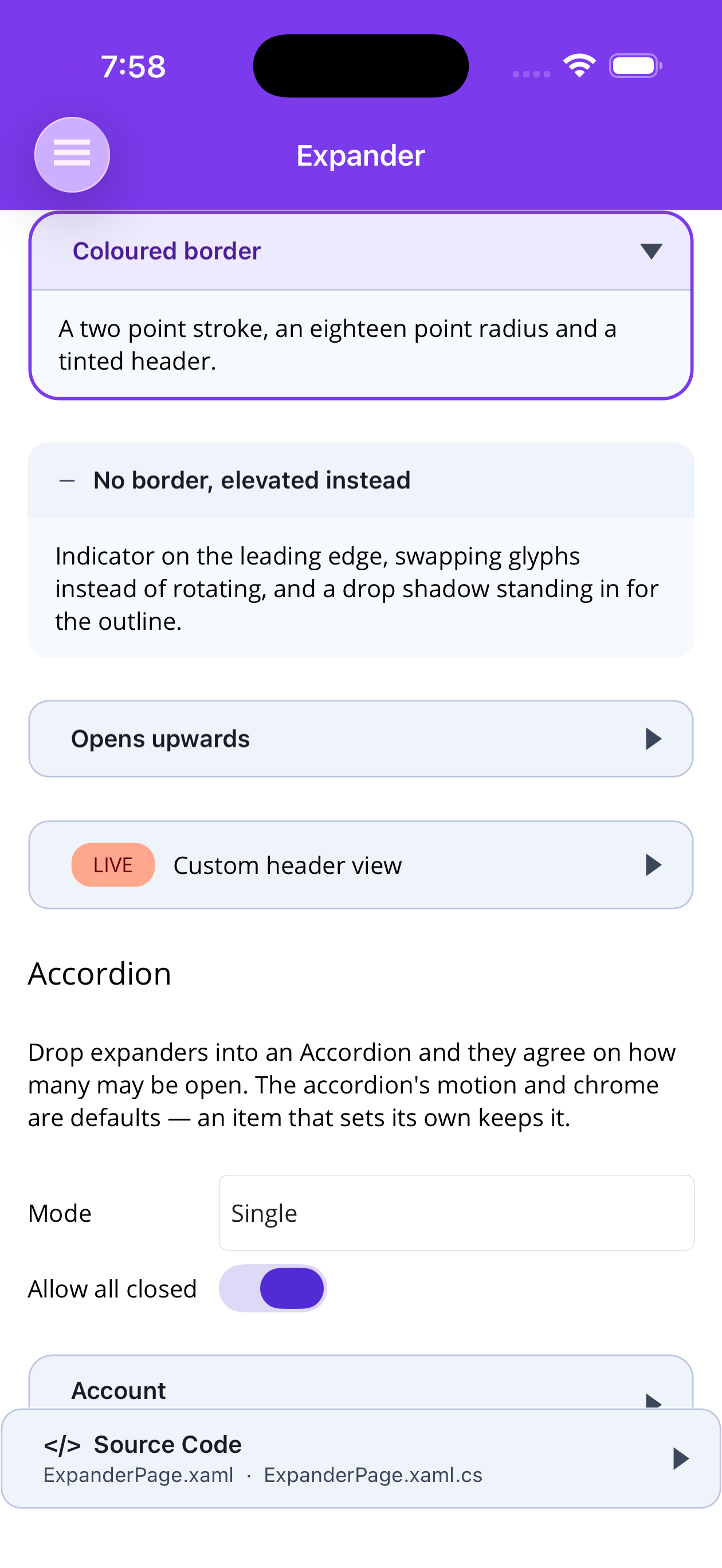
| Header, detail and content | Border, colour and chrome |
|---|---|
 |
 |
Blazor
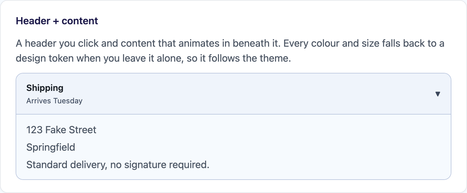
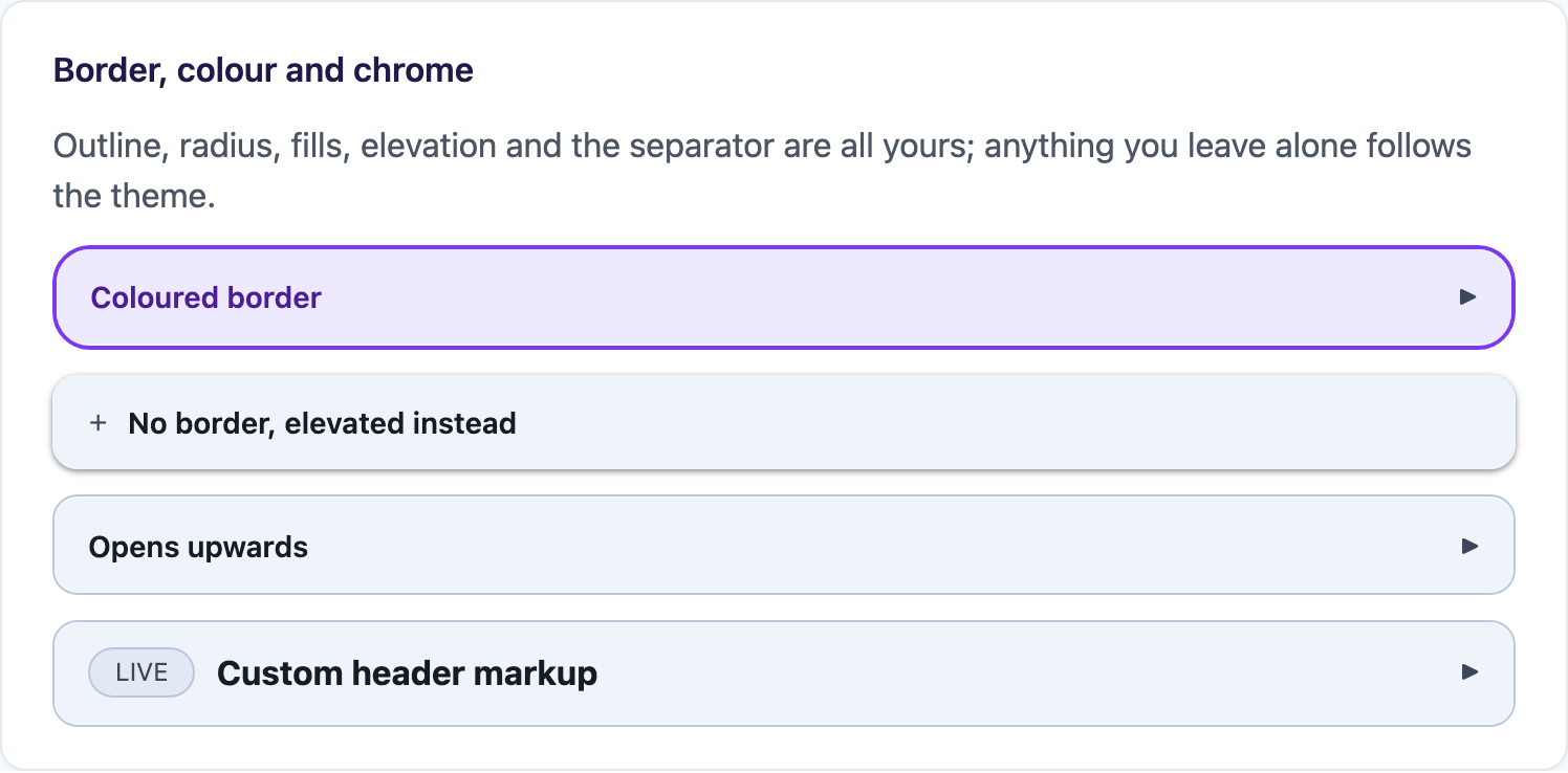
| Header + content | Border, colour and chrome |
|---|---|
 |
 |
Features
Section titled “Features”- Header text plus an optional detail line, or a header view / template of your own
- Combinable reveal animations —
Fade,SlideandHeightare flags, not alternatives SlideFromaims the slide atTop,Bottom,LeftorRightExpandDirectionopens the panel downwards (header on top) or upwards (content above the header)- Two-way
IsExpanded, with cancelableExpanding/Collapsingevents LoadContentOnDemandholds the body back until the first open- Rotating or swapping indicator, on either edge, or one of your own
- Border colour, thickness, radius, elevation, header and content fills, paddings and a separator — each falling back to the active theme when left alone
- Keyboard and screen-reader ready on Blazor (
role="button",aria-expanded,aria-controls, Enter and Space, aninertcollapsed panel)
Quick Start
Section titled “Quick Start”<shiny:Expander HeaderText="Shipping" HeaderDetail="Arrives Tuesday"> <VerticalStackLayout Spacing="4"> <Label Text="123 Fake Street" /> <Label Text="Springfield" /> </VerticalStackLayout></shiny:Expander>Expander derives from Grid and Content is its XAML content property, so the body goes straight
between the tags.
Motion
Section titled “Motion”Animation is a flags enum, so the three effects combine. The default is Height | Fade.
| Flag | What it does |
|---|---|
Height |
Grows and shrinks the panel between zero and the content’s size, so everything below it moves with the reveal. This is what makes an accordion read as an accordion. |
Fade |
Cross-fades the content. |
Slide |
Translates the content in from the edge named by SlideFrom. |
None |
Snaps open and closed. |
<shiny:Expander HeaderText="Everything at once" Animation="Height,Slide,Fade" SlideFrom="Top" AnimationDuration="250" AnimationEasing="CubicOut"> <Label Text="…" /></shiny:Expander>SlideFrom does nothing unless the Slide flag is on. AnimationDuration="0" snaps regardless of the
flags.
Opening upwards
Section titled “Opening upwards”ExpandDirection="Up" puts the content above the header — what a panel pinned to the bottom of a page
wants. The indicator turns the other way to match, so it always points at where the content actually is.
<shiny:Expander HeaderText="Filters" ExpandDirection="Up" SlideFrom="Bottom" Animation="Height,Slide,Fade"> <Label Text="…" /></shiny:Expander>Header
Section titled “Header”HeaderText and HeaderDetail give you a title with an optional second line. For anything else, set
Header to a view or HeaderTemplate to a DataTemplate — the indicator and the tap target are still
handled for you.
<shiny:Expander> <shiny:Expander.Header> <HorizontalStackLayout Spacing="10"> <shiny:PillView Text="LIVE" Type="Critical" /> <Label Text="Custom header" FontAttributes="Bold" VerticalOptions="Center" /> </HorizontalStackLayout> </shiny:Expander.Header> <Label Text="…" /></shiny:Expander>Content built on first open
Section titled “Content built on first open”LoadContentOnDemand="True" holds ContentTemplate back until the expander is first opened, and then
keeps what it built. A list of twenty expanders over twenty forms builds one form rather than twenty.
<shiny:Expander HeaderText="Report" LoadContentOnDemand="True"> <shiny:Expander.ContentTemplate> <DataTemplate> <local:ExpensiveReportView /> </DataTemplate> </shiny:Expander.ContentTemplate></shiny:Expander>Indicator
Section titled “Indicator”| Property | Values |
|---|---|
IndicatorMode |
Rotate (default — one glyph, turned a quarter turn), Swap, None |
IndicatorPosition |
End (default), Start |
CollapsedIcon / ExpandedIcon |
Glyphs; default ▶ and ▼ |
IndicatorColor, IndicatorSize |
Colour and font size |
IndicatorView |
A view of your own — still rotates under Rotate |
UI automation
Section titled “UI automation”Setting AutomationId on a MAUI Expander also names its header row <AutomationId>_Header — the
suffix is the constant Expander.HeaderAutomationIdSuffix. The tap gesture lives on that row rather than
on the expander itself, so automation driving the expander’s own id finds nothing to tap:
maui devflow ui tap --automationId BasicExpander_HeaderOn Blazor the header is a focusable role="button" element, so a click or an Enter/Space key press on it
works without anything extra.
Chrome
Section titled “Chrome”Every one of these falls back to a theme token when you leave it alone, so a theme swap reaches inside the control:
BorderColor, BorderThickness, CornerRadius, HasShadow, HeaderBackgroundColor,
HeaderTextColor, HeaderDetailColor, HeaderFontSize, HeaderFontFamily, HeaderFontAttributes,
HeaderPadding, HeaderHeight, ContentBackgroundColor, ContentPadding, ShowSeparator,
SeparatorColor.
<shiny:Expander HeaderText="Coloured border" BorderColor="#7C3AED" BorderThickness="2" CornerRadius="18" HeaderBackgroundColor="#EDE9FE" HeaderTextColor="#4C1D95"> <Label Text="…" /></shiny:Expander>IsExpanded is two-way. Expand(), Collapse() and Toggle() drive it from code.
| Event | When |
|---|---|
Expanding / Collapsing |
Before the change; set e.Cancel to abandon it |
Expanded / Collapsed |
After the change |
ExpandedChanged |
After either change |
ExpandedChangedCommand |
Invoked with the new IsExpanded value |
expander.Expanding += (_, e) => e.Cancel = !this.form.IsValid;IsToggleEnabled="False" stops the header responding to taps without disabling the control.
CanCollapse="False" lets an open expander refuse to close on a tap — an
Accordion sets it for you when closing the last open item would leave
nothing open. It guards taps only: setting IsExpanded in code still wins.
- Accordion — coordinating a stack of expanders
- Blazor Usage