


CarouselGallery
A Netflix-style horizontal carousel that snaps the focused item to center, scales adjacent items down, and reveals a configurable peek of the next and previous items. Native handlers provide smooth, performant scrolling on each platform.


Frameworks
.NET MAUI
Blazor
MAUI
| Basic + Scale | Free Scroll | Photo Gallery |
|---|---|---|
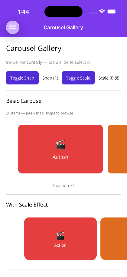 |
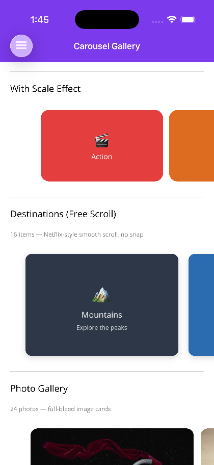 |
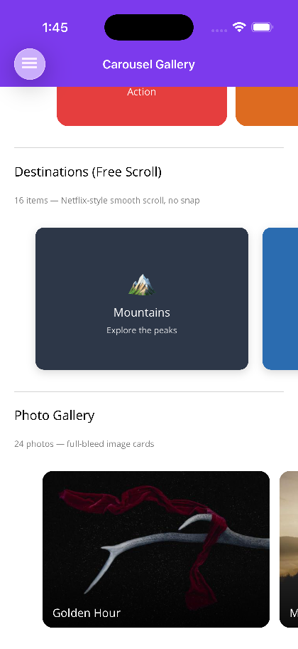 |
Blazor
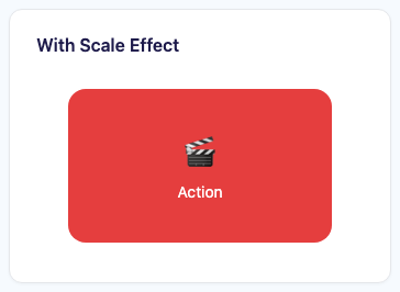
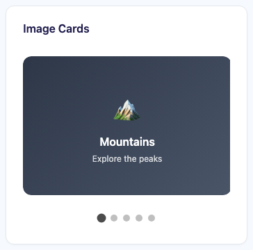
| Basic carousel | Scale effect | Image cards |
|---|---|---|
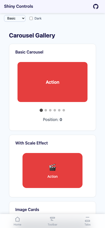 |
 |
 |
Features
Section titled “Features”| Feature | Description |
|---|---|
| Snap-to-Center | Items snap to the center of the viewport on scroll end, ensuring the focused item is always fully visible. Control snapping behavior via SnapCount. |
| Free Scroll | Set SnapCount="0" for Netflix-style free scrolling with no snap behavior. Items decelerate naturally without locking to a position. |
| Scale Transforms | The focused item renders at FocusedItemScale while all other items render at UnfocusedItemScale, providing a clear visual hierarchy. |
| Peek Insets | PeekAreaInsets (MAUI) or PeekAmount (Blazor) reveals the edges of adjacent items, communicating that the list is scrollable. |
| Infinite Looping | Set IsInfinite="true" to loop the item list continuously. |
| Position Tracking | CurrentPosition is a two-way bindable property that reflects and controls the active index. |
| Native Handlers | Android: RecyclerView with snap helper; iOS: UICollectionView with centered flow layout; Windows: ItemsRepeater with scroll snap; Blazor: CSS scroll-snap-type. |
AI Skill
Section titled “AI Skill”Step 1 — Add the marketplace:
claude plugin marketplace add shinyorg/skillsStep 2 — Install the plugin:
claude plugin install shiny@shinyOne plugin installs all 48 Shiny skills. Your agent loads only the skill relevant to what you're building, so there's no cost to having them all available.
Step 1 — Add the marketplace:
copilot plugin marketplace add https://github.com/shinyorg/skillsStep 2 — Install the plugin:
copilot plugin install shiny@shinyOne plugin installs all 48 Shiny skills. Your agent loads only the skill relevant to what you're building, so there's no cost to having them all available.
Quick Start
Section titled “Quick Start”.NET MAUI
Section titled “.NET MAUI”<shiny:CarouselGallery ItemsSource="{Binding Movies}" CurrentPosition="{Binding SelectedIndex, Mode=TwoWay}" ItemWidth="280" ItemHeight="180" FocusedItemScale="1.0" UnfocusedItemScale="0.8" PeekAreaInsets="40" ItemSpacing="12" ItemSelectedCommand="{Binding SelectMovieCommand}"> <shiny:CarouselGallery.ItemTemplate> <DataTemplate> <Border StrokeShape="{RoundRectangle CornerRadius=12}"> <Image Source="{Binding Thumbnail}" Aspect="AspectFill" /> </Border> </DataTemplate> </shiny:CarouselGallery.ItemTemplate></shiny:CarouselGallery>Blazor
Section titled “Blazor”<CarouselGallery Items="movies" @bind-CurrentPosition="selectedIndex" ItemWidth="300" ItemHeight="200" FocusedItemScale="1.0" UnfocusedItemScale="0.85" PeekAmount="40" ItemSpacing="16" ShowIndicators="true" ItemSelected="OnMovieSelected"> <ItemTemplate Context="movie"> <div class="card"> <img src="@movie.Thumbnail" alt="@movie.Title" /> </div> </ItemTemplate></CarouselGallery>
@code { List<Movie> movies = []; int selectedIndex = 0;
void OnMovieSelected(Movie movie) { }}Properties
Section titled “Properties”| Property | MAUI Type | Blazor Type | Default | Description |
|---|---|---|---|---|
| ItemsSource / Items | IEnumerable | IReadOnlyList<TItem> | – | Collection of items to display |
| ItemTemplate | DataTemplate | RenderFragment<TItem> | – | Template for each carousel item |
| ItemWidth | double | double | – / 300 | Width of each item in px |
| ItemHeight | double | double | – / 200 | Height of each item in px |
| ItemSpacing | double | double | – / 16 | Spacing between items in px |
| FocusedItemScale | double | double | 1.0 | Scale applied to the centered/focused item |
| UnfocusedItemScale | double | double | 0.8 / 0.85 | Scale applied to non-focused items |
| PeekAreaInsets / PeekAmount | Thickness | double | – / 40 | Inset that reveals edges of adjacent items |
| CurrentPosition | int | int | 0 | Index of the currently focused item (TwoWay) |
| IsInfinite | bool | – | false | Loop items infinitely (MAUI only) |
| SnapCount | int | int | 1 | Number of items to snap into view. Set to 0 for free-scroll (Netflix-style) with no snapping |
| ShowIndicators | – | bool | true | Show dot position indicators (Blazor only) |
Events & Commands
Section titled “Events & Commands”MAUI:
PositionChangedCommand(ICommand) – Fired whenCurrentPositionchanges; parameter is the new indexItemSelectedCommand(ICommand) – Fired when the user taps a focused item; parameter is the selected item
Blazor:
ItemSelected(EventCallback<TItem>) – Fired when the user clicks/taps an item
Behavior
Section titled “Behavior”- Scrolling past the last item when
IsInfiniteisfalsestops at the boundary PeekAreaInsets/PeekAmountclip the outer items to hint at scrollability without requiring a full item to be visible- Changing
CurrentPositionprogrammatically animates the carousel to the target item - Scale transforms animate smoothly during scroll so intermediate positions show a continuous scale blend
- When
SnapCountis0, items scroll freely without snapping;CurrentPositionstill tracks the closest-to-center item