


DataGrid | Grouping & Summary Rows
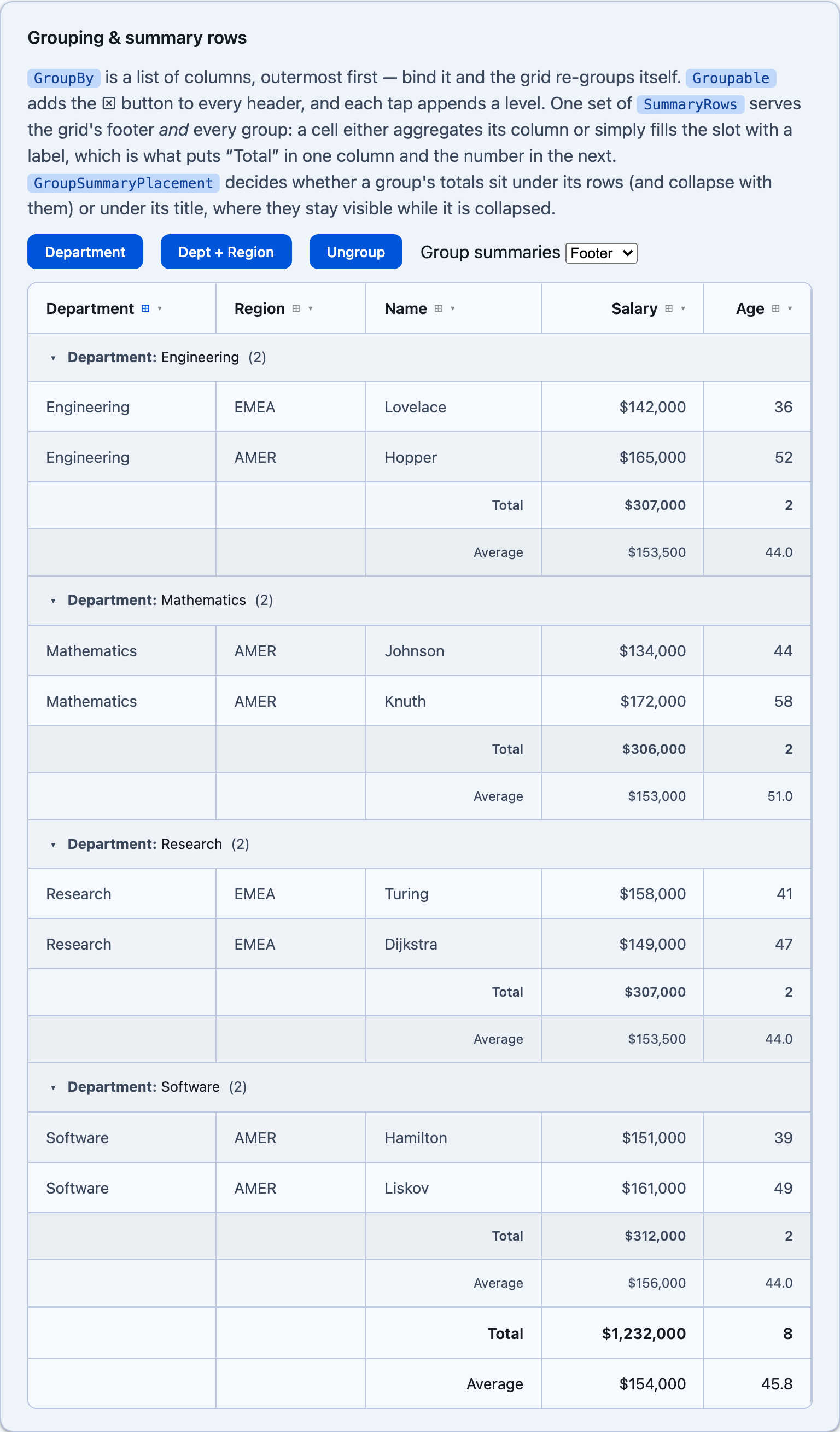
Two features that are really one. GroupBy splits the rows into nested groups; SummaryRows totals a set of rows — and a group is a set of rows, so the same declarations serve the grid’s footer and every group inside it.
Grouping
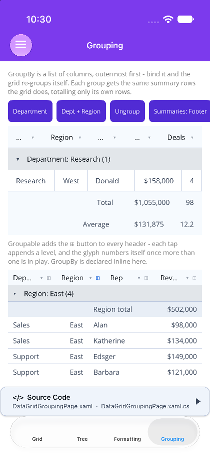
Section titled “Grouping”GroupBy is a list of columns, outermost first. Grouping is on whenever it has an entry:
@* Blazor - two levels, bound so the page can re-group it *@<DataGrid TItem="Sale" Items="sales" @bind-GroupBy="groupBy" Groupable="true">    <Columns>        <PropertyColumn Property="x => x.Department" />        <PropertyColumn Property="x => x.Region" />        <PropertyColumn Property="x => x.Rep" />        <PropertyColumn Property="x => x.Revenue" DisplayAs="DataGridColumnFormat.Currency" Decimals="0" />    </Columns></DataGrid>
@code {    IReadOnlyList<string> groupBy = ["Department", "Region"];}
<!-- MAUI - a binding, or inline <x:String> children --><shiny:DataGrid ItemsSource="{Binding Sales}" Groupable="True" GroupBy="{Binding GroupColumns}"> <shiny:DataGridColumn Title="Department" PropertyName="Department" Width="*" /> <shiny:DataGridColumn Title="Region" PropertyName="Region" Width="Auto" /> <shiny:DataGridColumn Title="Rep" PropertyName="Rep" Width="*" /> <shiny:DataGridColumn Title="Revenue" PropertyName="Revenue" DisplayAs="Currency" Decimals="0" Width="*" /></shiny:DataGrid><!-- ...the same thing, declared inline --><shiny:DataGrid.GroupBy> <x:String>Department</x:String> <x:String>Region</x:String></shiny:DataGrid.GroupBy>- Each level indents from its parent, and a header carries the count of every row beneath it — its nested groups included.
- A group header reads through its column’s own formatting, so it says
Revenue: $45,000, neverRevenue: 45000. - Groups order by key —
GroupSortDirectionisAscendingby default, andNoneleaves them in row order (which is what a sort on the grouped column already gives you). GroupsInitiallyExpanded="false"starts them closed.ExpandAllGroups()/CollapseAllGroups()drive them from code, and collapse state is keyed on the group path — a “West” under one department is independent of the “West” under another.GroupHeaderTemplatereplaces the header’s content: MAUI’s context is aDataGridGroupHeader, Blazor’s aDataGridGroupInfo<T>(Key,KeyText,Title,Count,Level,Items,IsExpanded).
Paging is skipped while the grid is grouped — a page boundary would slice a group in half.
Summary rows
Section titled “Summary rows”A summary row is a set of cells, each pointing at a column. A cell either aggregates that column or simply fills its slot with a label — which is what puts the word “Total” in one column and the number in the next. A column with no cell is left blank.
@* Blazor *@<DataGrid TItem="Sale" Items="sales" @bind-GroupBy="groupBy" GroupSummaryPlacement="DataGridGroupSummaryPlacement.Footer"> <Columns>...</Columns> <SummaryRows> <SummaryRow> <SummaryCell Column="Rep" Text="Total" Alignment="DataGridCellAlignment.End" /> <SummaryCell Column="Revenue" Aggregate="DataGridAggregateType.Sum" /> </SummaryRow> <SummaryRow Scope="DataGridSummaryScope.Grid"> <SummaryCell Column="Rep" Text="Average" Alignment="DataGridCellAlignment.End" Bold="false" /> <SummaryCell Column="Revenue" Aggregate="DataGridAggregateType.Average" Bold="false" /> </SummaryRow> </SummaryRows></DataGrid><!-- MAUI --><shiny:DataGrid.SummaryRows> <shiny:DataGridSummaryRow> <shiny:DataGridSummaryCell Column="Rep" Text="Total" Alignment="End" /> <shiny:DataGridSummaryCell Column="Revenue" Aggregate="Sum" /> </shiny:DataGridSummaryRow>
<shiny:DataGridSummaryRow Scope="Grid"> <shiny:DataGridSummaryCell Column="Rep" Text="Average" Alignment="End" Bold="False" /> <shiny:DataGridSummaryCell Column="Revenue" Aggregate="Average" Bold="False" /> </shiny:DataGridSummaryRow></shiny:DataGrid.SummaryRows>| Cell property | What it does |
|---|---|
Column |
Which column this cell fills — a property name, or a template column’s Title |
Text |
A literal label. Wins over Aggregate |
Aggregate |
Sum, Count, Average, Min, Max, or Custom |
CustomAggregate |
Func<IEnumerable<T>, string> over the rows this summary covers |
StringFormat |
"C0" or "{0:C0}" — both dialects work |
Alignment |
Auto follows the column, so a total lines up under its own values |
Bold |
On by default; off for a secondary row like an average |
CellTemplate (MAUI) / child content (Blazor) |
Owns the slot entirely; the context carries the rows, and the group if there is one |
Rows stack in declaration order, which is what a subtotal / tax / total block is.
Where a group’s totals go
Section titled “Where a group’s totals go”GroupSummaryPlacement decides where each group’s summary rows sit:
| Value | Where | When it is what you want |
|---|---|---|
Footer (default) |
After the group’s rows | The classic subtotal — it collapses along with the rows it totals |
Header |
Directly under the group’s title | Totals stay on screen while the group is collapsed, which turns a collapsed grid into a summary table |
Both |
Both places | Long groups, where the total is wanted at each end |
None |
Nowhere | Groups stay plain; the grid keeps its own footer |
Scope on the row is the other half of the pair: Both (the default) renders it under the grid and inside each group, Grid keeps it out of the groups, Group keeps it out of the footer.
Migrating from column aggregates
Section titled “Migrating from column aggregates”The older per-column Aggregate / FooterTemplate still works and still produces the single footer row it always did — nothing to change:
<shiny:DataGridColumn Title="Revenue" PropertyName="Revenue"> <shiny:DataGridColumn.Aggregate> <shiny:DataGridAggregateDefinition Type="Sum" Format="C0" /> </shiny:DataGridColumn.Aggregate></shiny:DataGridColumn>Declaring any SummaryRows takes over from it. Reach for them when you want a label beside the number, more than one total row, or different totals for the grid and its groups.
Next Steps
Section titled “Next Steps”| Topic | Description |
|---|---|
| Column Formatting | the presets an aggregate inherits |
| Detail (Breakdown) Rows | a full-width row under an expanded row |
| TreeDataGrid | hierarchy from the data itself rather than from a key |