


FrostedGlassView
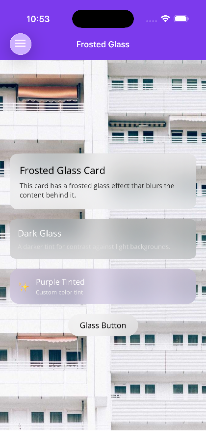
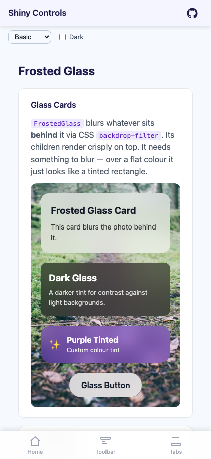
A view that blurs whatever sits behind it, so content can float over a photo, gradient, or scrolling list with a glassmorphism look. It is not a filter on its own children — the children render crisply on top of the blurred backdrop.
On MAUI the control is FrostedGlassView, a ContentView that drops a native blur surface behind its content. On Blazor it is FrostedGlass, a container that applies CSS backdrop-filter.


MAUI
Blazor
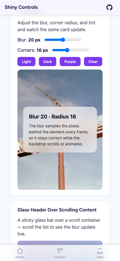
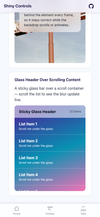
| Glass cards over a photo | Live blur and tint tuning | Sticky glass header |
|---|---|---|
 |
 |
 |
Features
Section titled “Features”- Real backdrop blur, not a tint — samples the pixels behind the view every frame, so it stays correct while the content underneath scrolls or animates
- Native per-platform implementation —
UIVisualEffectViewon Apple,RenderEffecton Android 12+,backdrop-filteron the web - Automatic light/dark material on Apple — picks the ultra-thin light or dark system material to match the current theme
- Tint layer on top of the blur —
TintColor+TintOpacitylet you push the glass warmer, cooler, lighter, or darker - Corner clipping —
CornerRadiusrounds the blur surface itself, not just the content
Quick Start
Section titled “Quick Start”<!-- MAUI --><Grid> <Image Source="hero.jpg" Aspect="AspectFill" />
<shiny:FrostedGlassView BlurRadius="20" TintColor="#80FFFFFF" TintOpacity="0.6" CornerRadius="16" Margin="20" VerticalOptions="End"> <VerticalStackLayout Padding="20" Spacing="8"> <Label Text="Glass Card" FontSize="20" FontAttributes="Bold" /> <Label Text="Content over a blurred background." FontSize="14" /> </VerticalStackLayout> </shiny:FrostedGlassView></Grid>@* Blazor *@<div style="background-image: url('hero.jpg'); background-size: cover;"> <FrostedGlass BlurRadius="20" TintColor="rgba(255,255,255,0.6)" CornerRadius="16"> <h3>Glass Card</h3> <p>Content over a blurred background.</p> </FrostedGlass></div>Properties
Section titled “Properties”MAUI — FrostedGlassView
Section titled “MAUI — FrostedGlassView”| Property | Type | Default | Description |
|---|---|---|---|
GlassContent |
View? |
null |
Content rendered on top of the glass. This is the ContentProperty, so child XAML binds to it implicitly |
BlurRadius |
double |
20 |
Blur strength in pixels |
TintColor |
Color |
#80FFFFFF |
Tint overlay drawn above the blur |
TintOpacity |
double |
0.6 |
Opacity of the tint overlay |
CornerRadius |
double |
0 |
Corner radius applied to the glass surface |
Blazor — FrostedGlass
Section titled “Blazor — FrostedGlass”| Parameter | Type | Default | Description |
|---|---|---|---|
ChildContent |
RenderFragment? |
null |
Content rendered on top of the glass |
BlurRadius |
double |
20 |
Blur strength in pixels |
TintColor |
string |
rgba(255, 255, 255, 0.6) |
CSS color for the tint overlay |
CornerRadius |
double |
0 |
Border radius in pixels |
CssClass |
string? |
null |
Extra CSS classes on the root element |
Style |
string? |
null |
Extra inline CSS on the root element |
Platform Behavior
Section titled “Platform Behavior”| Platform | Implementation |
|---|---|
| iOS / Mac Catalyst | UIVisualEffectView with the system ultra-thin material — light or dark is chosen from the current theme. Because the material carries its own tint, the control reduces its own tint overlay to avoid double-tinting |
Android 12+ (API 31, S) |
The background behind the view is captured on each pre-draw pass and blurred with RenderEffect |
| Android 11 and older | RenderEffect is unavailable, so no blur is applied — the view falls back to the semi-transparent tint only |
| Blazor | CSS backdrop-filter: blur() with the -webkit- prefix |
- Over dark backgrounds use a light tint (
#80FFFFFF); over light backgrounds use a dark tint (#80000000) - Pair with
CornerRadiusfor rounded glass cards, or leave it at0for edge-to-edge bars - For a translucent nav bar or toolbar, overlay a
FrostedGlassViewon top of the page content rather than placing it in the layout flow - Larger
BlurRadiusvalues cost more on Android, since each pre-draw pass re-blurs the captured backdrop — keep it modest on long scrolling lists
Related
Section titled “Related”- Overlay & LoadingOverlay — has a
BlurRadiusthat uses this same effect behind its backdrop - FloatingPanel — commonly paired with glass for sheet chrome
Step 1 — Add the marketplace:
claude plugin marketplace add shinyorg/skillsStep 2 — Install the plugin:
claude plugin install shiny@shinyOne plugin installs all 36 Shiny skills. Your agent loads only the skill relevant to what you're building, so there's no cost to having them all available.
Step 1 — Add the marketplace:
copilot plugin marketplace add https://github.com/shinyorg/skillsStep 2 — Install the plugin:
copilot plugin install shiny@shinyOne plugin installs all 36 Shiny skills. Your agent loads only the skill relevant to what you're building, so there's no cost to having them all available.