


Border Animations
Animated card outlines in the style of Magic UI’s border beam and shine border. Both hosts have them, in the core packages:
BorderBeamsends a short beam of light around the border, without end. The head of the beam isColorFrom, it shades intoColorTo, and the tail fades out.ShineBordermoves a soft glow in several colours across the border and back.
Each one is a rounded card that wraps your content. The effect is drawn over the content, so the content can never hide it. Taps and clicks go straight through it. Under the effect is a static track, which is the theme’s outline-variant colour unless you set TrackColor. Set it to Transparent to show only the animation.


Frameworks
.NET MAUI
Blazor
Screenshots
Section titled “Screenshots”MAUI
| iOS | Android |
|---|---|
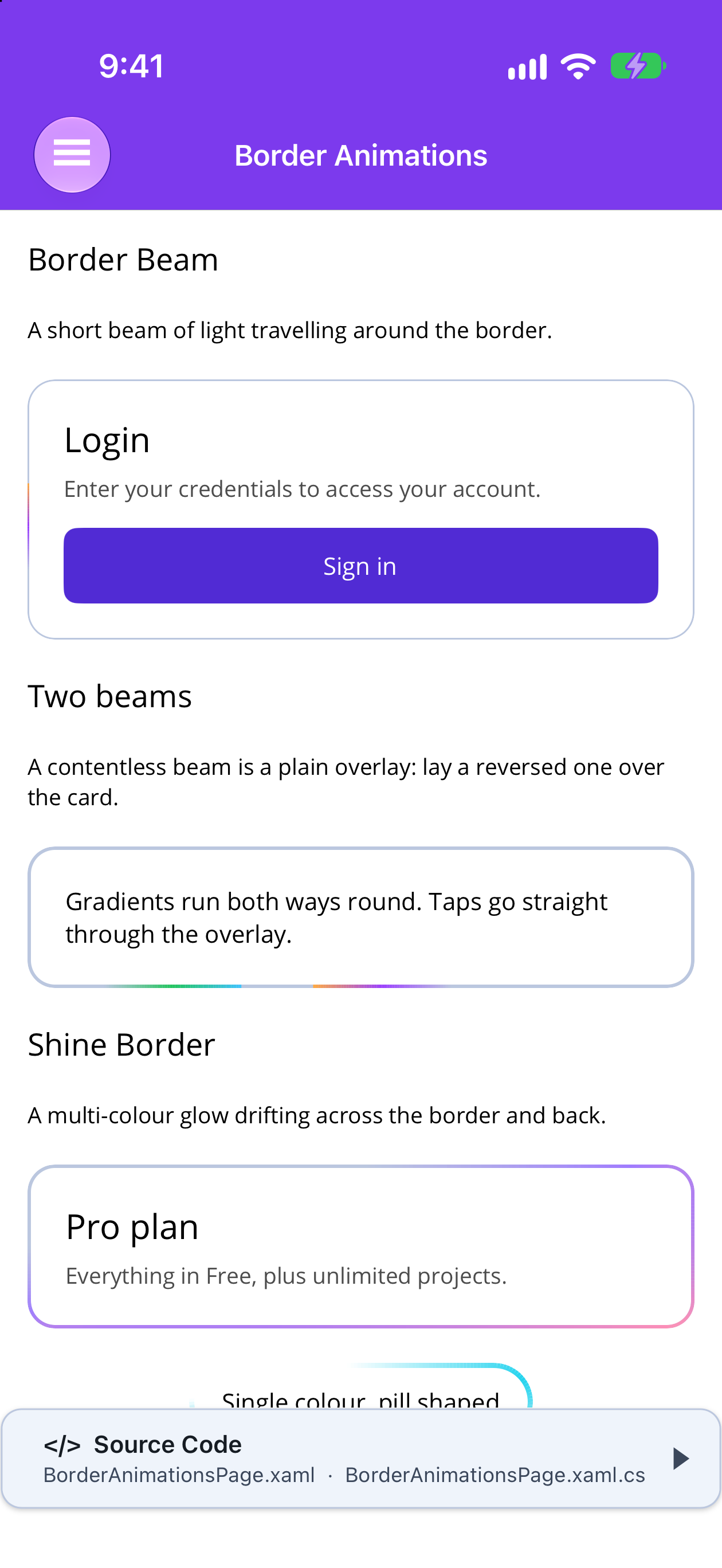 |
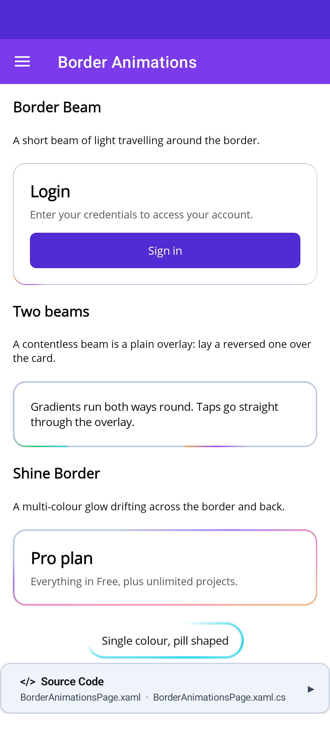 |
Blazor
| BorderBeam | Two beams (Overlay="true") |
ShineBorder |
|---|---|---|
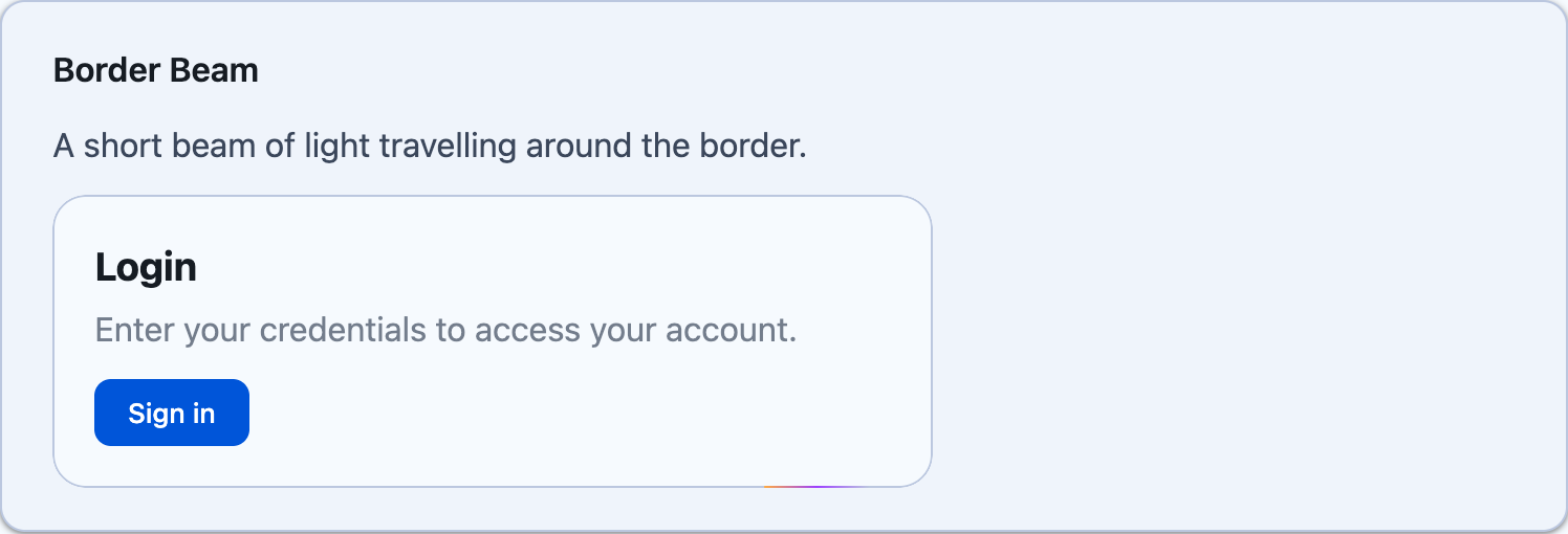 |
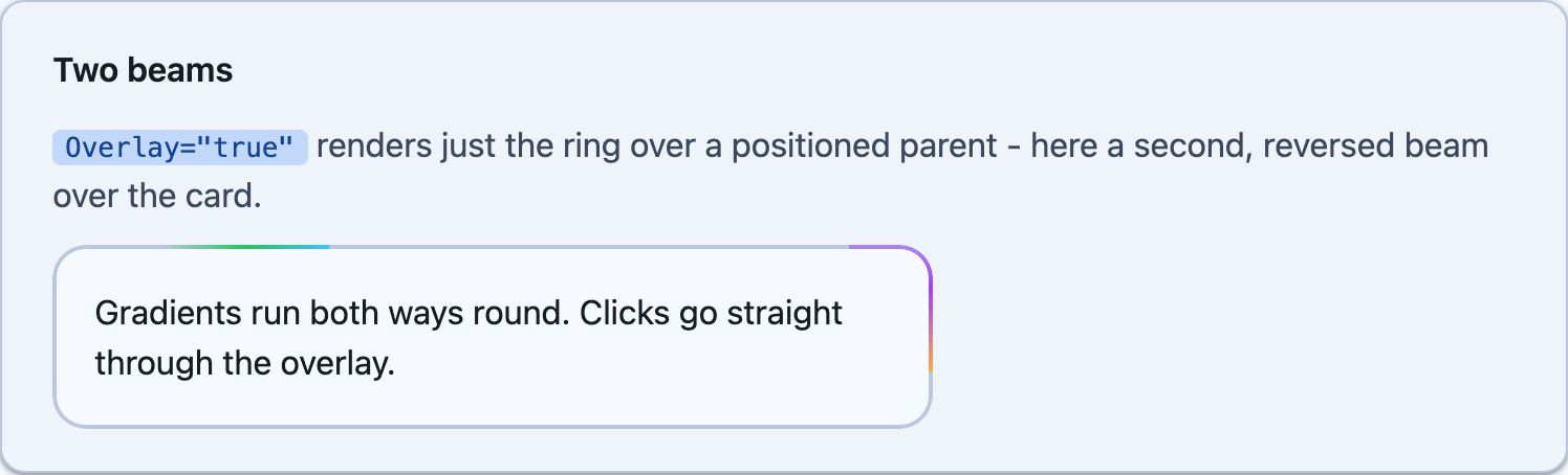 |
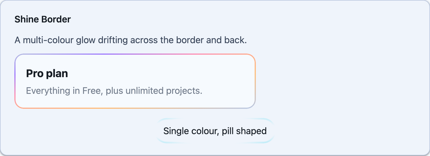 |
<shiny:BorderBeam CornerRadius="16" BorderWidth="2" Padding="20" Background="White">    <Label Text="Upgrade to Pro" /></shiny:BorderBeam>
<shiny:ShineBorder ShineColors="#A07CFE,#FE8FB5,#FFBE7B" BorderWidth="2" Padding="20">    <Label Text="Sign in" /></shiny:ShineBorder>
<!-- two beams: a beam with no content is a plain overlay --><Grid> <shiny:BorderBeam CornerRadius="16" Padding="20"> <Label Text="Both ways round" /> </shiny:BorderBeam> <shiny:BorderBeam CornerRadius="16" Reverse="True" InitialOffset="50" ColorFrom="#40C4FF" ColorTo="#22C55E" TrackColor="Transparent" InputTransparent="True" /></Grid>- Clipping: the control clips itself, its
Backgroundand its content toCornerRadius. - Content inset: the content sits inside
PaddingplusBorderWidth. - Drawing: the effect is drawn on a
GraphicsView, so it looks the same on iOS, Android, Mac Catalyst, macOS (AppKit), Windows and Linux (GTK4). - Timing: it runs on the window’s shared frame ticker, the same one that Marquee and Motion Icons use.
- When it stops: it stops while unloaded, while
IsRunningis false, and while the OS has reduced motion turned on (unlessRespectReducedMotion="False"). ShineColorsin XAML: a comma-separated list. One colour works too, and so doesrgb(...).
Blazor
Section titled “Blazor”<BorderBeam CornerRadius="16" BorderWidth="2" Style="padding:20px; background:white"> Upgrade to Pro</BorderBeam>
<ShineBorder ShineColors="@(["#A07CFE", "#FE8FB5", "#FFBE7B"])" Style="padding:20px"> Sign in</ShineBorder>
<!-- a second beam over the card: Overlay renders only the ring, over the nearest positioned ancestor --><BorderBeam CornerRadius="16" Style="padding:20px"> Both ways round <BorderBeam Overlay="true" CornerRadius="16" Reverse="true" InitialOffset="50" ColorFrom="#40c4ff" ColorTo="#22c55e" TrackColor="transparent" /></BorderBeam>- No script: the effect is pure CSS. It is a ring laid over the content and masked down to the border.
- Padding: the card’s padding defaults to
BorderWidth. Set padding, background, size and shadow throughStyleorClass. - Colours: every colour can be any CSS colour, including
var(--shiny-color-primary). - Reduced motion: the animation pauses under
prefers-reduced-motion: reduceunlessRespectReducedMotion="false". - Browser support: the beam uses CSS
offset-path: rect(), which needs Chrome 116, Safari 17.2, Firefox 122 or later. Older browsers show the track without the beam.
Shared properties
Section titled “Shared properties”| Property | Default | Notes |
|---|---|---|
CornerRadius |
12 | Radius of the outer corners |
BorderWidth |
1 | Thickness of the track and the effect |
TrackColor |
theme outline-variant | The static border under the effect. Transparent hides it |
IsRunning |
true | False holds the effect where it is |
RespectReducedMotion |
true | Holds still when the OS or browser asks for reduced motion |
Overlay (Blazor) |
false | Renders only the ring, absolutely positioned. On MAUI, leave out the content and lay it over a sibling instead |
BorderBeam
Section titled “BorderBeam”| Property | Default | Notes |
|---|---|---|
Size |
50 | Length of the beam along the border |
Duration |
6s | Time for one lap |
Delay |
0 | A head start into the lap, as in Magic UI. The beam does not wait; it starts this far along |
ColorFrom |
#FFAA40 |
Colour at the head of the beam |
ColorTo |
#9C40FF |
Colour the beam shades into before the tail fades out |
Reverse |
false | Travels anticlockwise |
InitialOffset |
0 | Where the lap starts, as a percentage of the way round from the top-left |
ShineBorder
Section titled “ShineBorder”| Property | Default | Notes |
|---|---|---|
ShineColors |
#A07CFE, #FE8FB5, #FFBE7B |
The colours the glow passes through. MAUI: IReadOnlyList<Color>, a comma list in XAML. Blazor: IReadOnlyList<string> |
Duration |
14s | Time for the glow to move across the border and back |