BadgeView
A content-wrapping overlay that pins a small badge — a count, label, or dot — to one of the four corners of a wrapped view. Use it for unread counts, cart counters, “has new” indicators, status markers, or any “look at me” callout that sits on top of an icon, avatar, button, or card.
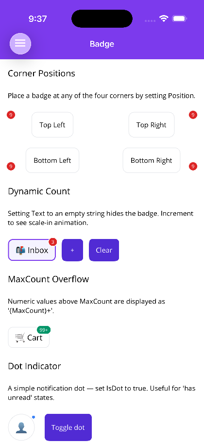
Setting Text to an empty string (and leaving IsDot false) hides the badge automatically — bind your unread/count value directly and the control shows or clears itself.


 | 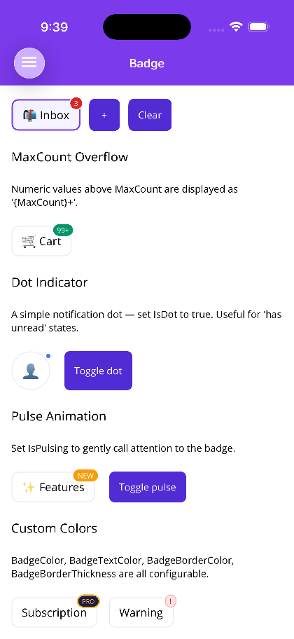 |
Features
Section titled “Features”- Four-corner positioning (
TopLeft,TopRight,BottomLeft,BottomRight) with per-corner offset nudge - Auto-hide when
Textis empty — bind your count source directly and let the control show/clear itself - Dot mode (
IsDot) for simple “has new” / “has unread” indicators MaxCountnumeric overflow rendering (e.g.127→"99+")- Scale-in/out animation when the badge appears or disappears (
IsAnimated) - Optional continuous pulse animation (
IsPulsing) for attention-grabbing badges - Configurable colors, border, font, corner radius, and padding
- Blazor honors
prefers-reduced-motionand disables animations when set
Quick Start
Section titled “Quick Start”MAUI — Count Badge with Overflow
Section titled “MAUI — Count Badge with Overflow”The child element is the Content (it is the ContentProperty), so nest it directly inside <shiny:BadgeView>.
<shiny:BadgeView xmlns:shiny="http://shiny.net/maui/controls" Text="{Binding UnreadCount}" MaxCount="99"> <Border Stroke="#E5E7EB" StrokeThickness="1" Padding="14,10" StrokeShape="RoundRectangle 10"> <Label Text="📬 Inbox" FontSize="16" /> </Border></shiny:BadgeView>When UnreadCount becomes "" the badge is hidden; when it parses as a number above MaxCount, the badge renders "99+" instead of the raw value.
MAUI — Corner Positions
Section titled “MAUI — Corner Positions”<shiny:BadgeView Text="9" Position="TopLeft"> ... </shiny:BadgeView><shiny:BadgeView Text="9" Position="TopRight"> ... </shiny:BadgeView> <!-- default --><shiny:BadgeView Text="9" Position="BottomLeft"> ... </shiny:BadgeView><shiny:BadgeView Text="9" Position="BottomRight"> ... </shiny:BadgeView>OffsetX (default 4) and OffsetY (default -4) nudge the badge from the corner. Positive OffsetX pushes outward; positive OffsetY pushes downward (negative lifts the badge above the corner).
MAUI — Dot Indicator
Section titled “MAUI — Dot Indicator”For a “has new” / “has unread” state with no count:
<shiny:BadgeView IsDot="{Binding HasNew}" BadgeColor="#3B82F6" OffsetX="2" OffsetY="2"> <Border WidthRequest="56" HeightRequest="56" StrokeShape="RoundRectangle 28" Padding="12"> <Label Text="👤" FontSize="22" HorizontalTextAlignment="Center" VerticalTextAlignment="Center" /> </Border></shiny:BadgeView>When IsDot is true, Text, MaxCount, and BadgePadding are ignored and the badge renders as a circle of DotSize (default 10).
MAUI — Pulse
Section titled “MAUI — Pulse”<shiny:BadgeView Text="NEW" IsPulsing="True" BadgeColor="#F59E0B" FontSize="9"> <Border Padding="14,10" StrokeShape="RoundRectangle 10" Stroke="#E5E7EB" StrokeThickness="1"> <Label Text="✨ Features" FontSize="16" /> </Border></shiny:BadgeView>IsAnimated (default true) handles the scale-in/out when the badge appears or disappears. IsPulsing (default false) runs a continuous gentle scale animation while the badge is visible — leave it off for normal count badges, turn it on for important “look at me” badges.
Blazor — Count Badge
Section titled “Blazor — Count Badge”<BadgeView Text="@unreadCount" Position="BadgePosition.TopRight" MaxCount="99"> <div class="inbox-card">📬 Inbox</div></BadgeView>When unreadCount is "" the badge is hidden.
Blazor — Dot Indicator
Section titled “Blazor — Dot Indicator”<BadgeView IsDot="@hasNew" BadgeColor="#3B82F6" OffsetX="2" OffsetY="2"> <div class="avatar">👤</div></BadgeView>Blazor — Pulse
Section titled “Blazor — Pulse”<BadgeView Text="NEW" IsPulsing="true" BadgeColor="#F59E0B" FontSize="9"> <div class="feature-card">✨ Features</div></BadgeView>Properties
Section titled “Properties”| Property | Type | Default | Description |
|---|---|---|---|
| Content | View? | null | The wrapped view (ContentProperty) |
| Text | string | "" | Badge text. Empty hides the badge unless IsDot is true |
| Position | BadgePosition | TopRight | TopLeft, TopRight, BottomLeft, BottomRight |
| BadgeColor | Color | #DC2626 | Badge fill color |
| BadgeTextColor | Color | White | Badge text color |
| BadgeBorderColor | Color | White | Border color (default white creates a clean ring against any background) |
| BadgeBorderThickness | double | 1.5 | Border thickness |
| FontSize | double | 10 | Badge text font size |
| FontAttributes | FontAttributes | Bold | Badge font weight |
| CornerRadius | double | 999 | Default fully rounded pill |
| BadgePadding | Thickness | 6,2 | Inner padding |
| OffsetX | double | 4 | Horizontal nudge from the corner (positive = outward) |
| OffsetY | double | -4 | Vertical nudge from the corner (negative = upward) |
| IsDot | bool | false | When true, renders a small dot — text is ignored |
| DotSize | double | 10 | Dot diameter when IsDot is true |
| MaxCount | int | 0 | When > 0 and Text parses as a number above this limit, renders "{MaxCount}+" |
| IsAnimated | bool | true | Scale/fade in-out when the badge appears or disappears |
| IsPulsing | bool | false | Continuous pulse animation while visible |
Blazor
Section titled “Blazor”| Parameter | Type | Default | Description |
|---|---|---|---|
| ChildContent | RenderFragment? | — | The wrapped view |
| Text | string? | "" | Badge text. Empty hides the badge unless IsDot is true |
| Position | BadgePosition | TopRight | TopLeft, TopRight, BottomLeft, BottomRight |
| BadgeColor | string | #DC2626 | Badge fill color (CSS) |
| BadgeTextColor | string | #FFFFFF | Badge text color (CSS) |
| BadgeBorderColor | string | #FFFFFF | Badge border color (CSS) |
| BadgeBorderThickness | double | 1.5 | Border thickness (px) |
| FontSize | double | 10 | Badge text font size (px) |
| FontWeight | string | ”700” | Badge text font weight (CSS) |
| CornerRadius | double | 999 | Default fully rounded pill (px) |
| BadgePadding | string | ”2px 6px” | Inner padding (CSS) |
| OffsetX | double | 4 | Horizontal nudge from the corner (px) |
| OffsetY | double | -4 | Vertical nudge from the corner (px) |
| IsDot | bool | false | Render a small dot — text is ignored |
| DotSize | double | 10 | Dot diameter (px) when IsDot is true |
| MaxCount | int | 0 | When > 0 and Text is numeric above this limit, renders "{MaxCount}+" |
| IsAnimated | bool | true | CSS scale-in animation on first render |
| IsPulsing | bool | false | Continuous CSS pulse animation while visible |
| CssClass | string? | null | Additional CSS class on the root |
Textbeing an empty string is the auto-hide signal — bind your count source directly and set it to""(ornull) to clear the badge.MaxCountonly formats whenTextparses as an integer. Non-numeric text ("NEW","PRO", etc.) is shown as-is regardless ofMaxCount.- Default
OffsetX=4,OffsetY=-4nudges the badge slightly outside the corner of the wrapped content for the typical “hangs off the edge” badge look. Set both to0to keep the badge fully inside the corner instead. BadgeBorderColordefaults to white so the badge reads cleanly against any underlying content; match it to the surrounding background when wrapping inside a colored card.- Use
IsDotfor unread indicators (no count needed) andMaxCountfor count badges. ReserveIsPulsingfor genuinely important badges — it’s eye-catching by design. - The wrapped view is laid out exactly as if the badge weren’t there — the badge does not affect the host’s measurement.
- For inline status labels (not anchored to a corner of another view), see PillView instead.