


ColorPicker
A full-featured color picker with spectrum view, hue bar, opacity slider, hex input, and preview swatch. Available as both an inline ColorPicker control and a ColorPickerButton that opens the picker as a popup dialog.


Screenshots
Section titled “Screenshots”MAUI
| Button | Picker Dialog |
|---|---|
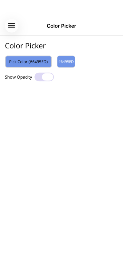 |
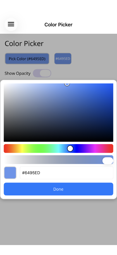 |
Blazor
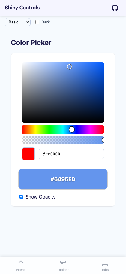
Basic Usage
Section titled “Basic Usage”ColorPickerButton (popup dialog)
Section titled “ColorPickerButton (popup dialog)”<shiny:ColorPickerButton SelectedColor="{Binding SelectedColor}" Text="Pick Color" ShowOpacity="True" />ColorPicker (inline)
Section titled “ColorPicker (inline)”<shiny:ColorPicker SelectedColor="{Binding SelectedColor}" ShowOpacity="True" />ColorPickerButton Properties
Section titled “ColorPickerButton Properties”| Property | Type | Default | Description |
|---|---|---|---|
SelectedColor |
Color |
Red |
Currently selected color (TwoWay) |
Text |
string? |
null |
Button label text |
ShowOpacity |
bool |
false |
Show/hide opacity slider in the picker |
CornerRadius |
int |
8 |
Button corner radius |
ColorChangedCommand |
ICommand? |
null |
Fires when color changes |
DoneText |
string |
Done |
Text of the popup’s confirm button (MAUI) |
Event: ColorChanged (EventHandler<Color>)
Committing and Cancelling
Section titled “Committing and Cancelling”The popup writes SelectedColor on every drag so the button behind it previews the colour live. Done accepts whatever is showing; tapping the backdrop discards the change and puts back the colour the popup opened with, through the same property write a caller would make — so a two-way binding, ColorChanged and the button swatch all follow the revert.
ColorPicker Properties
Section titled “ColorPicker Properties”| Property | Type | Default | Description |
|---|---|---|---|
SelectedColor |
Color |
Red |
Currently selected color (TwoWay) |
ShowOpacity |
bool |
true |
Show/hide opacity slider |
ShowHexInput |
bool |
true |
Show/hide hex input field |
ShowPreview |
bool |
true |
Show/hide color preview swatch |
ColorChangedCommand |
ICommand? |
null |
Fires when color changes |
Event: ColorChanged (EventHandler<Color>)
Features
Section titled “Features”- Color spectrum – HSV-based spectrum with saturation (horizontal) and brightness (vertical) axes
- Hue bar – Full rainbow hue slider below the spectrum
- Opacity slider – Optional alpha channel slider with gradient track
- Preview swatch – Live preview of the selected color
- Hex input – Enter colors as hex values (#RGB, #RRGGBB, or #AARRGGBB)
- Auto-contrast – Button text color automatically adjusts for readability against the selected color
- Popup mode –
ColorPickerButtonopens the picker as an overlay dialog with a backdrop and Done button; on MAUI the backdrop cancels andDoneTextlabels the button
ViewModel Pattern
Section titled “ViewModel Pattern”public partial class ColorPickerViewModel : ObservableObject{ [ObservableProperty] Color selectedColor = Colors.CornflowerBlue; [ObservableProperty] bool showOpacity = true; [ObservableProperty] string colorDisplay = "#6495ED";
partial void OnSelectedColorChanged(Color value) { var r = (int)(value.Red * 255); var g = (int)(value.Green * 255); var b = (int)(value.Blue * 255); ColorDisplay = $"#{r:X2}{g:X2}{b:X2}"; }}Blazor Usage
Section titled “Blazor Usage”The Blazor components mirror the MAUI controls. Colors use CSS strings:
@using Shiny.Blazor.Controls
<!-- Inline picker --><ColorPicker SelectedColor="@selectedColor"             SelectedColorChanged="c => selectedColor = c"             ShowOpacity="true" />
<!-- Popup button --><ColorPickerButton SelectedColor="@selectedColor"                   SelectedColorChanged="c => selectedColor = c"                   Text="Pick Color"                   ShowOpacity="true" />
@code { string selectedColor = "#6495ED";}AI Skill
Section titled “AI Skill”Step 1 — Add the marketplace:
claude plugin marketplace add shinyorg/skillsStep 2 — Install the plugin:
claude plugin install shiny@shinyOne plugin installs all 36 Shiny skills. Your agent loads only the skill relevant to what you're building, so there's no cost to having them all available.
Step 1 — Add the marketplace:
copilot plugin marketplace add https://github.com/shinyorg/skillsStep 2 — Install the plugin:
copilot plugin install shiny@shinyOne plugin installs all 36 Shiny skills. Your agent loads only the skill relevant to what you're building, so there's no cost to having them all available.