


ProgressLine
The thin determinate or indeterminate line that runs across the top or bottom of the window while something is loading.


Screenshots
Section titled “Screenshots”Blazor
| Bound to a value | Driven from the service | Anchored to a container |
|---|---|---|
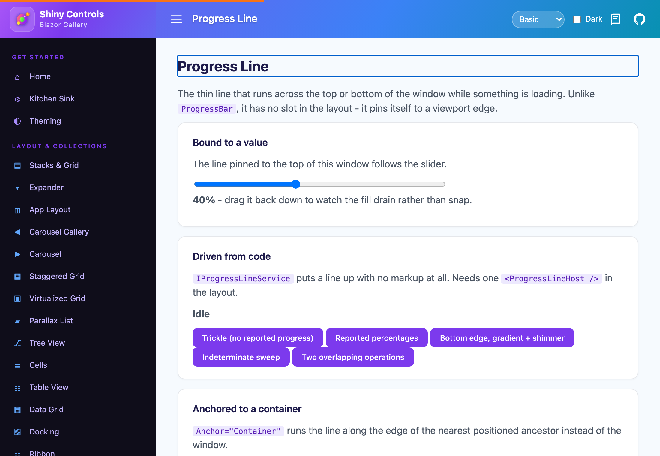 |
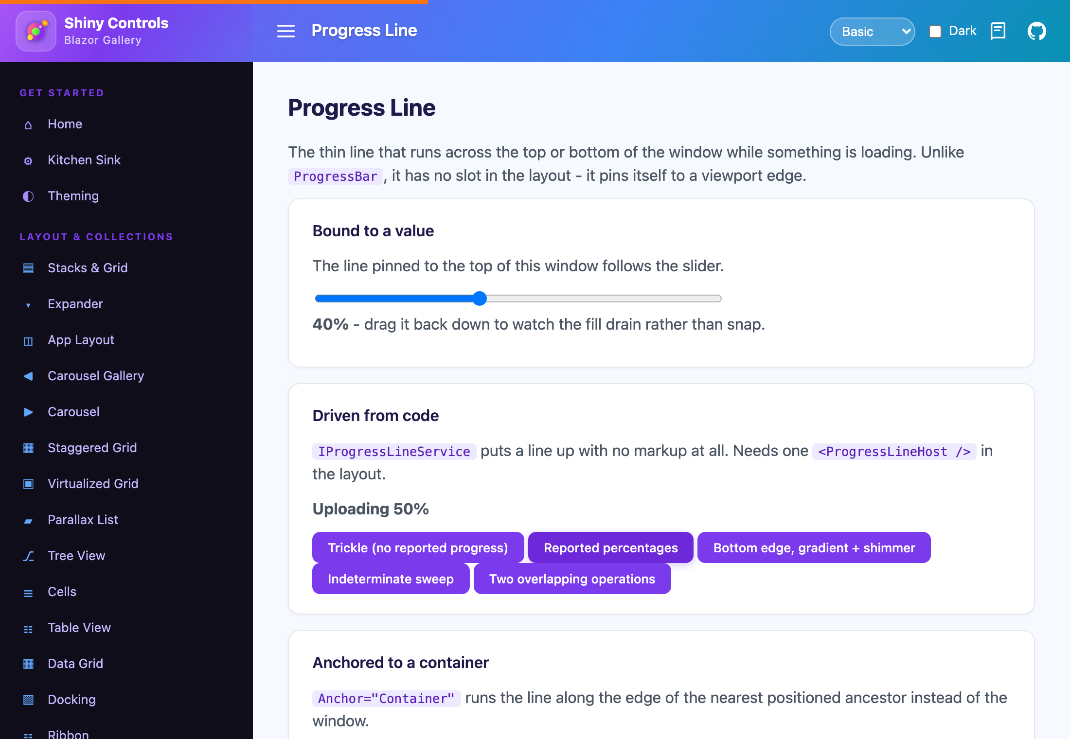 |
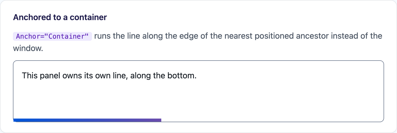 |
MAUI (iOS)
| Dock=“False”, inline |
|---|
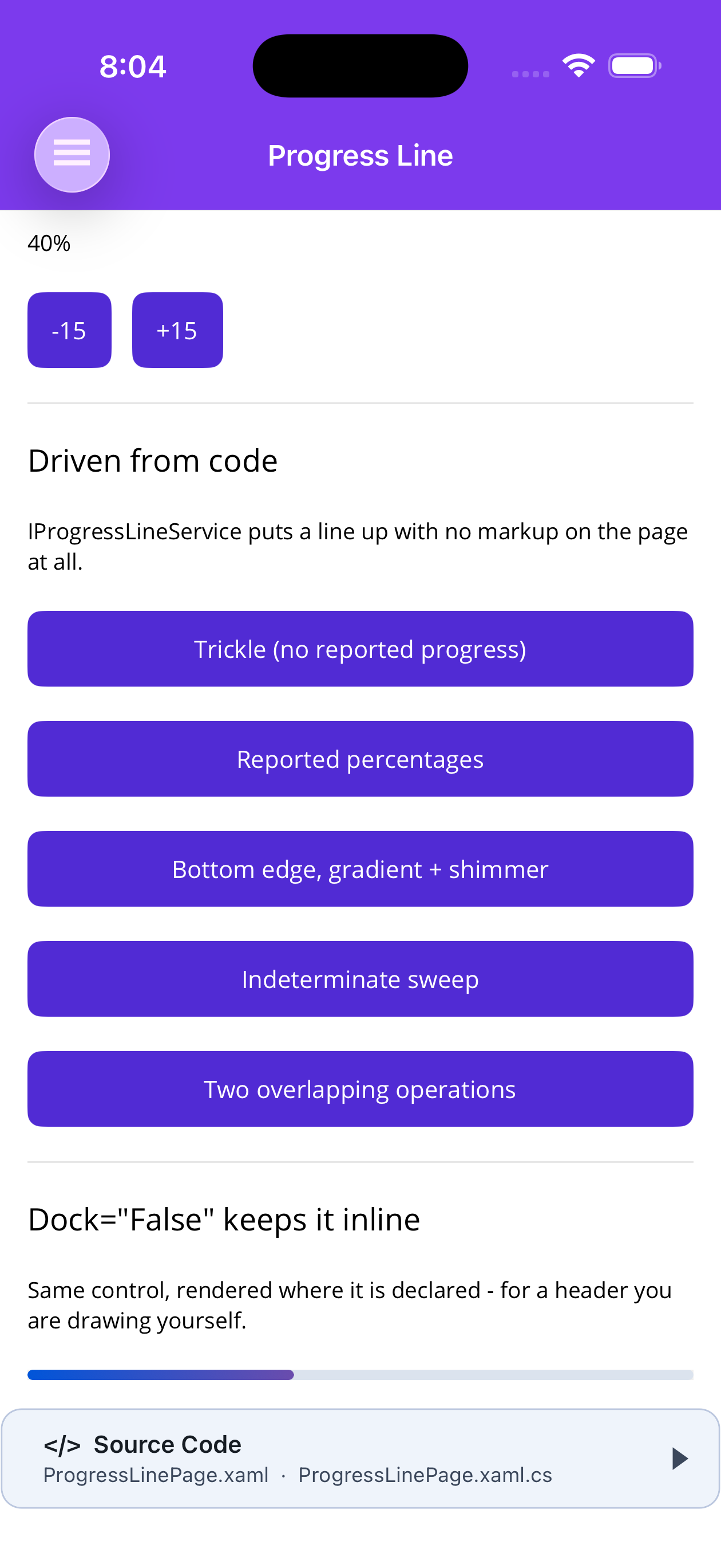 |
| Docked line | Service, top edge | Service, bottom edge |
|---|---|---|
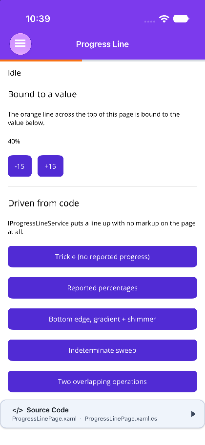 |
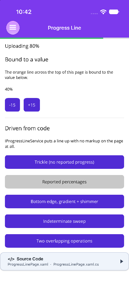 |
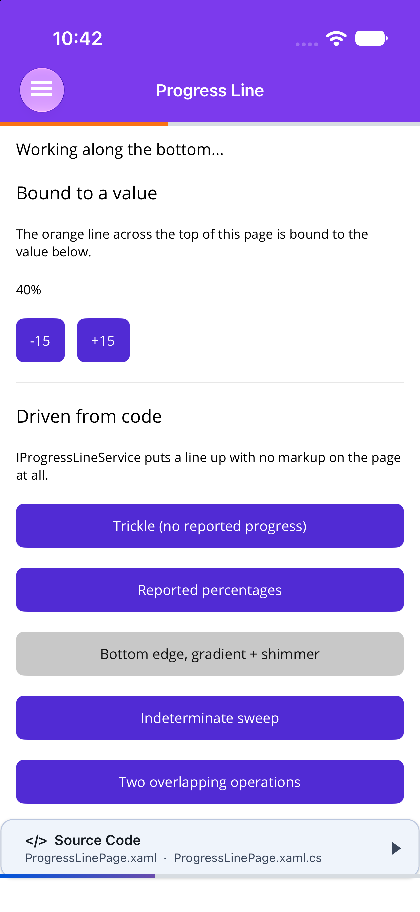 |
ProgressLine or ProgressBar?
Section titled “ProgressLine or ProgressBar?”They are siblings, not two modes of one control. Pick by asking whether the thing has a slot in your layout.
| ProgressBar | ProgressLine | |
|---|---|---|
| Placement | Fills the slot you gave it in a layout | Page chrome — pins itself to a window edge |
| Typical driver | Value bound to a view model |
A code path, via IProgressLineService |
| Track | Visible by default | Transparent by default |
| Corners | Rounded | Square, so the line meets the window edges |
| Chrome awareness | None | Clears the navigation bar, tab bar and safe area |
The drawing is shared — ProgressLine composes a ProgressBar internally — so the gradient, the shimmer sweep, indeterminate mode and the animated fill are the same code on both, and every platform paint fix applies to both.
Features
Section titled “Features”| Feature | Description |
|---|---|
| Docks itself | on MAUI, a line declared anywhere in a page’s markup moves onto the edge named by Position. It is chrome, so it does not render where you wrote it. |
| Clears the chrome | offsets past ShinyNavBar, ShinyTabBar and the safe area, and knows when not to, which is the harder half. |
| Reference-counted runs | two overlapping operations produce one line that stays up until the slower of them lands. |
| Trickle | with nothing reported, the line creeps forward and decelerates, so a request that goes quiet for two seconds still looks alive. |
| Animated fill | slides to each new value in both directions, so a value that drops drains rather than jumping backwards. |
| Themed | the fill and both gradient ends fall back to theme tokens, so a theme pack change carries. |
Basic Usage
Section titled “Basic Usage”.NET MAUI
Section titled “.NET MAUI”<ContentPage xmlns:shiny="http://shiny.net/maui/controls">
<!-- Declared here, rendered across the top of the page --> <shiny:ProgressLine Position="Top" Value="{Binding Progress}" BarColor="#F97316" LineHeight="4" />
<ScrollView> <!-- page content --> </ScrollView></ContentPage>Blazor
Section titled “Blazor”<ProgressLine Position="ProgressLinePosition.Top" Value="@progress" BarColor="#F97316" LineHeight="4" />There is no re-parenting on Blazor — the component is position: fixed at the viewport edge, so declaring it anywhere works.
Driven from code
Section titled “Driven from code”The line is more often chrome you never write markup for. IProgressLineService puts one up and hands you the handle that drives it.
.NET MAUI
Section titled “.NET MAUI”Registered by UseShinyControls().
public partial class MyViewModel(IProgressLineService progressLine) : ObservableObject{    async Task LoadAsync()    {        using var run = progressLine.Start(c =>        {            c.Position = ProgressLinePosition.Top;            c.BarColor = Colors.Orange;        });
        run.SetProgress(0.4);       // 0..1 — or report nothing and let it trickle        await DoWorkAsync();    }                               // Dispose == Complete: sweeps to 100%, then fades}
Blazor
Section titled “Blazor”Registered by AddShinyControls() (or AddShinyProgressLine()), plus one host in your layout:
@* MainLayout.razor *@<ProgressLineHost />@inject IProgressLineService ProgressLine
@code { async Task LoadAsync() { using var run = this.ProgressLine.Start(c => c.BarColor = "#F59E0B"); run.SetProgress(0.6); await DoWorkAsync(); }}How the inset is resolved (MAUI)
Section titled “How the inset is resolved (MAUI)”“The top of the page” means different things depending on how the page was assembled, and getting it wrong is visible either way: too little and the line hides behind the bar, too much and it floats in a gap.
One rule covers every arrangement: a bar earns an offset exactly when it is painted inside the same coordinate space the line is — that is, when it is a descendant of the line’s own overlay root.
| Arrangement | Inset |
|---|---|
ShinyTabBar docked over a Shell page (ShinyTabBarBehavior) |
The bar’s height |
ShinyNavBar inside the page’s overlay root |
The bar’s height |
ShinyNavigationPage — the bar wraps the overlay root in a two-row grid |
0 — the root already starts below it |
ShinyTabbedPage — the bar is a sibling of the hosted page |
0 |
Native NavigationPage / TabbedPage |
0 — MAUI already excludes their chrome from the content area |
| Shell’s native nav bar, and Shell’s bottom tabs when the item has more than one section | 0 — same as NavigationPage / TabbedPage |
| Nothing on that edge | The safe-area inset (Apple heads only) |
The measured height wins over the declared BarHeight wherever it is available, because ShinyTabBar.RespectSafeArea folds the home indicator into the bar’s own height — adding a safe-area inset on top of BarHeight would count it twice.
AutoInset="False" turns the whole thing off; Offset stacks on top of whatever it resolved. Rotation and window resizes are handled; call RefreshLayout() after changing the height of a bar the line sits against.
Positioning on Blazor
Section titled “Positioning on Blazor”The line is position: fixed against the viewport, clearing the notch and home indicator via env(safe-area-inset-*) — which matters in a PWA or a MAUI BlazorWebView and is a no-op in an ordinary browser tab.
Anchor="Container" switches to position: absolute so the line runs along the edge of the nearest positioned ancestor instead — a panel, a card, a dialog.
To push the line below an application shell’s header without the component having to know that header exists, set the custom property on any ancestor:
.my-shell { --shiny-progressline-offset: 64px; }Trickle
Section titled “Trickle”With nothing reported, the line advances a fraction of the distance still to run on each tick, so it decelerates as it approaches TrickleCeiling and never quite arrives.
That asymptote is deliberate. A line that reaches 100% on its own has told the user the work finished when it has not — completion has to come from the caller.
using var run = progressLine.Start(c =>{ c.Trickle = true; // default c.StartProgress = 0.08; // never a zero-width nothing c.TrickleCeiling = 0.9; // approached, never reached c.TrickleInterval = TimeSpan.FromMilliseconds(400); c.TrickleRate = 0.12; // fraction of the remaining distance per tick});Indeterminate = true runs the sweeping animation instead — for work that genuinely has no measurable progress. Where there is any signal at all, the trickle is the better indicator, because it still moves toward completion.
Overlapping runs
Section titled “Overlapping runs”Runs are reference-counted, and the rules exist to stop the line reporting something untrue:
- One line, not two. Two overlapping operations share it, and the last caller’s appearance settings win.
- It stays up until the last run finishes. The alternative — vanishing when the first of two requests lands — is the bug this exists to prevent.
- The slowest run is the one shown, not the average. Averaging lets a quick call drag the bar most of the way across while the slow one it is actually waiting on has barely started.
- Progress never goes backwards. A value below the current one is ignored; a bar that runs backwards reads as a fault, and the usual cause is a second reporter with a stale number.
On MAUI the service re-resolves the page that is showing on every tick, so a run started before a navigation follows it rather than drawing onto a page the user has already left.
Properties
Section titled “Properties”| Property | Type | Default | Description |
|---|---|---|---|
| Position | ProgressLinePosition | Top | Top or Bottom |
| Value | double | 0 | Current progress (TwoWay on MAUI) |
| Minimum / Maximum | double | 0 / 100 | Range |
| IsIndeterminate | bool | false | Sweeping animation instead of a fill |
| BarColor | Color? / string | theme Primary | Fill color |
| TrackColor | Color? / string | Transparent | The unfilled remainder |
| LineHeight | double | 3 | Thickness |
| CornerRadius | double / string | 0 | Corner radius of the fill |
| UseGradient | bool | false | Enable gradient fill |
| GradientStartColor | Color? / string | theme Primary | Gradient start |
| GradientEndColor | Color? / string | theme Tertiary | Gradient end |
| PulseEnabled | bool | false | Shimmer sheen along the fill |
| PulseColor / PulseLength / PulseSpeed | Color-string / double / int | White / 0.4 / 800 | Sheen settings |
| AnimateProgress | bool | true | Slide the fill instead of snapping |
| ProgressAnimationDuration | int | 250 | Slide length in ms; 0 snaps |
| ProgressAnimationEasing | Easing / string | CubicOut | Slide curve |
| IsActive | bool | true | The animated show/hide switch |
| FadeDuration | int | 200 | IsActive fade length in ms |
| Offset | Thickness / string | 0 | Extra distance from the edge |
MAUI only
Section titled “MAUI only”| Property | Type | Default | Description |
|---|---|---|---|
| Dock | bool | true | Relocate onto the page edge |
| AutoInset | bool | true | Offset past the nav/tab bar and safe area |
| Bar | ProgressBar | — | Read-only; the inner bar, for styling not surfaced here |
Blazor only
Section titled “Blazor only”| Parameter | Type | Default | Description |
|---|---|---|---|
| Anchor | ProgressLineAnchor | Viewport | Container pins to the nearest positioned ancestor |
| RespectSafeArea | bool | true | Clear the notch/home indicator via env(safe-area-inset-*) |
Service API
Section titled “Service API”Identical on both hosts.
public interface IProgressLineService{    IProgressLineHandle Start(Action<ProgressLineConfig>? configure = null);    bool IsRunning { get; }    void CompleteAll();}
public interface IProgressLineHandle : IDisposable{    double Progress { get; }        // 0..1    bool IsComplete { get; }    void SetProgress(double progress);    void Complete();                // sweep to 100%, then fade    void Cancel();                  // end without the sweep — abandoned, not finished}
ProgressLineConfig carries the appearance settings above plus Indeterminate, Trickle, StartProgress, TrickleCeiling, TrickleInterval and TrickleRate. On MAUI it also takes a Configure callback for anything it does not surface.