


Layout
Layout primitives for Blazor: flexbox stacks and a responsive 12-column grid. These are Blazor only — .NET MAUI already ships VerticalStackLayout, HorizontalStackLayout and Grid, so use those there.

Screenshots
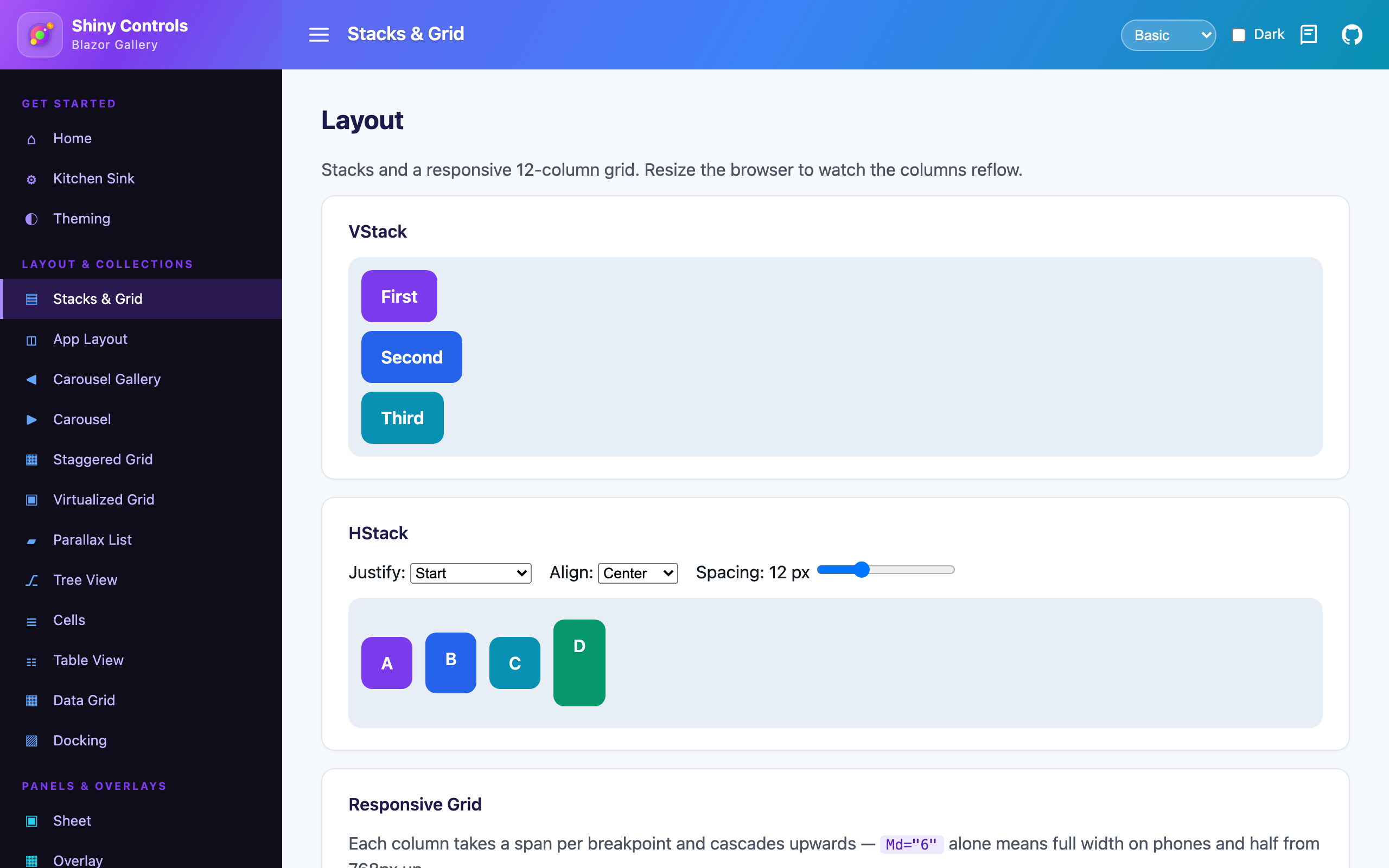
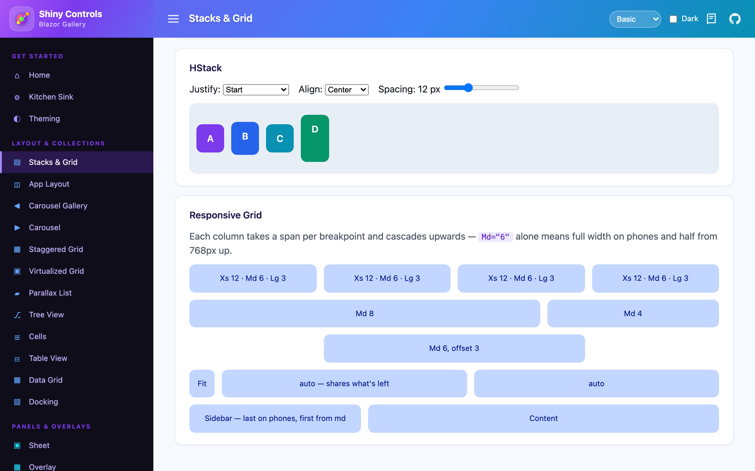
Section titled “Screenshots”| VStack & HStack | Responsive Grid |
|---|---|
 |
 |
Features
Section titled “Features”VStack/HStack– flexbox stacks with pixel spacing, alignment, wrapping and their own optional scroll region. All styling is inline, so there is no stylesheet to load or override.Grid/Row/Column– a responsive 12-column grid whose spans, offsets and visual order are all set per breakpoint.- Spans cascade upwards – a column with only
Md="6"is full width on phones and half from 768px up, the same rule you already know from Bootstrap. - Merged
class/style– passing your ownclassorstyleadds to the component’s styling instead of replacing it. - No registration – no service, no JS reference, nothing to add to
Program.cs. Everything is in the rootShiny.Blazor.Controlsnamespace.
Step 1 — Add the marketplace:
claude plugin marketplace add shinyorg/skillsStep 2 — Install the plugin:
claude plugin install shiny@shinyOne plugin installs all 37 Shiny skills. Your agent loads only the skill relevant to what you're building, so there's no cost to having them all available.
Step 1 — Add the marketplace:
copilot plugin marketplace add https://github.com/shinyorg/skillsStep 2 — Install the plugin:
copilot plugin install shiny@shinyOne plugin installs all 37 Shiny skills. Your agent loads only the skill relevant to what you're building, so there's no cost to having them all available.
VStack & HStack
Section titled “VStack & HStack”@using Shiny.Blazor.Controls
<VStack Spacing="12" Padding="16"> <h3>Profile</h3>
<HStack Spacing="8" Justify="StackJustify.SpaceBetween" Align="StackAlign.Center"> <span>Notifications</span> <input type="checkbox" @bind="notify" /> </HStack>
<HStack Spacing="8" Justify="StackJustify.End"> <ShinyButton Text="Cancel" Appearance="ButtonAppearance.Text" /> <ShinyButton Text="Save" /> </HStack></VStack>| Parameter | Type | Default | Description |
|---|---|---|---|
Spacing |
double |
0 |
Gap between children, in pixels |
Align |
StackAlign |
Stretch |
Cross axis: Start, Center, End, Stretch, Baseline |
Justify |
StackJustify |
Start |
Main axis: Start, Center, End, SpaceBetween, SpaceAround, SpaceEvenly |
Wrap |
bool |
false |
Wrap children onto additional lines |
Reverse |
bool |
false |
Lay children out in reverse order |
Grow |
bool |
false |
Fill the remaining space of a flex parent, and allow shrinking below the content |
Scrollable |
bool |
false |
Scroll the stack’s overflow along its main axis |
Padding |
string? |
null |
CSS shorthand. Bare numbers are treated as pixels – "16" is "16px", "8 16" is "8px 16px" |
Background |
string? |
null |
CSS background shorthand |
Grid, Row & Column
Section titled “Grid, Row & Column”Grid sets the column count and gutters, Row is a wrapping flex line, and each Column takes a span measured in the grid’s columns.
Breakpoints
Section titled “Breakpoints”| Parameter suffix | Applies from |
|---|---|
Xs |
below 576px |
Sm |
576px |
Md |
768px |
Lg |
992px |
Xl |
1200px |
Xxl |
1400px |
A span set at one breakpoint applies at every larger one until another span overrides it. Anything below the smallest span you set is full width.
<Grid Gutter="16" MaxWidth="1200">    <Row>        <Column Xs="12" Md="6" Lg="3">Card</Column>        <Column Xs="12" Md="6" Lg="3">Card</Column>        <Column Xs="12" Md="6" Lg="3">Card</Column>        <Column Xs="12" Md="6" Lg="3">Card</Column>    </Row>
    <Row>        @* the sidebar drops below the article on phones *@        <Column Md="4" OrderXs="2" OrderMd="1"><Sidebar /></Column>        <Column Md="8" OrderXs="1" OrderMd="2"><Article /></Column>    </Row>
<Row> <Column Fit>Icon</Column> <Column>Takes whatever is left</Column> <Column>Shares it equally</Column> </Row></Grid>| Parameter | Type | Default | Description |
|---|---|---|---|
Columns |
int |
12 |
Columns a Row is divided into |
Gutter |
double? |
null |
Sets both gutters, in pixels |
GutterX / GutterY |
double |
16 |
Horizontal / vertical spacing |
MaxWidth |
double? |
null |
Caps the width and centres the grid |
Padding |
string? |
null |
CSS padding shorthand |
Columns, Gutter, GutterX and GutterY are nullable overrides of the parent Grid. Justify and Align distribute the columns, and NoWrap keeps them all on one line. A Row works without a Grid ancestor — it falls back to 12 columns and a 16px gutter.
Column
Section titled “Column”| Parameter | Type | Description |
|---|---|---|
Xs Sm Md Lg Xl Xxl |
int? |
Span in grid columns |
OffsetXs … OffsetXxl |
int? |
Empty columns to leave on the left |
OrderXs … OrderXxl |
int? |
Visual order at that breakpoint |
Fit |
bool |
Shrink to the content instead of taking a share of the row |
Padding |
string? |
Applied inside the column’s gutter |
A Column with no span at all shares the row equally with its other span-less siblings.
Next steps
Section titled “Next steps”- AppLayout — an application shell with collapsible, resizable side panels built on top of these primitives.