


AnimatedBackground
A container that draws an animated effect behind its content: aurora, particles, snow, rain, meteors, a dot pattern with a spotlight, film grain, a starfield, fireflies, bubbles, waves or the Matrix’s digital rain. Both hosts have it, in the core packages.
You use it like a MAUI Border or an HTML div. The content sits on top and the effect is drawn behind it, so taps and clicks go straight through to the content. One Effect property picks the effect. Each effect is its own typed options object, so the properties you can set are the ones that make sense for that effect.


Screenshots
Section titled “Screenshots”MAUI (iOS)
| Playground | Gallery |
|---|---|
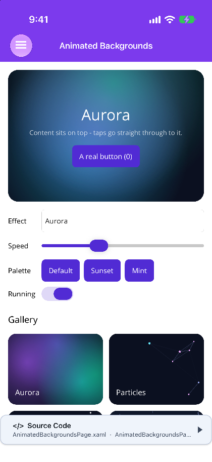 |
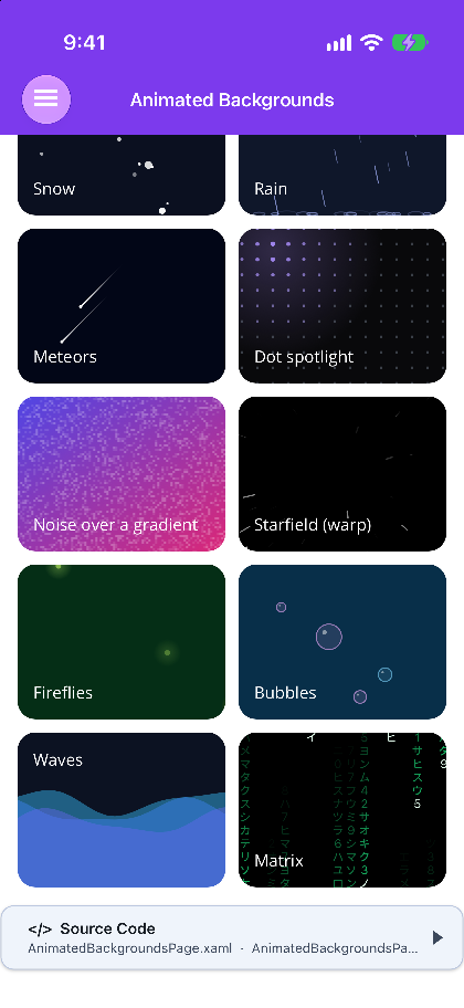 |
Blazor
| Playground | Gallery |
|---|---|
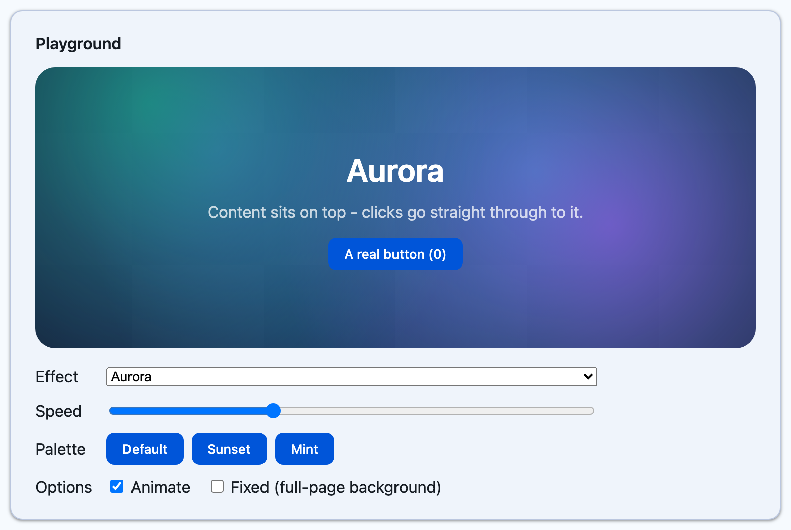 |
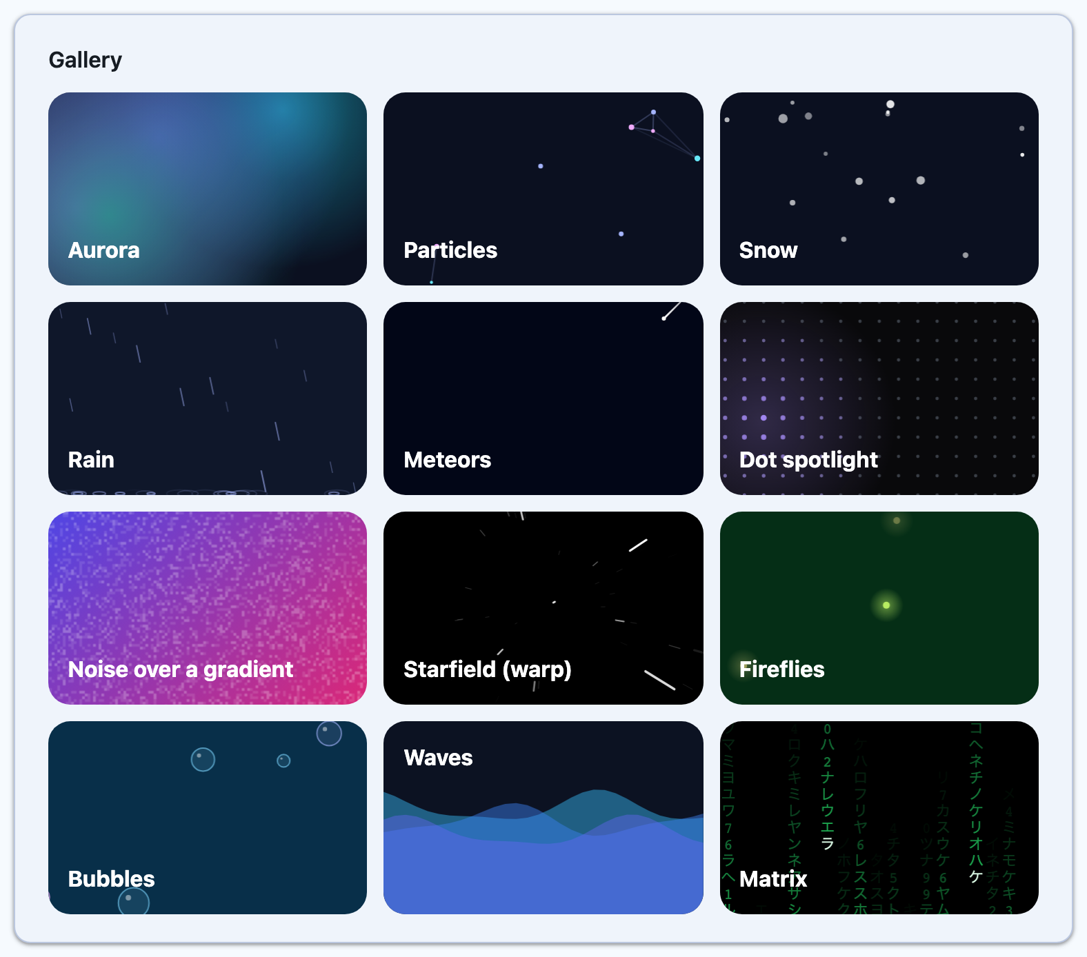 |
<ContentPage xmlns:shiny="http://shiny.net/maui/controls">
    <shiny:AnimatedBackground CornerRadius="16" Padding="24" Background="#0B1020">        <shiny:AnimatedBackground.Effect>            <shiny:SnowEffect Density="7" Wind="0.3" />        </shiny:AnimatedBackground.Effect>        <Label Text="Let it snow" TextColor="White" FontSize="24" />    </shiny:AnimatedBackground>
    <shiny:AnimatedBackground CornerRadius="16" Padding="24" Background="#020617">        <shiny:AnimatedBackground.Effect>            <shiny:AuroraEffect Colors="#22D3EE,#6366F1,#A855F7" Intensity="0.7" />        </shiny:AnimatedBackground.Effect>        <Label Text="Northern lights" TextColor="White" />    </shiny:AnimatedBackground>
<!-- a spotlight that follows the mouse, and wanders on a phone --> <shiny:AnimatedBackground HeightRequest="240" Background="#0F172A"> <shiny:AnimatedBackground.Effect> <shiny:DotPatternEffect Spotlight="Auto" SpotlightColor="#22D3EE" Pulse="True" /> </shiny:AnimatedBackground.Effect> </shiny:AnimatedBackground></ContentPage>- Layout: it is a
Layoutwith a singleContent(the content property). The content is inset byPadding. It is not aBorder, so there is noStrokeShapeorStroke. - Background: set
Backgroundfor the colour behind the effect. Most effects are made for a dark one. - Clipping: the background, the effect and the content are all clipped to
CornerRadius. - Full page: make it the page’s content.
- Colour lists in XAML: a comma-separated string, such as
Colors="#22D3EE,#6366F1". - Live changes: effect properties are bindable. Bind them or change them in code while the effect runs, and it picks up the change without restarting. One effect instance can be shared by several backgrounds (from a resource or a style), and they do not move in lock-step.
- Drawing: the effect is drawn on a
GraphicsViewunder the content, so it looks the same on iOS, Android, Mac Catalyst, macOS (AppKit), Windows and Linux (GTK4). - Timing: frames come from the window’s shared frame ticker, the same one that Marquee, Border Animations and Motion Icons use. It runs only while the control is loaded.
- Pointer: on the desktop heads (Windows, Mac Catalyst, macOS, Linux) the DotPattern spotlight and the Particles repel/attract follow the mouse, trackpad or pen through hover (
PointerGestureRecognizer). iOS and Android do not track the pointer at all: a phone has no hover, and on Android the recognizer claimed the press, so aButtonin the content never got its tap. On a phone,SpotlightMode.Autowanders, andPointermode shows no spotlight. The content’s own gestures always work.
Blazor
Section titled “Blazor”<AnimatedBackground Effect="snow" Background="#0b1020" CornerRadius="16" Style="padding:24px"> <h2>Let it snow</h2></AnimatedBackground>
<AnimatedBackground Effect="aurora" Background="#020617" CornerRadius="16" Style="padding:24px"> <h2>Northern lights</h2></AnimatedBackground>
@* a full-page background that stays put while the page scrolls over it *@<AnimatedBackground Effect="stars" Fixed="true" Background="#000"> @Body</AnimatedBackground>
@code { readonly SnowEffect snow = new() { Density = 7, Wind = 0.3 }; readonly AuroraEffect aurora = new() { Colors = ["#22d3ee", "#6366f1", "#a855f7"], Intensity = 0.7 }; readonly StarfieldEffect stars = new() { Warp = true };}- Background:
Backgroundis any CSS background, a colour or a gradient. - Styling: set padding, size and shadow through
StyleorClass. Other attributes are passed through to the rootdiv. - Colours: every colour is a CSS string. Colour lists are
IReadOnlyList<string>, such asColors = ["#22d3ee", "#6366f1"]. - Live changes: change a property on the same effect instance and re-render, and it takes effect. The component compares the settings, not the object reference, and sends nothing when nothing changed.
Fixed="true"(Blazor only) pins the effect to the viewport, behind the page, instead of to the block. Use it for a full-page background.- Drawing: a
<canvas>drawn by a script withrequestAnimationFrame. Nothing round-trips through .NET per frame. - When it pauses: while scrolled out of view (
IntersectionObserver) and while the tab is hidden, so a long page of backgrounds runs only the ones you can see. - Pointer: tracked on the window, so content on top of the effect still moves the spotlight or the particles. Touch clears it when the finger lifts.
Density and speed
Section titled “Density and speed”Densityis a count per 100×100 area, so a bigger box gets more snowflakes, stars or particles, and a phone and a desktop look equally full.Speedis on every effect. It is a multiplier of the effect’s natural pace. Default 1, and 0 holds it still.
Host properties
Section titled “Host properties”| Property | Default | Notes |
|---|---|---|
Effect |
null | The effect drawn behind the content. Null draws only the background |
Content (MAUI) / ChildContent (Blazor) |
null | What sits on top of the effect |
Background |
none | The colour behind the effect. MAUI: a Brush. Blazor: a CSS background string |
CornerRadius |
0 | Clips the background, effect and content to rounded corners |
Padding (MAUI) |
0 | Insets the content. On Blazor, use Style |
IsRunning |
true | False holds the effect where it is |
RespectReducedMotion |
true | Holds a still frame when the OS or browser asks for reduced motion. The background never goes blank |
Fixed (Blazor) |
false | Pins the effect to the viewport as a full-page background |
Class / Style (Blazor) |
none | Added to the root div |
Effects
Section titled “Effects”Every effect also has Speed (default 1). Colours below are the defaults. On MAUI they are Color values, and on Blazor CSS strings.
AuroraEffect
Section titled “AuroraEffect”Soft, glowing washes of colour drifting slowly over one another, like the northern lights. One glow per colour.
| Property | Default | Notes |
|---|---|---|
Colors |
#22D3EE, #6366F1, #A855F7, #10B981 |
One glow per colour |
Intensity |
0.6 | How strong the glows are at their centres, 0 to 1 |
Size |
0.65 | How big each glow is, as a fraction of the box’s longer side |
ParticlesEffect
Section titled “ParticlesEffect”Drifting particles joined by faint lines when they come close: the “constellation” or network background. The pointer can push them away or pull them in.
| Property | Default | Notes |
|---|---|---|
Colors |
#A5B4FC, #F0ABFC, #67E8F9 |
Particles pick from these |
Density |
2.5 | Per 100×100 area, at most 400 in all |
MinSize / MaxSize |
1 / 2.5 | Particle radius range |
LinkDistance |
110 | How close two particles must be to be joined. 0 draws no lines |
LinkColor |
unset | The colour of the lines. Unset uses the first of Colors |
LinkOpacity |
0.35 | The strength of a line between two touching particles. It fades with distance |
PointerMode |
Repel |
None, Repel or Attract (ParticlePointerMode) |
PointerRadius |
120 | How far from the pointer particles feel it |
SnowEffect
Section titled “SnowEffect”Snowflakes drifting down. The larger ones are nearer and faster, and they sway as they fall.
| Property | Default | Notes |
|---|---|---|
Color |
#FFFFFF |
|
Density |
5 | Per 100×100 area |
MinSize / MaxSize |
1 / 3.5 | Flake radius range |
Wind |
0 | A steady sideways push, about -1 (left) to 1 (right) |
Sway |
1 | How far flakes rock side to side. 0 falls straight |
RainEffect
Section titled “RainEffect”Slanted streaks of rain. Nearer drops are longer and brighter, and they splash where they land.
| Property | Default | Notes |
|---|---|---|
Color |
#A5B4FC |
|
Density |
8 | Per 100×100 area |
Angle |
12 | Lean from vertical in degrees. Positive falls to the right |
Length |
18 | Length of the nearest drops |
Thickness |
1 | |
Splash |
true | Splashes at the bottom edge |
MeteorsEffect
Section titled “MeteorsEffect”A meteor shower: bright heads with fading tails streaking across at an angle, each after a random pause.
| Property | Default | Notes |
|---|---|---|
Color |
#FFFFFF |
The head. The tail fades from it to transparent |
Density |
0.25 | Per 100×100 area. Most are waiting their turn |
Angle |
135 | Direction of travel in degrees, clockwise from pointing right. 90 is straight down, 135 is down and to the left |
Length |
90 | Tail length |
Thickness |
1.5 | Thickness at the head end of the tail |
MaxDelay |
5s | The longest a meteor waits before it streaks again. A TimeSpan ("0:0:5" in XAML) |
DotPatternEffect
Section titled “DotPatternEffect”A grid of dots, lit up and enlarged under a soft spotlight that follows the pointer or wanders on its own, with an optional ripple of light running through the grid.
| Property | Default | Notes |
|---|---|---|
Color |
#94A3B8 |
Slate grey, which reads on light and dark |
Spacing |
18 | Distance between neighbouring dots |
DotSize |
1.2 | Dot radius |
DotOpacity |
0.35 | How visible the dots are away from the spotlight |
Spotlight |
Auto |
None, Pointer (goes out when the pointer leaves), Wander or Auto (follows the pointer, wanders otherwise) (SpotlightMode) |
SpotlightColor |
unset | Colour of lit dots and the glow. Unset uses Color |
SpotlightRadius |
140 | How far the spotlight reaches |
Glow |
0.12 | Strength of the soft glow under the spotlight, 0 to 1 |
Pulse |
false | Runs a slow diagonal ripple of light through the grid |
NoiseEffect
Section titled “NoiseEffect”Flickering film grain. On its own it is TV static. At a low Intensity over a gradient it adds the subtle texture that stops flat colour looking digital.
| Property | Default | Notes |
|---|---|---|
Color |
#FFFFFF |
Black suits a light background |
Intensity |
0.15 | How visible the grain is, 0 to 1 |
GrainSize |
2 | Speck size |
Coverage |
0.3 | Fraction of the area covered in specks, 0 to 1 |
FrameRate |
12 | How many times a second the grain changes, scaled by Speed |
StarfieldEffect
Section titled “StarfieldEffect”A night sky: stars twinkling and drifting slowly. With Warp, they streak out from the centre as if you were flying through them.
| Property | Default | Notes |
|---|---|---|
Color |
#FFFFFF |
|
Density |
6 | Per 100×100 area |
MaxSize |
1.6 | Radius of the brightest stars |
Warp |
false | Flies through the stars instead of watching them |
Twinkle |
true |
FirefliesEffect
Section titled “FirefliesEffect”Glowing specks wandering lazily and pulsing in and out, like fireflies at dusk.
| Property | Default | Notes |
|---|---|---|
Colors |
#FDE68A, #FACC15, #BEF264 |
Fireflies pick from these |
Density |
0.5 | Per 100×100 area |
Size |
2.5 | Radius of each bright core |
Glow |
5 | How far the glow spreads, as a multiple of Size. 0 for no glow |
BubblesEffect
Section titled “BubblesEffect”Translucent bubbles rising and wobbling, each with a little highlight.
| Property | Default | Notes |
|---|---|---|
Colors |
#7DD3FC, #A5B4FC, #F0ABFC |
Bubbles pick from these |
Density |
0.6 | Per 100×100 area |
MinSize / MaxSize |
4 / 18 | Bubble radius range |
WavesEffect
Section titled “WavesEffect”Layered, translucent waves rolling across the bottom of the box, one layer per colour.
| Property | Default | Notes |
|---|---|---|
Colors |
#38BDF8, #3B82F6, #6366F1 |
One wave per colour, back to front |
Opacity |
0.45 | Opacity of each layer, so the ones behind show through |
Amplitude |
18 | Wave height |
Wavelength |
320 | Distance from one crest to the next |
Level |
0.65 | Where the back wave’s surface sits, as a fraction of the height from the top |
MatrixEffect
Section titled “MatrixEffect”Columns of glyphs raining down, bright at the head and fading behind: the digital rain.
| Property | Default | Notes |
|---|---|---|
Color |
#22C55E |
The trail |
HeadColor |
#DCFCE7 |
The leading glyph in each column |
FontSize |
14 | Glyph size, which also sets the column width |
Characters |
half-width katakana and digits | The glyphs to rain |
TrailLength |
16 | How many glyphs fade out behind each head |
Platform notes
Section titled “Platform notes”- Reduced motion: with
RespectReducedMotionon (the default), the OS setting on MAUI andprefers-reduced-motion: reduceon Blazor hold a still frame. The pointer still moves the spotlight on a still background. - MAUI pointer input: hover comes from
PointerGestureRecognizer, so pointer-following needs a mouse, trackpad or pen. On a touch screen useSpotlightMode.AutoorWander. - Blazor
Fixed: the block stops clipping so the fixed canvas can cover the viewport.CornerRadiusthen rounds only the block’s own background.