


Modal
ModalView is a modal window: a titled panel over a backdrop that owns the screen until it is dismissed. Every region is optional and replaceable — the header, the close button, the body and the footer — and what it does not leave to you is the modal contract itself: focus moves in and is trapped, the page behind stops scrolling, Escape and the backdrop dismiss, focus goes back where it came from.

Screenshots
Section titled “Screenshots”Blazor
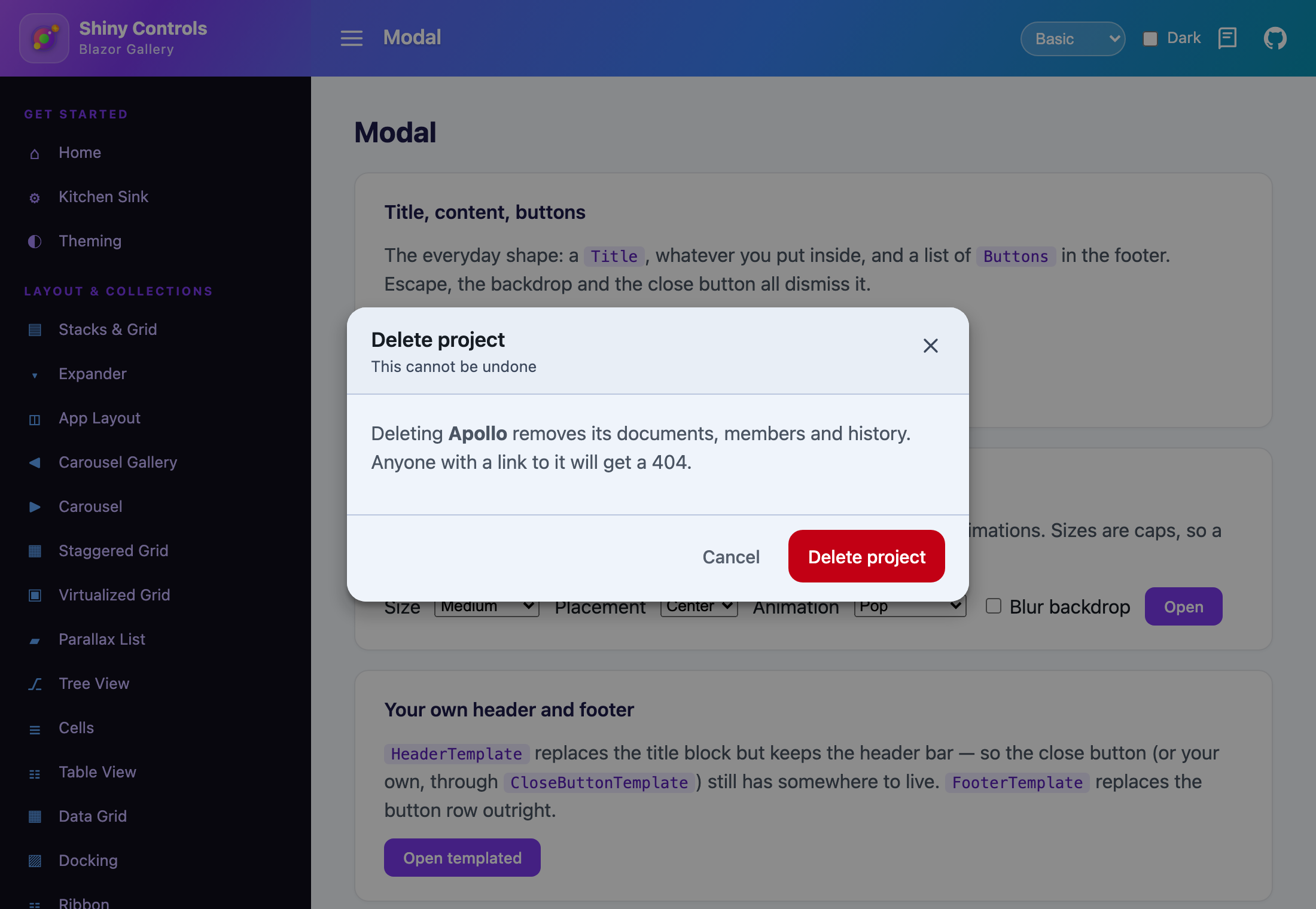
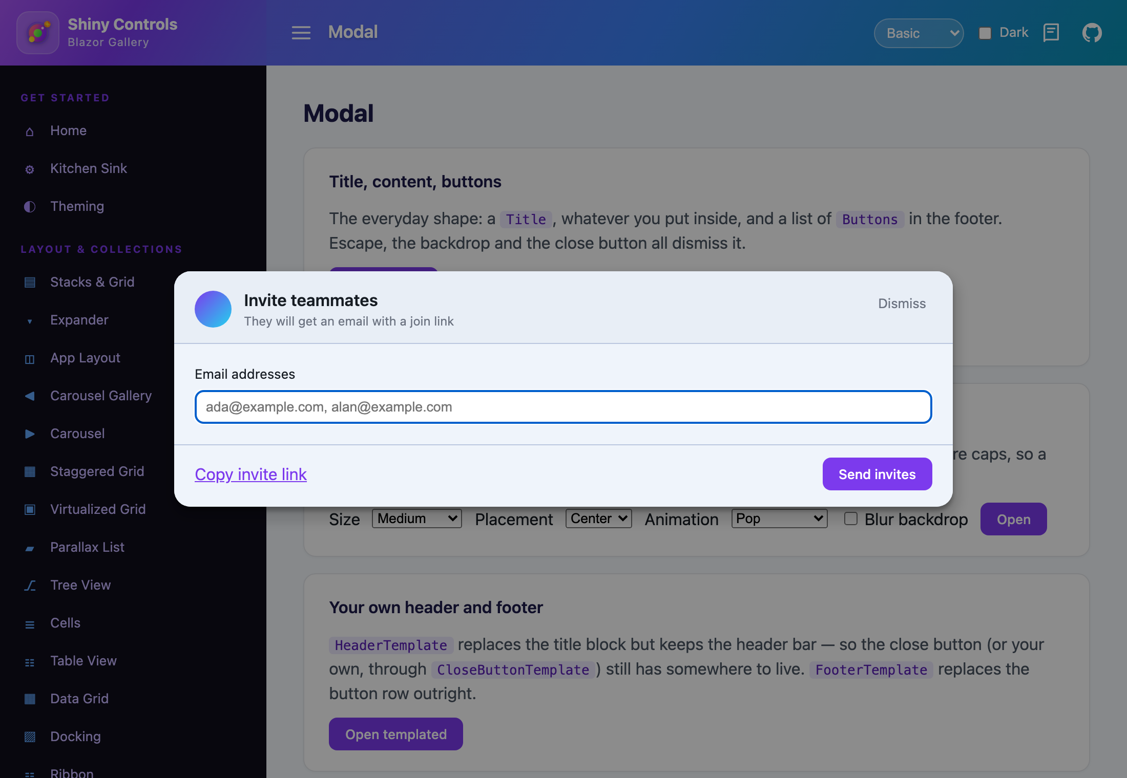
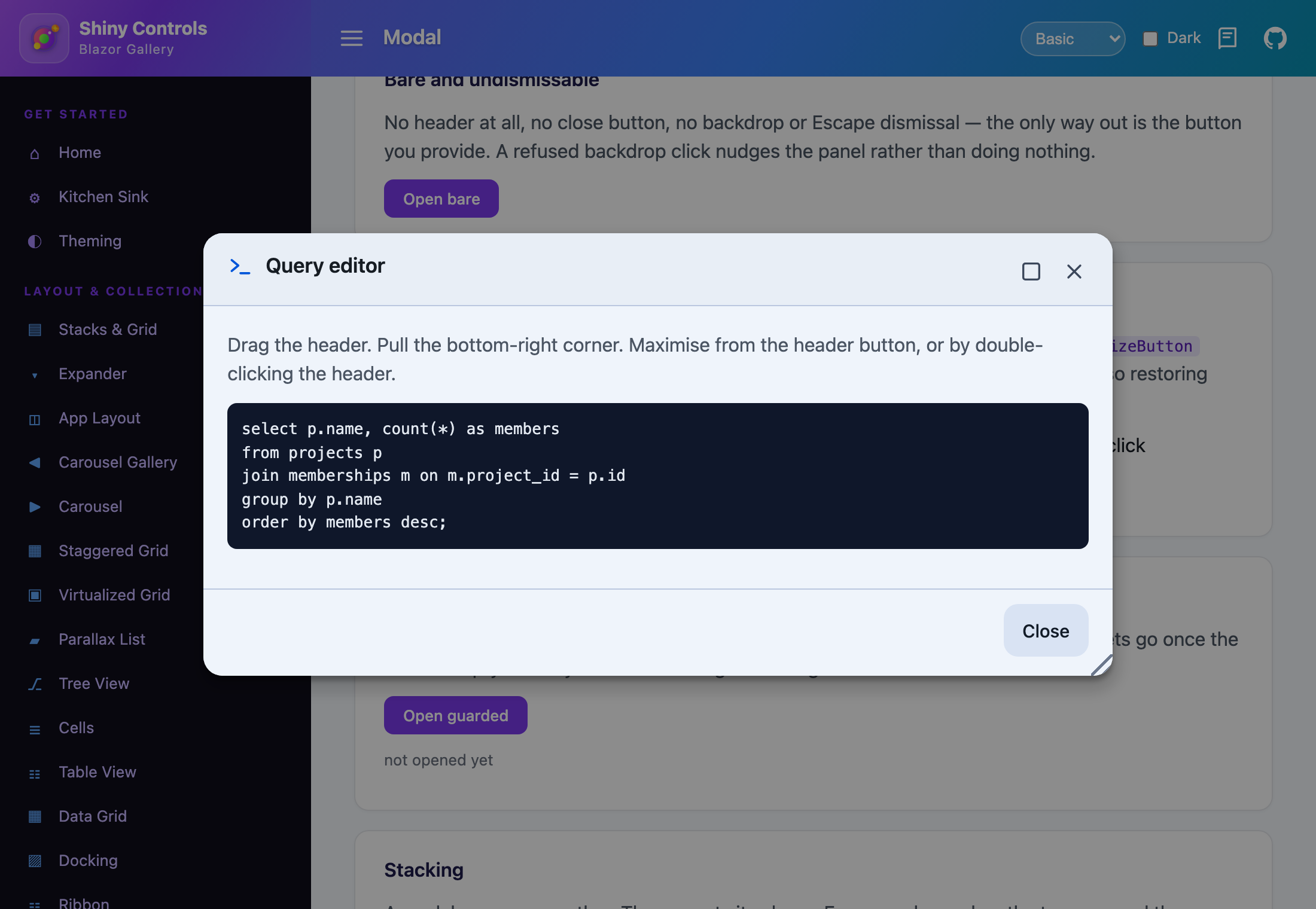
| Title, content, buttons | Your own header and footer | A window, not a card |
|---|---|---|
 |
 |
 |
Features
Section titled “Features”| Feature | Description |
|---|---|
| Configurable header | a Title (plus Subtitle and Icon), your own HeaderTemplate, or no header at all |
| Configurable close button | the built-in ✕, your own CloseButtonTemplate, or none |
| Content template | anything you like, scrolling in the body while the header and footer stay pinned, with ContentMaxHeight to say where that scrolling starts |
| Configurable footer | a list of ModalButton rendered as themed ShinyButtons, or a FooterTemplate |
| Events | Opened, cancellable Closing, and Closed carrying what dismissed it |
| A window when you want one | drag by the header, resize from a corner grip, maximise and restore |
| Sizes, placement, motion | five sizes, three placements, six animations, a blurrable backdrop |
| Accessible by default | focus trap, focus restore, scroll lock, role="dialog" aria-modal="true" |
| Stacks | a modal can open another; only the topmost answers Escape |
No DI registration and no host component — ModalView renders where you put it.
@* _Imports.razor *@@using Shiny.Blazor.Controls<button @onclick="() => showEdit = true">Edit customer</button>
<ModalView @bind-IsOpen="showEdit" Title="Edit customer" Subtitle="Changes apply immediately" Size="ModalSize.Large" Buttons="@buttons" Closing="OnClosing" Closed="@(reason => status = $"closed by {reason}")"> <EditForm Model="customer"> <InputText @bind-Value="customer.Name" data-shiny-autofocus /> </EditForm></ModalView>
@code { bool showEdit; string? status;
// A field, not an expression: a ModalButton carries state (State, Disabled) that a list rebuilt // on every render would throw away. readonly List<ModalButton> buttons = [];
protected override void OnInitialized() => this.buttons.AddRange( [ new("Cancel") { Type = ButtonType.Secondary, Appearance = ButtonAppearance.Text }, new("Save") { ClosesModal = false, OnClick = SaveAsync } ]);
async Task SaveAsync() { var save = this.buttons[1]; save.State = ButtonState.Busy; // the modal stays up while the work runs StateHasChanged();
await this.api.SaveAsync(this.customer);
save.State = ButtonState.Normal; this.showEdit = false; }
// The dirty-form veto. Every dismissal route goes through it. void OnClosing(ModalClosingEventArgs e) => e.Cancel = this.customer.IsDirty && e.Reason != ModalCloseReason.Button;}From code
Section titled “From code”<ModalView @ref="modal" Title="Pick a date">…</ModalView>
@code { ModalView? modal;
async Task Run() { await this.modal!.ShowAsync();
// false when Closing vetoed it, or it was already closed var closed = await this.modal.CloseAsync();
await this.modal.ToggleAsync(); await this.modal.SetMaximizedAsync(true); }}The three regions
Section titled “The three regions”Each one has a built-in form, a template that replaces it, and an off switch.
| Region | Built in | Yours | Off |
|---|---|---|---|
| Header | Title, Subtitle, Icon |
HeaderTemplate — replaces the title block but keeps the bar, so the close button still has a home |
ShowHeader="false" |
| Close | the ✕ button | CloseButtonTemplate — already wired, no handler needed |
ShowCloseButton="false" |
| Footer | Buttons |
FooterTemplate — wins over Buttons |
set neither |
<ModalView @bind-IsOpen="open" AriaLabel="Invite teammates"> <HeaderTemplate> <div class="invite-header"> <Avatar Url="@user.Avatar" /> <div>Invite teammates</div> </div> </HeaderTemplate> <CloseButtonTemplate> <span class="link">Dismiss</span> </CloseButtonTemplate> <ChildContent> <input data-shiny-autofocus placeholder="ada@example.com" /> </ChildContent> <FooterTemplate> <a href="#">Copy invite link</a> <button @onclick="Send">Send invites</button> </FooterTemplate></ModalView>Events
Section titled “Events”| Event | Type | When |
|---|---|---|
Opened |
EventCallback |
The panel is up and focus is inside it |
Closing |
EventCallback<ModalClosingEventArgs> |
Before anything unwinds. Set Cancel to keep it open |
Closed |
EventCallback<ModalCloseReason> |
After it has left the screen |
IsOpenChanged |
EventCallback<bool> |
Two-way binding hook |
ModalCloseReason is CloseButton, Backdrop, Escape, Button (a footer button with ClosesModal) or Programmatic.
Buttons
Section titled “Buttons”new ModalButton("Delete project"){ Type = ButtonType.Critical, // Primary/Secondary/Success/Warning/Critical/Info Appearance = ButtonAppearance.Filled, // Filled/Tonal/Outlined/Text/Elevated Icon = "<svg …>", // inline SVG, before the text Disabled = false, State = ButtonState.Normal, // flip to Busy from OnClick ClosesModal = true, // false keeps the modal up while work runs OnClick = DeleteAsync, // awaited before the close Tag = project // whatever a shared handler needs back}OnClick is awaited before the close runs, so “save then close” needs no IsOpen juggling. Mutating a button in place needs a StateHasChanged unless the handler that changed it is the one returning.
Sizing, placement and motion
Section titled “Sizing, placement and motion”| Parameter | Type | Default | Notes |
|---|---|---|---|
Size |
ModalSize |
Medium |
Small 360 · Medium 520 · Large 760 · ExtraLarge 1080 · Full. Caps, not fixed widths, so a phone still gets a full-width panel |
Placement |
ModalPlacement |
Center |
Center, Top, Bottom |
Width / Height / MaxWidth / MaxHeight |
string? |
— | CSS. Width beats Size. MaxHeight caps the whole panel; unset, that is the viewport less the layer’s gutter |
ContentMaxHeight |
string? |
— | CSS. Caps the scrolling region rather than the panel — see below |
ScrollBody |
bool |
true |
Body scrolls, header and footer stay pinned |
Animation |
ModalAnimation |
Pop |
None, Fade, Zoom, Pop, SlideTop, SlideBottom |
AnimationDuration |
int |
200 |
Milliseconds |
ShowBackdrop / BackdropOpacity / BlurBackdrop |
bool / double / bool |
true / 0.45 / false |
With no backdrop the click surface stays, invisible |
CornerRadius / Background / ContentPadding / CssClass |
string? |
— | CSS; bare numbers in padding are read as pixels |
Long content, and the footer that has to survive it
Section titled “Long content, and the footer that has to survive it”The panel is a column of header, body and footer in which only the body gives. ScrollBody — on by default — scrolls that body and leaves the header and footer exactly where they are, which is what keeps the buttons that answer the modal reachable however long the content runs.
There are two ways to say where the scrolling should start.
{/* Cap the panel: the body gets whatever is left after the header and footer take theirs. */}<ModalView @bind-IsOpen="open" Title="Terms" MaxHeight="70vh" Buttons="@buttons">    @* ... *@</ModalView>
{/* Cap the content: the panel shrink-wraps up to 320px of body and scrolls past it. */}<ModalView @bind-IsOpen="open" Title="Terms" ContentMaxHeight="320px" Buttons="@buttons">    @* ... *@</ModalView>
MaxHeight caps the whole panel, so the body ends up with that height less the chrome’s. ContentMaxHeight caps the scrolling region itself: a short modal stays short and only starts scrolling at the cap, with no arithmetic over the header and footer to arrive at a panel height. Unset, the panel’s cap is the viewport less the layer’s gutter, which is why a long modal already scrolls without either being set.
A ContentMaxHeight scrolls whatever ScrollBody says, because a capped region that does not scroll only hides the rest.
ScrollBody="false" is the opposite trade: the panel is free to outgrow the viewport and the layer scrolls behind it, taking the header and footer with it. Use it when the content is the thing being read and the chrome is not needed on screen throughout — otherwise leave it on.
Window behaviour
Section titled “Window behaviour”<ModalView @bind-IsOpen="open" Title="Query editor" Draggable="true" Resizable="true" ShowMaximizeButton="true" MaximizeOnHeaderDoubleClick="true" @bind-IsMaximized="maximized"> …</ModalView>| Parameter | Default | Notes |
|---|---|---|
Draggable |
false |
Move by the header. Header buttons are excluded from the drag surface, so grabbing near one still presses it |
Resizable |
false |
Bottom-right grip |
AllowMaximize |
false |
The capability on its own — a window that maximises on double-click but carries no button |
ShowMaximizeButton |
false |
The header button. Implies AllowMaximize |
MaximizeOnHeaderDoubleClick |
true |
Only acts when maximising is allowed, so it costs nothing to leave on |
IsMaximized |
false |
Two-way bindable |
Maximising drops any drag offset and resized size, so restoring lands where the stylesheet says rather than wherever the panel happened to be.
Dismissal
Section titled “Dismissal”| Parameter | Default | Notes |
|---|---|---|
CloseOnBackdropClick |
true |
|
CloseOnEscape |
true |
Only the topmost modal answers |
NudgeOnBlockedDismiss |
true |
A refused dismissal shoves the panel, so it reads as “no” rather than as a dead click — a backdrop click that does not close, and any route Closing cancels |
An undismissable modal — the only way out is a button you provide:
<ModalView @bind-IsOpen="open" ShowHeader="false" ShowCloseButton="false" CloseOnBackdropClick="false" CloseOnEscape="false" AriaLabel="Finish setup" Buttons="@[new ModalButton("Get started")]"> …</ModalView>Accessibility
Section titled “Accessibility”| Parameter | Default | Notes |
|---|---|---|
AutoFocus |
true |
Focuses the first focusable element, or whatever carries data-shiny-autofocus |
TrapFocus |
true |
Tab stays inside the panel |
RestoreFocus |
true |
Focus returns to whatever had it when the modal opened |
LockScroll |
true |
The page behind stops scrolling, and the scrollbar’s width is replaced with padding so the layout does not lurch sideways |
AriaLabel / AriaDescribedBy |
— | The panel is labelled by its own Title when it has one |
Stacking
Section titled “Stacking”A modal can open another. The newest sits on top, Escape reaches only the topmost, and the page’s scrollbar comes back only when the last one closes.
<ModalView @bind-IsOpen="settingsOpen" Title="Settings">    <button @onclick="() => confirmOpen = true">Reset everything…</button></ModalView>
<ModalView @bind-IsOpen="confirmOpen" Title="Are you sure?" Size="ModalSize.Small"> …</ModalView>Step 1 — Add the marketplace:
claude plugin marketplace add shinyorg/skillsStep 2 — Install the plugin:
claude plugin install shiny@shinyOne plugin installs all 48 Shiny skills. Your agent loads only the skill relevant to what you're building, so there's no cost to having them all available.
Step 1 — Add the marketplace:
copilot plugin marketplace add https://github.com/shinyorg/skillsStep 2 — Install the plugin:
copilot plugin install shiny@shinyOne plugin installs all 48 Shiny skills. Your agent loads only the skill relevant to what you're building, so there's no cost to having them all available.