Document DB v12 - Improved Interceptors with Soft Delete Integration, AI protections, & More! How!?
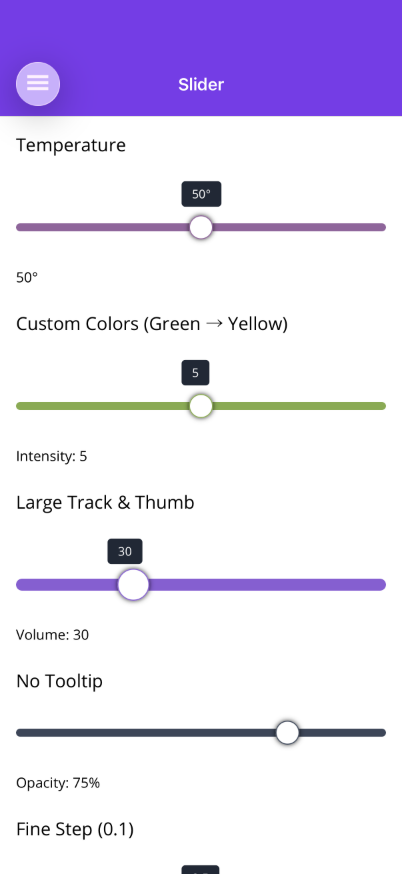
Slider
A slider control with a left-to-right gradient track that blends from a cold color to a hot color. The thumb border color samples the gradient at the current position, and a tooltip floats above showing the current value.


Frameworks
.NET MAUI
Blazor
Features
Section titled “Features”- Two-Color Gradient Track — Full track displays a linear gradient from
ColdColor(left) toHotColor(right). - Blended Fill — The filled portion of the track blends the two colors up to the current thumb position.
- Blended Thumb Border — The thumb’s border color matches the gradient color at the current position, providing a visual cue of the value.
- Value Tooltip — A configurable tooltip badge floats above the thumb displaying the formatted current value with a pointer arrow.
- Custom Tooltip Template — Replace the default badge with a
DataTemplate(MAUI) orRenderFragment<double>(Blazor) for fully custom tooltip rendering. - Step Snapping — Values snap to the configured
Stepincrement. - Drag & Tap — Supports both drag (pan gesture / pointer drag) and tap-to-jump interaction.
AI Skill
Section titled “AI Skill”Step 1 — Add the marketplace:
claude plugin marketplace add shinyorg/skills Step 2 — Install plugins:
claude plugin install shiny-client@shiny claude plugin install shiny-maui@shiny claude plugin install controls@shiny claude plugin install shiny-mediator@shiny claude plugin install shiny-data@shiny claude plugin install shiny-aspire@shiny claude plugin install shiny-extensions@shiny Step 1 — Add the marketplace:
copilot plugin marketplace add https://github.com/shinyorg/skills Step 2 — Install plugins:
copilot plugin install shiny-client@shiny copilot plugin install shiny-maui@shiny copilot plugin install controls@shiny copilot plugin install shiny-mediator@shiny copilot plugin install shiny-data@shiny copilot plugin install shiny-aspire@shiny copilot plugin install shiny-extensions@shiny Quick Start
Section titled “Quick Start”.NET MAUI
Section titled “.NET MAUI”<shiny:Slider Value="{Binding Temperature}" Minimum="0" Maximum="100" ColdColor="#3B82F6" HotColor="#EF4444" ValueFormat="0°" />Blazor
Section titled “Blazor”<Slider @bind-Value="temperature" Minimum="0" Maximum="100" ColdColor="#3B82F6" HotColor="#EF4444" ValueFormat="0°" />
@code { double temperature = 50;}Properties
Section titled “Properties”| Property | MAUI Type | Blazor Type | Default | Description |
|---|---|---|---|---|
| Value | double | double | 0 | Current value (TwoWay) |
| Minimum | double | double | 0 | Minimum value |
| Maximum | double | double | 100 | Maximum value |
| Step | double | double | 1 | Snap increment |
| ColdColor | Color | string | #3B82F6 | Left (cold) gradient color |
| HotColor | Color | string | #EF4444 | Right (hot) gradient color |
| TrackHeight | double | double | 8 | Track height in px |
| ThumbSize | double | double | 24 | Thumb diameter in px |
| ThumbColor | Color | string | White | Thumb fill color |
| ThumbBorderWidth | double | double | 2 | Thumb border width |
| ShowTooltip | bool | bool | true | Show/hide the value tooltip |
| TooltipBackgroundColor | Color | string | #1F2937 | Tooltip badge background |
| TooltipTextColor | Color | string | White | Tooltip text color |
| TooltipFontSize | double | double | 12 | Tooltip font size |
| ValueFormat | string? | string? | null | .NET format string for display |
| TooltipTemplate | DataTemplate? | RenderFragment<double>? | null | Custom tooltip content |
| IsEnabled | — | bool | true | Enable/disable (Blazor only; MAUI uses IsEnabled from VisualElement) |
Events & Commands
Section titled “Events & Commands”MAUI:
ValueChangedEvent(EventHandler<double>) — Fired when value changesValueChangedCommand(ICommand) — Command fired on value change
Blazor:
ValueChanged(EventCallback<double>) — Two-way binding callback
Custom Tooltip Template
Section titled “Custom Tooltip Template”<shiny:Slider Value="{Binding Temp}" Minimum="0" Maximum="100"> <shiny:Slider.TooltipTemplate> <DataTemplate> <Border BackgroundColor="#7C3AED" StrokeShape="{RoundRectangle CornerRadius=8}" Padding="8,4"> <Label Text="{Binding StringFormat='{0:0}°F'}" TextColor="White" FontSize="14" /> </Border> </DataTemplate> </shiny:Slider.TooltipTemplate></shiny:Slider>Blazor
Section titled “Blazor”<Slider @bind-Value="temp" Minimum="0" Maximum="100"> <TooltipTemplate Context="val"> <div style="background: #7C3AED; color: white; padding: 4px 12px; border-radius: 8px;"> @val.ToString("0")°F </div> </TooltipTemplate></Slider>Behavior
Section titled “Behavior”- The track always displays the full gradient from
ColdColortoHotColor - The fill portion renders a gradient from
ColdColorto the blended color at the current position - The thumb border takes the blended color, giving immediate visual feedback
- Values are clamped between
MinimumandMaximumand snapped toStep - Setting
ShowTooltip="False"hides the tooltip for a minimal appearance