


NavigationPage
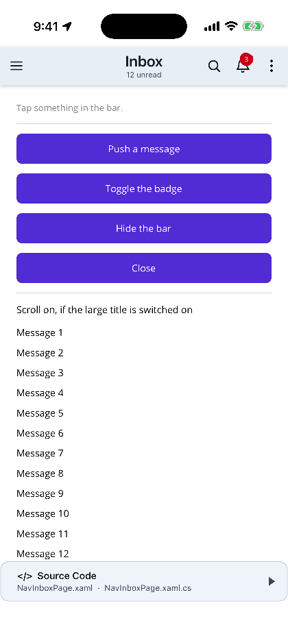
ShinyNavigationPage is a NavigationPage. PushAsync, PopAsync, PopToRootAsync,
InsertPageBefore, RemovePage, the modal stack, page lifecycle, Android’s hardware back button and
Pushed/Popped/PoppedToRoot all still work, unchanged. What it adds is a bar with items on the
left as well as the right.

MAUI
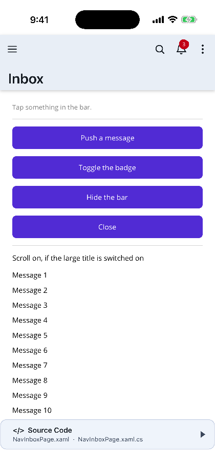
| Left and right items | A collapsing large title |
|---|---|
 |
 |
Why the bar is drawn
Section titled “Why the bar is drawn”No platform’s native navigation bar has a left slot to give you. It belongs to the back button on
iOS, on Android and in WinUI alike — and on macOS AppKit (net10.0-macos) and Linux GTK4 there is no
navigation bar at all.
So the native bar is hidden and ShinyNavBar draws its own. Nothing in it touches a platform SDK,
which is also what makes the overflow menu, the badges, the motion icons and the collapsing large
title render identically on every MAUI head.
Getting started
Section titled “Getting started”<shiny:ShinyNavigationPage xmlns="http://schemas.microsoft.com/dotnet/2021/maui" xmlns:x="http://schemas.microsoft.com/winfx/2009/xaml" xmlns:shiny="http://shiny.net/maui/controls" xmlns:local="clr-namespace:MyApp" x:Class="MyApp.MainNav" LargeTitleDisplay="Collapsing"> <x:Arguments> <local:InboxPage /> </x:Arguments></shiny:ShinyNavigationPage>Or wherever a NavigationPage went before:
Application.Current.Windows[0].Page = new ShinyNavigationPage(new InboxPage());Then declare the items on the page, the way ToolbarItems already are:
<ContentPage xmlns:shiny="http://shiny.net/maui/controls"             Title="Inbox"             shiny:ShinyNav.Subtitle="12 unread">
    <shiny:ShinyNav.LeftItems>        <shiny:NavBarItem Icon="menu" Command="{Binding OpenDrawerCommand}" />    </shiny:ShinyNav.LeftItems>
    <shiny:ShinyNav.RightItems>        <shiny:NavBarItem Icon="search" Command="{Binding SearchCommand}" />        <shiny:NavBarItem Icon="bell" Badge="3" Command="{Binding AlertsCommand}" />        <shiny:NavBarItem Text="Mark all read" Order="Secondary" Command="{Binding MarkAllCommand}" />    </shiny:ShinyNav.RightItems>
    <!-- page content --></ContentPage>
See Items & Overflow for the full item model.
What MAUI already gives you, honoured as-is
Section titled “What MAUI already gives you, honoured as-is”Nothing here is reinvented. The bar reads it straight off the page:
| MAUI API | Effect |
|---|---|
Page.Title |
the bar’s title |
Page.ToolbarItems |
drawn on the right, ahead of ShinyNav.RightItems |
NavigationPage.SetHasBackButton(page, false) |
hides the back affordance |
NavigationPage.SetBackButtonTitle(page, "Inbox") |
labels it |
NavigationPage.SetTitleView(page, view) |
replaces the title outright |
NavigationPage.SetTitleIconImageSource(page, src) |
artwork before the title |
NavigationPage.SetIconColor(page, color) |
tints the chevron and the item artwork |
BarBackground / BarBackgroundColor / BarTextColor |
on the navigation page, as always |
A page’s existing toolbar therefore keeps working the moment you swap the host, with nothing rewritten.
Large & collapsing titles
Section titled “Large & collapsing titles”LargeTitleDisplay is Inherit, None, Always or Collapsing.
<shiny:ShinyNavigationPage LargeTitleDisplay="Collapsing" />Collapsing gives the iOS behaviour: an oversized title beneath the bar row at rest, folding into
the inline title as the page scrolls. It follows the first ScrollView or ItemsView it finds in
the page’s content; name a different one when a page has more than one:
<ContentPage shiny:ShinyNav.ScrollSource="{x:Reference TheList}" />Inherit is the value that makes per-page overrides work. On the navigation page (and on the bar
itself) there is nothing above to ask, so it means None; on a page it means “whatever the
navigation page said” — which is what lets one page turn the large title off against a navigation
page that turned it on:
<ContentPage shiny:ShinyNav.LargeTitleDisplay="None" />Tune it with LargeTitleHeight (52), LargeTitleCollapseDistance (48) and LargeTitleFontSize.
ShinyNavBar.CollapseProgress runs 0 → 1 and is bindable, so a header image can be parallaxed off
the same value.
Intercepting back
Section titled “Intercepting back”<ContentPage shiny:ShinyNav.BackButtonCommand="{Binding ConfirmLeaveCommand}" />Nothing is popped for you — call Navigation.PopAsync() when the user confirms. Alternatively
handle ShinyNavBar.BackButtonPressed and set e.Cancel = true. With neither, the bar pops.
ShinyNav.BackButtonIcon swaps the chevron for any built-in motion icon —
close is the usual choice on a page pushed as a form.
Status bar & safe area
Section titled “Status bar & safe area”The bar’s background runs up through the status bar, the notch and the Dynamic Island while the title and the items stay below them, and the clock flips to whichever colour reads on it. Both are on by default, so a bar colour is the whole setup:
<shiny:ShinyNavigationPage BarBackgroundColor="#3F2B96" BarTextColor="White" />RespectSafeArea="False" opts out, StatusBarStyle pins the clock colour instead of deriving it, and
StatusBarColor pins what the status bar is told about. See
Status Bar & Safe Area — including the one Info.plist key iOS
needs before any status bar style applies.
Notes & limitations
Section titled “Notes & limitations”- Pages that are not a
ContentPageare left entirely alone. ATabbedPageorFlyoutPagepushed onto the stack brings its own chrome, keeps its native bar, and gets no drawn bar. - On a
ShinyContentPagethe wrapper goes aroundPageContent, so toasts, dialogs and floating panels still float above the bar. - iOS edge-swipe-back keeps working. UIKit disables
interactivePopGestureRecognizerwhenever the navigation bar is hidden, so the page puts it back deliberately, with a delegate that allows the swipe only when there is something to pop.EnableSwipeBackGesture="False"opts out.
- Shell cannot host a
NavigationPage— that is a MAUI rule, not one of ours. In a Shell app, present this modally for a self-contained flow, or use Shell’s own navigation with ShinyTabBarBehavior and Flyout. ShinyNavBarcan be used on its own at the top of any layout, but it owns no navigation — the host does the popping.
Step 1 — Add the marketplace:
claude plugin marketplace add shinyorg/skillsStep 2 — Install the plugin:
claude plugin install shiny@shinyOne plugin installs all 39 Shiny skills. Your agent loads only the skill relevant to what you're building, so there's no cost to having them all available.
Step 1 — Add the marketplace:
copilot plugin marketplace add https://github.com/shinyorg/skillsStep 2 — Install the plugin:
copilot plugin install shiny@shinyOne plugin installs all 39 Shiny skills. Your agent loads only the skill relevant to what you're building, so there's no cost to having them all available.