Client v5: BLE, BLE Hosting, HTTP, Jobs - Linux, MacOS, & Blazor Support! Full AOT, RX on BLE only & MANY other features! Power up!
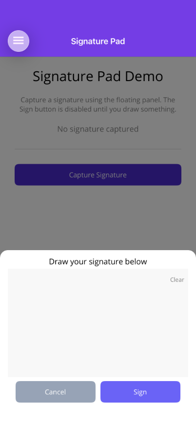
SignaturePad
A signature capture control that opens in a FloatingPanel overlay (MAUI) or SheetView (Blazor). Users draw on a canvas and tap Sign to export the signature as a PNG image. The Sign button is disabled until the user actually draws something. A Clear button lets users erase and start over.


Frameworks
.NET MAUI
Blazor
Important: Placement Requirement (MAUI)
Section titled “Important: Placement Requirement (MAUI)”SignaturePad uses a FloatingPanel internally, so it must be placed inside an OverlayHost or ShinyContentPage.Panels — just like a standalone FloatingPanel. Placing it outside an overlay host will not display correctly.
Basic Usage
Section titled “Basic Usage”Using ShinyContentPage (recommended)
Section titled “Using ShinyContentPage (recommended)”<shiny:ShinyContentPage xmlns="http://schemas.microsoft.com/dotnet/2021/maui" xmlns:x="http://schemas.microsoft.com/winfx/2009/xaml" xmlns:shiny="http://shiny.net/maui/controls" x:Class="MyApp.SignaturePage"> <shiny:ShinyContentPage.PageContent> <VerticalStackLayout Padding="20" Spacing="10"> <Button Text="Capture Signature" Command="{Binding OpenSignatureCommand}" /> <Border StrokeShape="RoundRectangle 12" Stroke="LightGray" StrokeThickness="1" Padding="10" IsVisible="{Binding HasSignature}"> <Image Source="{Binding SignatureImage}" HeightRequest="150" Aspect="AspectFit" /> </Border> </VerticalStackLayout> </shiny:ShinyContentPage.PageContent> <shiny:ShinyContentPage.Panels> <shiny:SignaturePad IsOpen="{Binding IsSignatureOpen}" StrokeColor="Black" SignatureBackgroundColor="#F8F8F8" StrokeWidth="3" SignButtonColor="#6C63FF" CancelButtonColor="#94A3B8" SignCommand="{Binding HandleSignedCommand}" CancelCommand="{Binding HandleCancelledCommand}" /> </shiny:ShinyContentPage.Panels></shiny:ShinyContentPage>Using OverlayHost (manual)
Section titled “Using OverlayHost (manual)”<ContentPage> <Grid> <ScrollView> <VerticalStackLayout Padding="20" Spacing="10"> <Button Text="Capture Signature" Command="{Binding OpenSignatureCommand}" /> </VerticalStackLayout> </ScrollView>
<shiny:OverlayHost> <shiny:SignaturePad IsOpen="{Binding IsSignatureOpen}" StrokeColor="Black" SignCommand="{Binding HandleSignedCommand}" /> </shiny:OverlayHost> </Grid></ContentPage>Properties (MAUI)
Section titled “Properties (MAUI)”| Property | Type | Default | Description |
|---|---|---|---|
IsOpen | bool | false | Opens/closes the signature panel (TwoWay) |
Position | FloatingPanelPosition | Bottom | Panel slide direction (Bottom, BottomTabs, Top) |
IsLocked | bool | true | Prevents drag dismiss of the panel |
Detent | DetentValue | Half | Panel snap position |
StrokeColor | Color | Black | Drawing stroke color |
SignatureBackgroundColor | Color | White | Canvas background color |
StrokeWidth | double | 3.0 | Drawing stroke width |
SignButtonText | string | "Sign" | Sign button label |
CancelButtonText | string | "Cancel" | Cancel button label |
SignButtonColor | Color | Blue | Sign button background color |
CancelButtonColor | Color | Gray | Cancel button background color |
ShowCancelButton | bool | true | Show/hide the cancel button |
PanelBackgroundColor | Color | White | Panel background color |
PanelCornerRadius | double | 16 | Panel corner radius |
HasBackdrop | bool | true | Show backdrop behind the panel |
ExportWidth | int | 600 | Exported PNG width in pixels |
ExportHeight | int | 200 | Exported PNG height in pixels |
SignCommand | ICommand? | null | Command invoked on sign with SignatureImageEventArgs |
CancelCommand | ICommand? | null | Command invoked on cancel |
Events (MAUI)
Section titled “Events (MAUI)”| Event | Args | Description |
|---|---|---|
Signed | SignatureImageEventArgs | Fires when the user taps Sign; ImageStream contains the PNG |
Cancelled | EventArgs | Fires when the user taps Cancel |
SignatureImageEventArgs
Section titled “SignatureImageEventArgs”| Property | Type | Description |
|---|---|---|
ImageStream | Stream | PNG image stream of the captured signature |
ViewModel Pattern (MAUI)
Section titled “ViewModel Pattern (MAUI)”public partial class SignatureViewModel : ObservableObject{ [ObservableProperty] bool isSignatureOpen;
[ObservableProperty] ImageSource? signatureImage;
public bool HasSignature => SignatureImage != null;
[RelayCommand] void OpenSignature() => IsSignatureOpen = true;
[RelayCommand] void HandleSigned(SignatureImageEventArgs args) { var ms = new MemoryStream(); args.ImageStream.CopyTo(ms); ms.Position = 0; SignatureImage = ImageSource.FromStream(() => ms); OnPropertyChanged(nameof(HasSignature)); }
[RelayCommand] void HandleCancelled() { }
[RelayCommand] void ClearSignature() { SignatureImage = null; OnPropertyChanged(nameof(HasSignature)); }}Blazor Usage
Section titled “Blazor Usage”<button @onclick="() => isOpen = true">Capture Signature</button>
@if (signatureDataUrl != null){ <img src="@signatureDataUrl" alt="Captured signature" style="max-width:100%;border:1px solid #E5E7EB;border-radius:8px;" /> <button style="background:#EF4444;color:white;" @onclick="ClearSignature">Clear</button>}
<SignaturePad @bind-IsOpen="isOpen" StrokeColor="#000000" SignatureBackgroundColor="#F8F8F8" StrokeWidth="3" SignButtonColor="#6C63FF" CancelButtonColor="#94A3B8" Signed="OnSigned" Cancelled="OnCancelled" />
@code { bool isOpen; string? signatureDataUrl;
void OnSigned(byte[] pngBytes) { var base64 = Convert.ToBase64String(pngBytes); signatureDataUrl = $"data:image/png;base64,{base64}"; }
void OnCancelled() { }
void ClearSignature() => signatureDataUrl = null;}Properties (Blazor)
Section titled “Properties (Blazor)”| Parameter | Type | Default | Description |
|---|---|---|---|
IsOpen | bool | false | Opens/closes the sheet (two-way via @bind-IsOpen) |
Direction | SheetDirection | Bottom | Sheet slide direction |
IsLocked | bool | true | Prevents drag dismiss |
Detent | DetentValue | Half | Sheet snap position |
StrokeColor | string | "#000000" | CSS stroke color |
SignatureBackgroundColor | string | "#FFFFFF" | CSS canvas background |
StrokeWidth | double | 3 | Stroke width |
SignButtonText | string | "Sign" | Sign button label |
CancelButtonText | string | "Cancel" | Cancel button label |
SignButtonColor | string | "#6C63FF" | CSS sign button color |
CancelButtonColor | string | "#94A3B8" | CSS cancel button color |
ShowCancelButton | bool | true | Show/hide cancel button |
PanelBackgroundColor | string | "#FFFFFF" | CSS panel background |
PanelCornerRadius | double | 16 | Panel corner radius |
HasBackdrop | bool | true | Show backdrop |
ExportWidth | int | 600 | Exported PNG width |
ExportHeight | int | 200 | Exported PNG height |
Events (Blazor)
Section titled “Events (Blazor)”| Event | Type | Description |
|---|---|---|
Signed | EventCallback<byte[]> | Fires with raw PNG bytes when the user signs |
Cancelled | EventCallback | Fires when the user cancels |
Features
Section titled “Features”- Canvas drawing — Touch/pointer-based freehand drawing on a canvas surface
- Sign button gating — The Sign button is disabled until the user draws something
- Clear button — Erase the canvas and start over without closing the panel
- PNG export — Signature is exported as a PNG image at configurable resolution (
ExportWidthxExportHeight). The drawn strokes are scaled uniformly to fit and centered within those dimensions, so the full signature is preserved without clipping or aspect-ratio distortion when the canvas and export sizes differ (differing aspect ratios are letterboxed with the background color) - FloatingPanel integration — Opens as a bottom/top panel overlay with configurable detent, backdrop, and corner radius
- Auto-reset — Canvas resets automatically after signing or cancelling
- Auto-close — Panel closes automatically after sign or cancel
- iOS edge-swipe protection — While the pad is open, the navigation controller’s interactive “swipe back” gesture is automatically suppressed (and restored on close) so strokes that start near the left screen edge are drawn instead of triggering back-navigation
- Customizable buttons — Configure text, colors, and visibility of the Sign and Cancel buttons
AI Skill
Section titled “AI Skill”Step 1 — Add the marketplace:
claude plugin marketplace add shinyorg/skills Step 2 — Install the plugin:
claude plugin install controls@shiny Step 1 — Add the marketplace:
copilot plugin marketplace add https://github.com/shinyorg/skills Step 2 — Install the plugin:
copilot plugin install controls@shiny