Client v5: BLE, BLE Hosting, HTTP, Jobs - Linux, MacOS, & Blazor Support! Full AOT, RX on BLE only & MANY other features! Power up!
VirtualizedGrid
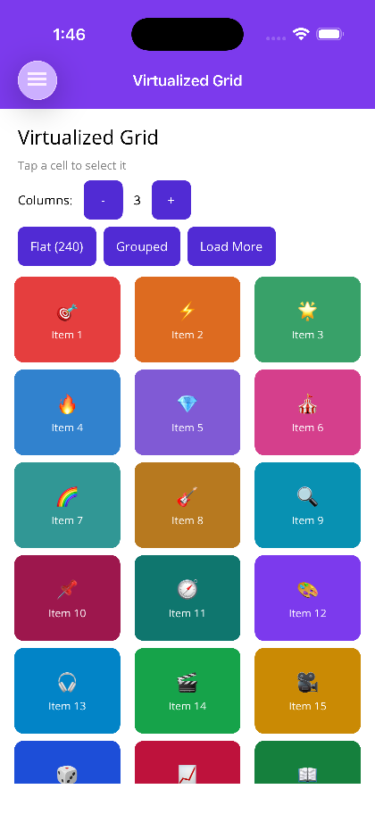
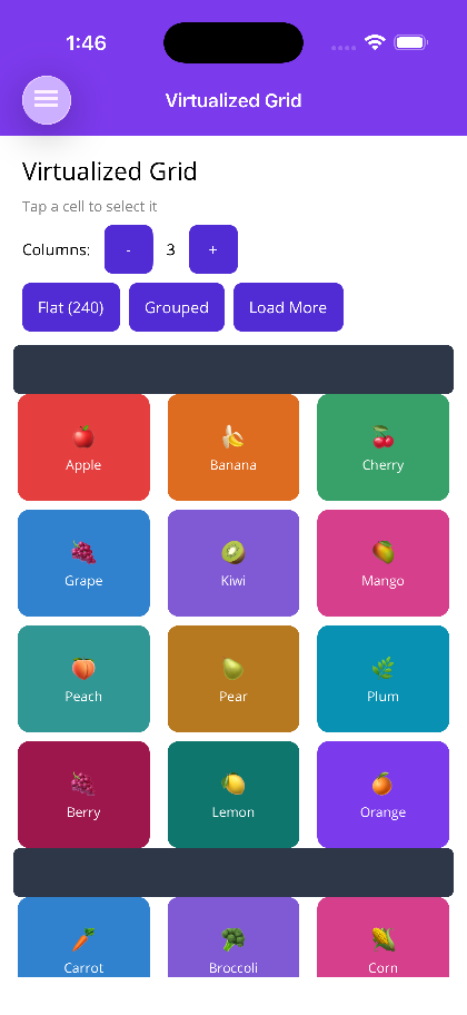
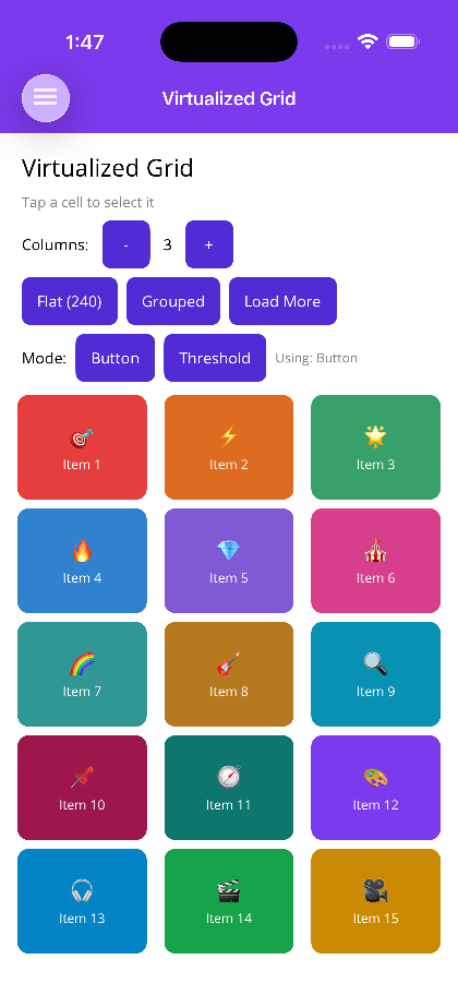
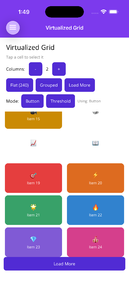
A high-performance virtualized grid that supports optional grouping with sticky headers, orientation-aware column counts, and built-in load-more pagination. Only the items currently visible in the viewport are created and measured, keeping memory use flat regardless of data set size.


Frameworks
.NET MAUI
Blazor
| Flat (240) | Grouped | Load More Modes | Load More Button |
|---|---|---|---|
 |  |  |  |
Features
Section titled “Features”- Virtualization — Native recycling on Android (
RecyclerView+GridLayoutManager), compositional layout on iOS (UICollectionViewCompositionalLayout), andItemsRepeater+UniformGridLayouton Windows. Blazor uses the built-in<Virtualize>component with CSS Grid. - Sticky Group Headers — When
IsGroupingEnabledistrue, group headers pin to the top of the viewport as the user scrolls through a group. - Orientation-Aware Columns — Set
PortraitColumnCountandLandscapeColumnCountindependently so the layout adapts automatically on device rotation. - Load-More Pagination — A
LoadMoreThresholdtriggersLoadMoreRequestedbefore the user reaches the last item; an optionalShowLoadMoreButtonrenders an explicit button for manual triggering. - Item Visibility Events —
ItemVisibleCommandandItemHiddenCommandfire as items enter and leave the viewport (MAUI). - Flexible Templates — Header, footer, empty view, group header, and load-more button are all fully templatable.
AI Skill
Section titled “AI Skill”Step 1 — Add the marketplace:
claude plugin marketplace add shinyorg/skills Step 2 — Install plugins:
claude plugin install shiny-client@shiny claude plugin install shiny-maui@shiny claude plugin install controls@shiny claude plugin install shiny-mediator@shiny claude plugin install shiny-data@shiny claude plugin install shiny-aspire@shiny claude plugin install shiny-extensions@shiny Step 1 — Add the marketplace:
copilot plugin marketplace add https://github.com/shinyorg/skills Step 2 — Install plugins:
copilot plugin install shiny-client@shiny copilot plugin install shiny-maui@shiny copilot plugin install controls@shiny copilot plugin install shiny-mediator@shiny copilot plugin install shiny-data@shiny copilot plugin install shiny-aspire@shiny copilot plugin install shiny-extensions@shiny Quick Start
Section titled “Quick Start”.NET MAUI
Section titled “.NET MAUI”<shiny:VirtualizedGrid ItemsSource="{Binding Products}" PortraitColumnCount="2" LandscapeColumnCount="4" IsGroupingEnabled="True" HasStickyHeaders="True" CellPadding="8" ShowLoadMoreButton="False" IsLoadingMore="{Binding IsLoadingMore}" ItemSelectedCommand="{Binding SelectProductCommand}"> <shiny:VirtualizedGrid.ItemTemplate> <DataTemplate> <Border StrokeShape="{RoundRectangle CornerRadius=8}" Padding="8"> <Label Text="{Binding Name}" /> </Border> </DataTemplate> </shiny:VirtualizedGrid.ItemTemplate> <shiny:VirtualizedGrid.GroupHeaderTemplate> <DataTemplate> <Label Text="{Binding Key}" FontAttributes="Bold" FontSize="16" /> </DataTemplate> </shiny:VirtualizedGrid.GroupHeaderTemplate></shiny:VirtualizedGrid>Blazor
Section titled “Blazor”<VirtualizedGrid Items="products" ColumnCount="2" ItemSpacing="8" IsGroupingEnabled="true" HasStickyHeaders="true" EnableVirtualization="true" LoadMoreThreshold="5" IsLoadingMore="isLoadingMore" LoadMoreRequested="OnLoadMore" ItemSelected="OnProductSelected"> <ItemTemplate Context="product"> <div class="product-card"> <span>@product.Name</span> </div> </ItemTemplate> <GroupHeaderTemplate Context="group"> <h3>@group</h3> </GroupHeaderTemplate> <EmptyViewTemplate> <p>No products found.</p> </EmptyViewTemplate></VirtualizedGrid>
@code { List<Product> products = []; bool isLoadingMore = false;
async Task OnLoadMore() { isLoadingMore = true; // fetch next page... isLoadingMore = false; }
void OnProductSelected(Product product) { }}Properties
Section titled “Properties”| Property | Type | Default | Description |
|---|---|---|---|
| ItemsSource | IEnumerable | — | Collection of items or grouped collections |
| ItemTemplate | DataTemplate | — | Template for each grid cell |
| ColumnCount | int | 1 | Default column count |
| PortraitColumnCount | int? | null | Column count in portrait orientation; overrides ColumnCount |
| LandscapeColumnCount | int? | null | Column count in landscape orientation; overrides ColumnCount |
| CellPadding | Thickness | — | Padding applied inside each cell |
| IsGroupingEnabled | bool | false | Enable grouped data with group headers |
| GroupHeaderTemplate | DataTemplate | — | Template for group header rows |
| HasStickyHeaders | bool | true | Pin group headers to the top while scrolling |
| ShowLoadMoreButton | bool | false | Render an explicit load-more button as a footer at the end of the data |
| LoadMoreButtonTemplate | DataTemplate | — | Custom template for the load-more button; defaults to a centered “Load More” button |
| IsLoadingMore | bool | false | Indicates a load-more operation is in progress |
| ItemSelectedCommand | ICommand | — | Command fired when a cell is tapped |
| ItemVisibleCommand | ICommand | — | Command fired when a cell enters the viewport |
| ItemHiddenCommand | ICommand | — | Command fired when a cell leaves the viewport |
Blazor
Section titled “Blazor”| Property | Type | Default | Description |
|---|---|---|---|
| Items | IReadOnlyList<TItem> | — | Flat list of items |
| ItemTemplate | RenderFragment<TItem> | — | Template for each grid cell |
| HeaderTemplate | RenderFragment | — | Content rendered above the grid |
| FooterTemplate | RenderFragment | — | Content rendered below the grid |
| EmptyViewTemplate | RenderFragment | — | Content rendered when Items is empty |
| ColumnCount | int | 1 | Number of grid columns |
| ItemSpacing | double | 8 | Gap between cells in px |
| CellPaddingLeft | double | — | Left padding inside each cell |
| CellPaddingRight | double | — | Right padding inside each cell |
| CellPaddingTop | double | — | Top padding inside each cell |
| CellPaddingBottom | double | — | Bottom padding inside each cell |
| IsGroupingEnabled | bool | false | Enable grouped rendering |
| GroupedItems | IReadOnlyList<VirtualizedGridGroup<TItem>> | — | Pre-grouped data source used when IsGroupingEnabled is true |
| GroupHeaderTemplate | RenderFragment<object> | — | Template for group header rows |
| HasStickyHeaders | bool | true | Pin group headers while scrolling |
| EnableVirtualization | bool | false | Use Blazor <Virtualize> for large datasets |
| LoadMoreThreshold | int | 5 | Number of items from the end that triggers LoadMoreRequested |
| ShowLoadMoreButton | bool | false | Render an explicit load-more button |
| IsLoadingMore | bool | false | Indicates a load-more operation is in progress |
| LoadMoreRequested | EventCallback | — | Fired when the threshold is reached or the load-more button is clicked |
| ItemSelected | EventCallback<TItem> | — | Fired when a cell is clicked/tapped |
Events & Commands
Section titled “Events & Commands”MAUI:
ItemSelectedCommand(ICommand) — Fires on cell tap; parameter is the selected itemItemVisibleCommand(ICommand) — Fires as a cell scrolls into the visible areaItemHiddenCommand(ICommand) — Fires as a cell scrolls out of the visible area
Blazor:
LoadMoreRequested(EventCallback) — Fires when proximity threshold is reached or load-more button is pressedItemSelected(EventCallback<TItem>) — Fires on cell click/tap
Behavior
Section titled “Behavior”- When both
PortraitColumnCountandLandscapeColumnCountare set,ColumnCountis ignored and the appropriate value is chosen based on current device orientation - Sticky headers require
IsGroupingEnabled="true"; settingHasStickyHeaders="false"renders standard (non-sticky) group headers LoadMoreThresholdcounts from the last item; reaching that position firesLoadMoreRequestedautomatically even withoutShowLoadMoreButton- Setting
IsLoadingMore="true"shows a built-in activity indicator in the load-more area until the value returns tofalse EnableVirtualizationin Blazor requiresItemsto be provided as a flat list; useGroupedItemsalongsideIsGroupingEnabledfor grouped virtualized rendering