


Motion Icons
111 hand-drawn icons that animate — a bell that rings from its crown, a hamburger that morphs into a cross, a tick that draws itself on, a spinner whose arc chases its own tail, a folder tab that lifts off its crease. They run on a timer, while the pointer is over them, on tap, when they scroll into view, or entirely under your control.
MotionIconView on .NET MAUI, <MotionIcon> on Blazor. Both live in the core packages — there is nothing extra to install.


MAUI (iOS)
| Triggers, code-driven playback, presets | Presets & scrubbing | The icon set |
|---|---|---|
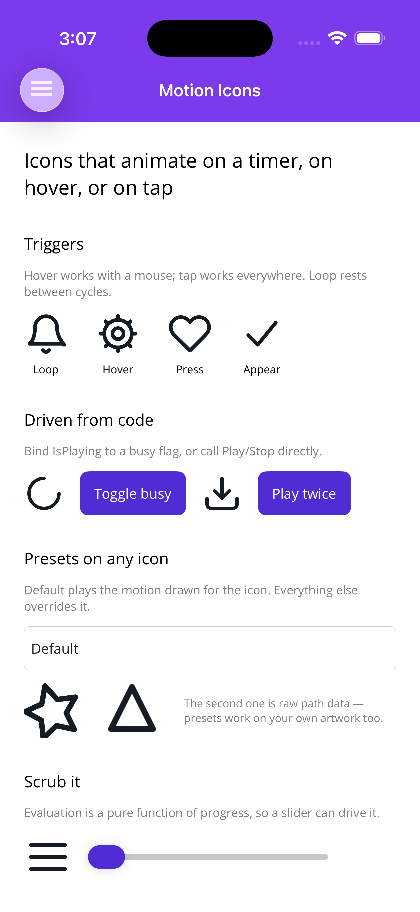 |
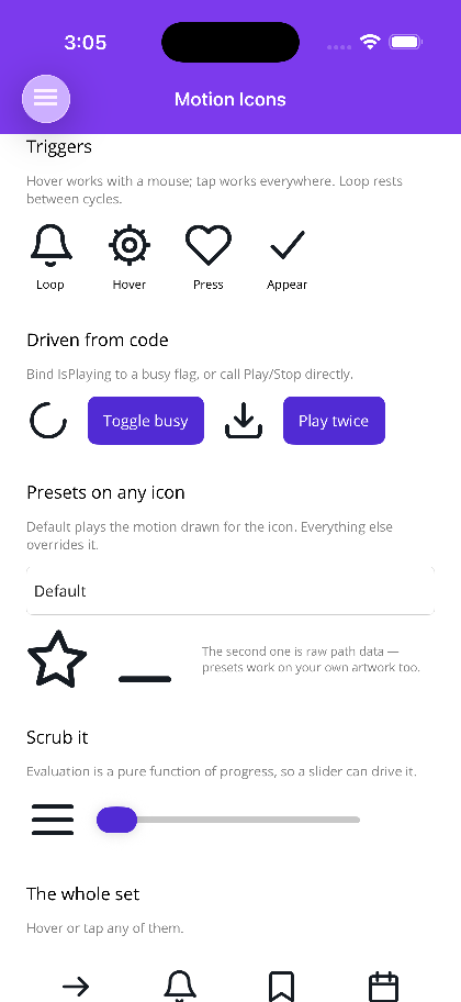 |
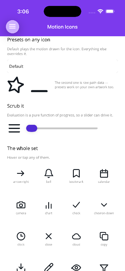 |
Blazor
| Triggers | Driven from code | Two-tone & colour | Presets on any icon |
|---|---|---|---|
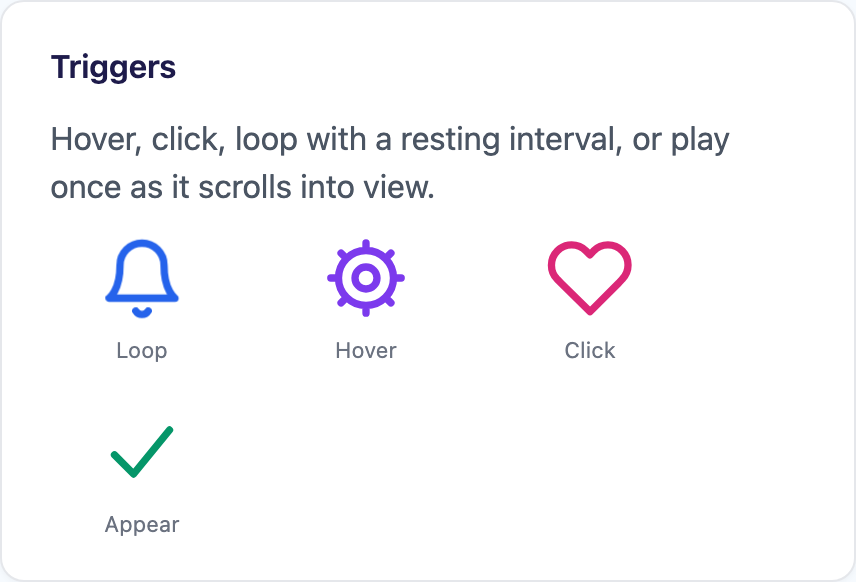 |
 |
 |
 |
Getting started
Section titled “Getting started”xmlns:shiny="http://shiny.net/maui/controls"
<shiny:MotionIconView Icon="bell" Trigger="Loop" Interval="0:0:1.5" Color="{AppThemeBinding Light=#2563EB, Dark=#60A5FA}" WidthRequest="32" HeightRequest="32" /><MotionIcon Icon="bell" Trigger="MotionTrigger.Loop" Interval="TimeSpan.FromSeconds(1.5)" Size="32" />No registration, no builder.Use…() call. The icon names are plain lower-kebab-case strings, and a name that does not exist renders nothing rather than throwing — a typo leaves a gap you can see instead of taking the page down.
One definition, two very different engines
Section titled “One definition, two very different engines”The icon artwork and its motion live in Shiny.Controls.MotionIcons.Shared, a dependency-free package both hosts reference. What each host does with that definition could hardly be more different:
| .NET MAUI | Blazor | |
|---|---|---|
| Rendering | a KeyframeScene on a GraphicsView |
inline SVG |
| Animation | a keyframe Timeline, evaluated per frame |
compiled once to CSS @keyframes |
| Driven by | the Keyframe engine’s Player, on one shared dispatcher timer per window |
the browser’s compositor |
| C# per frame | evaluate + redraw | none |
That split is deliberate. On the web, nothing about a motion icon needs a render loop: once the keyframes are declared the browser composites them off the main thread, at the display’s refresh rate, and keeps going while WebAssembly is busy doing something else. A C# ticker driving re-renders would be slower, jankier, and would stop dead the moment the app did some work.
On MAUI there is no such compositor to hand the work to, so an icon is drawn — but by the Keyframe engine rather than by machinery of its own. The scene is a KeyframeScene layer tree and playback is its Player, which means motion icons and hand-written keyframe timelines share one clock per window, one set of easing curves and one implementation of position, rate and baselines.
Because both sides compile the same spec — including the same easing curves, evaluated by the same code — an icon looks and moves the same in a MAUI app and in a browser.
Properties
Section titled “Properties”Named identically on both hosts unless noted.
| Property | Type | Notes |
|---|---|---|
Icon |
string |
A built-in name. |
Source |
MotionIconDefinition |
Explicit artwork; beats Icon and PathData. |
PathData |
string |
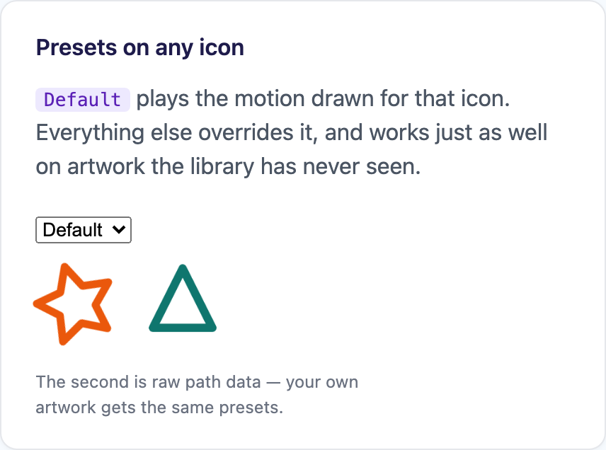
Raw SVG path drawn in a 24×24 box. |
Motion |
MotionPreset |
Defaults to Default — the motion drawn for that icon. |
Trigger |
MotionTrigger |
[Flags]. Defaults to Hover | Press. |
Duration |
TimeSpan |
Overrides one cycle. Zero uses the motion’s own. |
Interval |
TimeSpan |
Resting gap between cycles while looping. |
Speed |
double |
Rate multiplier. Negative reverses (MAUI only). |
RepeatCount |
int |
Cycles per triggered play. Zero or less repeats forever. |
Color |
Color / string |
MAUI: unset follows the app theme. Blazor: currentColor. |
AccentColor |
Color / string |
Secondary colour for two-tone artwork. |
StrokeWidth |
double |
In the icon’s own 24-unit space. The set is drawn for 2. |
IsPlaying |
bool |
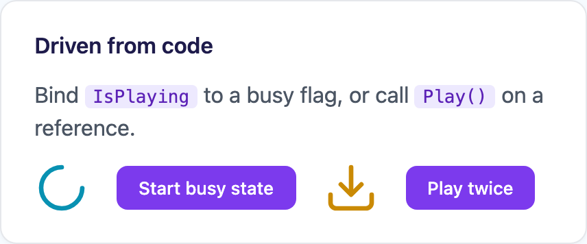
Two-way — bind it to a busy flag. |
Size |
double |
Blazor only; MAUI uses WidthRequest / HeightRequest. |
Progress |
double |
MAUI only. Two-way — bind a Slider to scrub the animation. |
Command |
ICommand |
MAUI only. Blazor uses OnClick. |
Title |
string |
Blazor only. Without it the icon is aria-hidden. |
Methods on both hosts: Play(), Stop(), StopAtCycleEnd(). MAUI adds PlayAsync() and Reset(); Blazor adds Loop(). Both raise Completed at the end of a play.
Colour
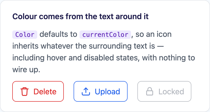
Section titled “Colour”On Blazor, Color defaults to currentColor, so an icon dropped inside a button, link or menu row takes that element’s colour automatically — including the hover and disabled states — with nothing to wire up:
<button class="danger" disabled="@busy"> <MotionIcon Icon="trash" Trigger="MotionTrigger.Hover" Size="20" /> Delete</button>MAUI has no equivalent of currentColor, so an unset Color follows the theme pack’s on-surface token through SetDynamicResource instead — which means icons restyle along with a live SetTheme. Assigning Color explicitly clears that, as it should. Set it explicitly wherever the icon sits on a coloured surface.
Accessibility
Section titled “Accessibility”Motion icons are usually decoration sitting beside a real label, which is how they are treated by default: on Blazor an icon with no Title is marked aria-hidden, so a screen reader announces the button’s text once rather than twice. Give it a Title when the icon is the label.
On the web, prefers-reduced-motion: reduce is honoured automatically — the icon still renders and still responds to clicks, it simply holds its resting pose.