


Flyout
A side panel that slides in from either edge, can rest as a narrow icon rail instead of a full panel, and either pushes the content aside or floats over it with a scrim. It replaces MAUI’s FlyoutPage for apps that want more than a drawer, and — unlike FlyoutPage — it works inside Shell.

Screenshots
Section titled “Screenshots”MAUI (iOS)
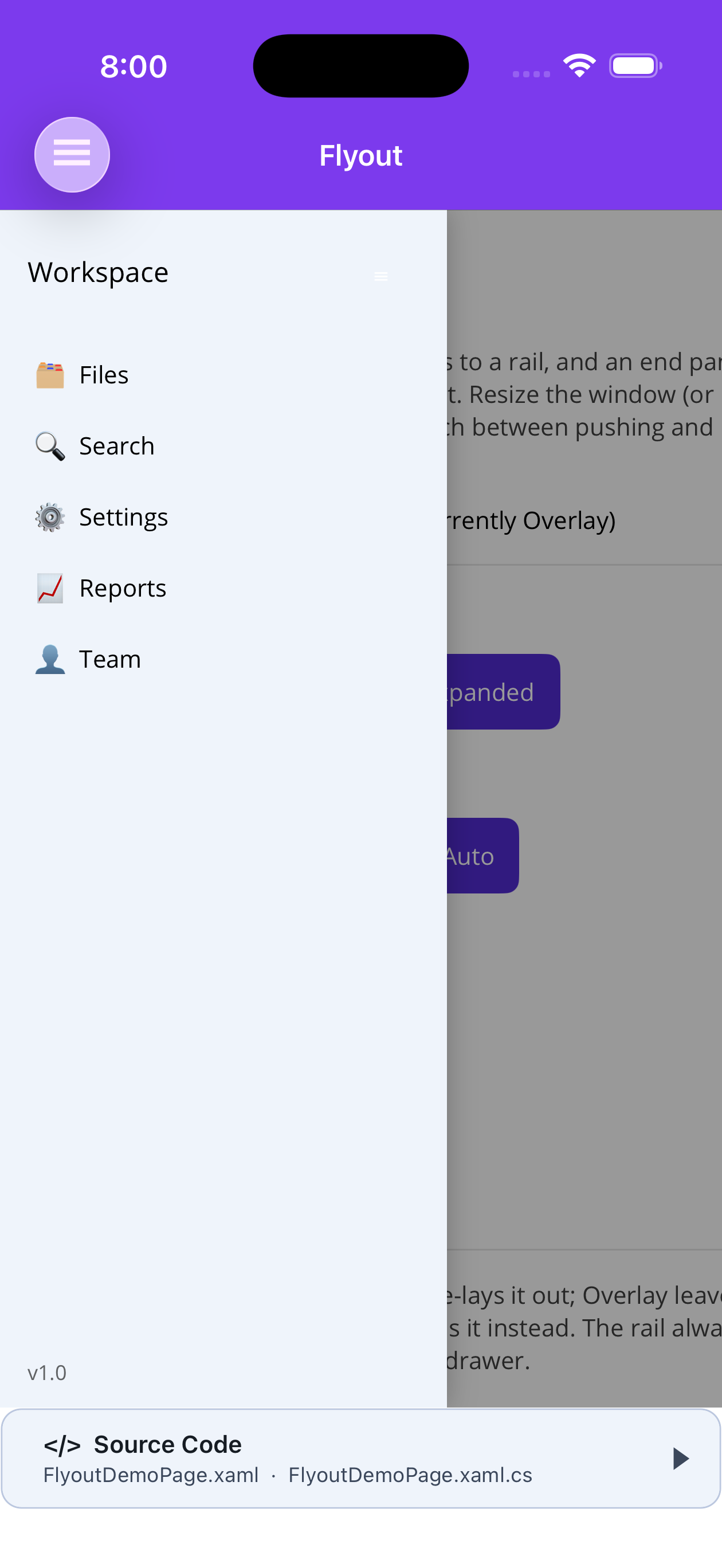
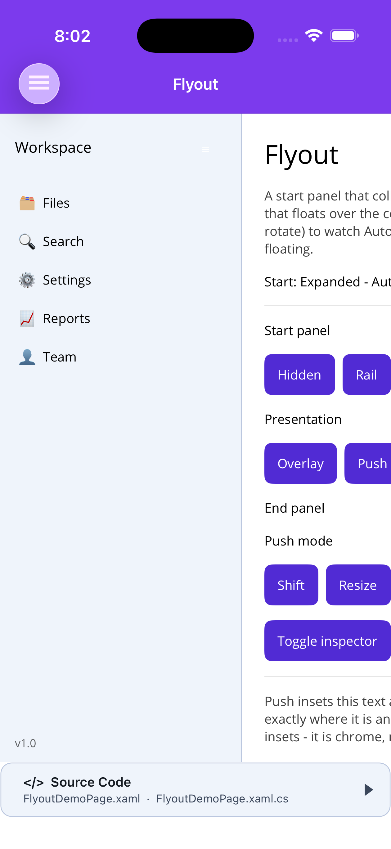
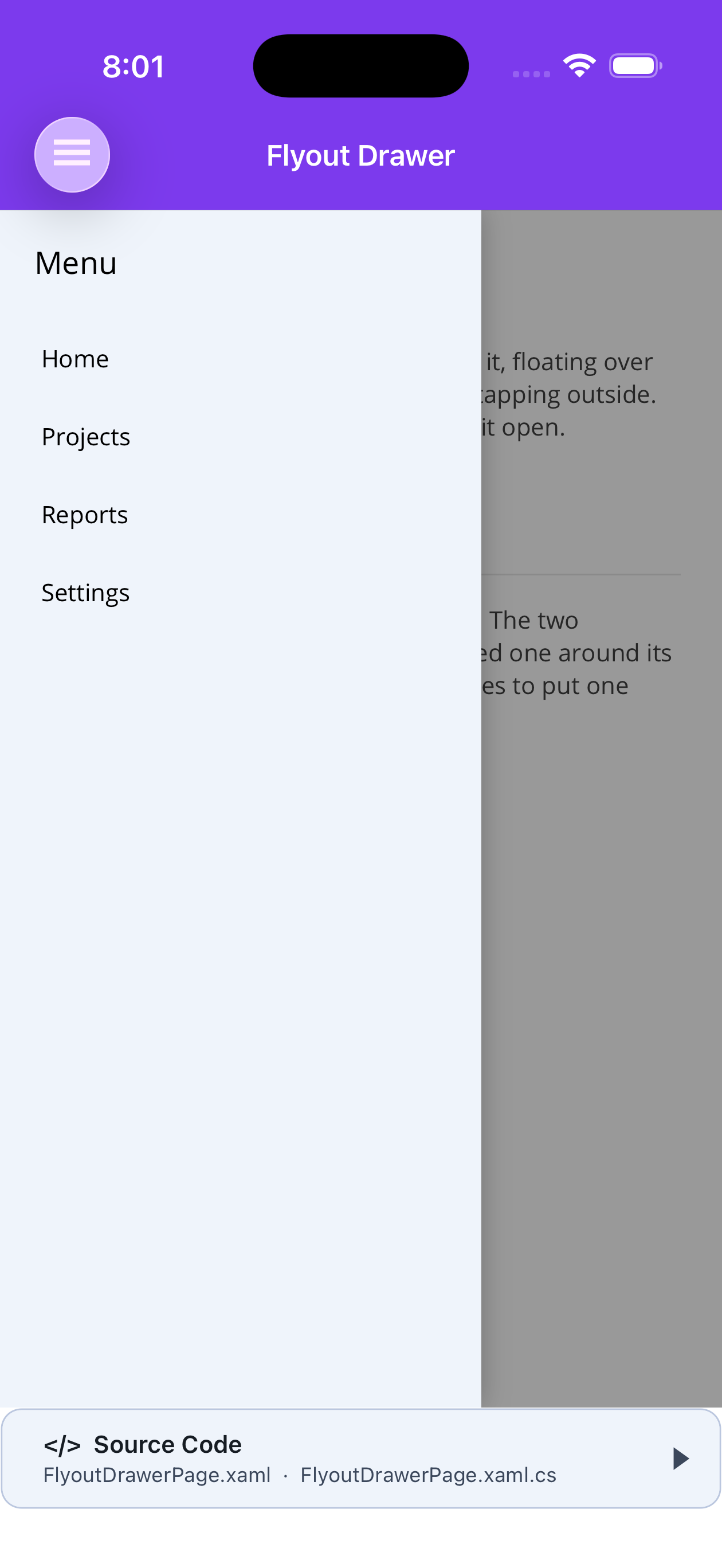
| Collapsed to a rail | Expanded, pushing content | Drawer over a scrim |
|---|---|---|
 |
 |
 |
The vocabulary
Section titled “The vocabulary”| State | Hidden · Collapsed (the rail) · Expanded |
| Side | Start · End — reading order, so both mirror under FlowDirection="RightToLeft" |
| Presentation | Overlay · Push · Auto |
Pushing: shift, don’t crush
Section titled “Pushing: shift, don’t crush”PushMode decides how a pushing panel moves the content:
Shift (default) |
The content keeps its full width and is translated aside; its far edge slides out of view and is clipped. Nothing inside re-lays out — text does not rewrap, columns do not collapse, a list re-measures no rows. |
Resize |
The content is genuinely narrowed and everything inside reflows to fit. |
Shift is the drawer feel — the whole screen slides over. Resize is the chrome feel, right for a
responsive layout that should reflow beside an open panel.
Two shifting panels cancel rather than crush: a 280 start and a 200 end give a net 80 shift. Shifting cannot satisfy both sides at once, and splitting the difference by narrowing is the exact thing the mode exists to avoid.
Presentation governs an expanded panel. Push insets the content and re-lays it out; Overlay floats over it with a scrim. A collapsed rail always insets the content on both presentations, because a rail is chrome rather than a drawer — which is exactly what lets a rail expand over the content without the content moving at all. Hidden insets nothing.
Auto pushes when the flyout is at least CompactWidth wide (default 800) and floats below that, measured against the FlyoutView rather than the window — so a flyout nested in a pane reacts to the pane.
As a page
Section titled “As a page”ShinyFlyoutPage is the FlyoutPage replacement. Its content property is Detail.
<shiny:ShinyFlyoutPage xmlns="http://schemas.microsoft.com/dotnet/2021/maui" xmlns:x="http://schemas.microsoft.com/winfx/2009/xaml" xmlns:shiny="http://shiny.net/maui/controls" x:Class="MyApp.MainPage" Title="Workspace">
<shiny:ShinyFlyoutPage.Start> <shiny:FlyoutPanel x:Name="Nav" State="Collapsed" CollapsedState="Collapsed" Presentation="Auto" CompactWidth="700" ExpandedWidth="260" CollapsedWidth="64" IsResizable="True">
<shiny:FlyoutPanel.HeaderContent> <Label Text="Explorer" FontAttributes="Bold" Padding="16,14" /> </shiny:FlyoutPanel.HeaderContent>
<!-- what Collapsed shows instead of the body --> <shiny:FlyoutPanel.RailContent> <VerticalStackLayout HorizontalOptions="Center" Padding="0,12" Spacing="6"> <Button Text="🗂" Clicked="OnToggle" /> <Button Text="🔍" Clicked="OnToggle" /> </VerticalStackLayout> </shiny:FlyoutPanel.RailContent>
<VerticalStackLayout Padding="8"> <Label Text="Files" Padding="12,10" /> <Label Text="Search" Padding="12,10" /> </VerticalStackLayout>
<shiny:FlyoutPanel.FooterContent> <Label Text="v1.0" Padding="16,12" FontSize="12" /> </shiny:FlyoutPanel.FooterContent> </shiny:FlyoutPanel> </shiny:ShinyFlyoutPage.Start>
<!-- implicit content is Detail --> <ScrollView> <VerticalStackLayout Padding="24" Spacing="16"> <Label Text="Detail" FontSize="28" /> </VerticalStackLayout> </ScrollView></shiny:ShinyFlyoutPage>public partial class MainPage : ShinyFlyoutPage{ public MainPage() => InitializeComponent();
void OnToggle(object? sender, EventArgs e) => _ = this.Nav.ToggleAsync();}ShinyFlyoutPage derives from ShinyContentPage, so the overlay host, FloatingPanel and the built-in loading overlay all still work, with the flyout underneath them.
Inside one page
Section titled “Inside one page”For a single screen that needs a panel — an inspector, a filter pane — use FlyoutView directly:
<ContentPage xmlns:shiny="http://shiny.net/maui/controls">    <shiny:FlyoutView x:Name="Flyout">        <shiny:FlyoutView.End>            <shiny:FlyoutPanel State="Hidden"                               CollapsedState="Hidden"                               Presentation="Overlay"                               ExpandedWidth="320" />        </shiny:FlyoutView.End>
        <Grid><!-- page body --></Grid>    </shiny:FlyoutView></ContentPage>
Panels span the full height of the FlyoutView. To keep one below an app bar, put the FlyoutView below the app bar rather than around it.
Driving it from code
Section titled “Driving it from code”public class ShellViewModel(IFlyoutService flyouts){ public Task ToggleNav() => flyouts.ToggleAsync(); public Task ShowInspector() => flyouts.SetStateAsync(FlyoutSide.End, FlyoutPanelState.Expanded);}IFlyoutService is registered by UseShinyControls() and resolves the flyout on the page currently showing — so a view model can open the drawer without holding a reference to the page. It also exposes GetPanel, GetState and StateChanged.
On a panel: ToggleAsync(), ExpandAsync(), CollapseAsync(), HideAsync(), SetStateAsync(state) — each completes when the transition finishes.
Gestures
Section titled “Gestures”- Swipe in from the edge to drag a floating panel open (
IsSwipeEnabled, catch stripEdgeSwipeWidth, default 20). - Tap or drag the scrim to close it (
CloseOnScrimTap). - Drag the inner-edge handle to resize a pushing panel between
MinExpandedWidthandMaxExpandedWidth(IsResizable), which writes back toExpandedWidth.
There is deliberately no drag-from-inside-the-panel gesture: it fights the scrolling content a panel usually holds.
What to know
Section titled “What to know”- Compacting.
CollapseBelowdrops an expanded panel to itsCollapsedStatewhen the flyout gets narrow, and restores what it was when there is room again. It is a response to the viewport rather than a preference, so it is never persisted — and a deliberate state change always wins: once the user has closed the panel themselves, growing the host back does not re-open it. - A slide is not a resize. Hidden ⇄ anything translates the panel at its final size, so no layout pass runs and the drawer stays smooth on a phone. Collapsed ⇄ Expanded genuinely resizes, and content beside a pushing panel is re-laid out each frame. That distinction is why
FlyoutViewis a custom layout rather than aGridwith animated column widths. - A panel is never wider than the flyout —
ExpandedWidth="400"on a 320-wide phone gives 320. - The edge-swipe strip sits over the content, so taps in that band go to it. Set
EdgeSwipeWidth="0"for content that needs the very edge. - macOS AppKit (
net10.0-macos) — the declare-once install re-parents a page’s content at runtime, which does not re-render on that head (the same pre-existing limitation as Toast, Dialogs and in-app Quick Entry). UseShinyFlyoutPageorFlyoutViewin the page’s own markup there; neither re-parents anything.
Step 1 — Add the marketplace:
claude plugin marketplace add shinyorg/skillsStep 2 — Install the plugin:
claude plugin install shiny@shinyOne plugin installs all 39 Shiny skills. Your agent loads only the skill relevant to what you're building, so there's no cost to having them all available.
Step 1 — Add the marketplace:
copilot plugin marketplace add https://github.com/shinyorg/skillsStep 2 — Install the plugin:
copilot plugin install shiny@shinyOne plugin installs all 39 Shiny skills. Your agent loads only the skill relevant to what you're building, so there's no cost to having them all available.