


FloatingToolbar
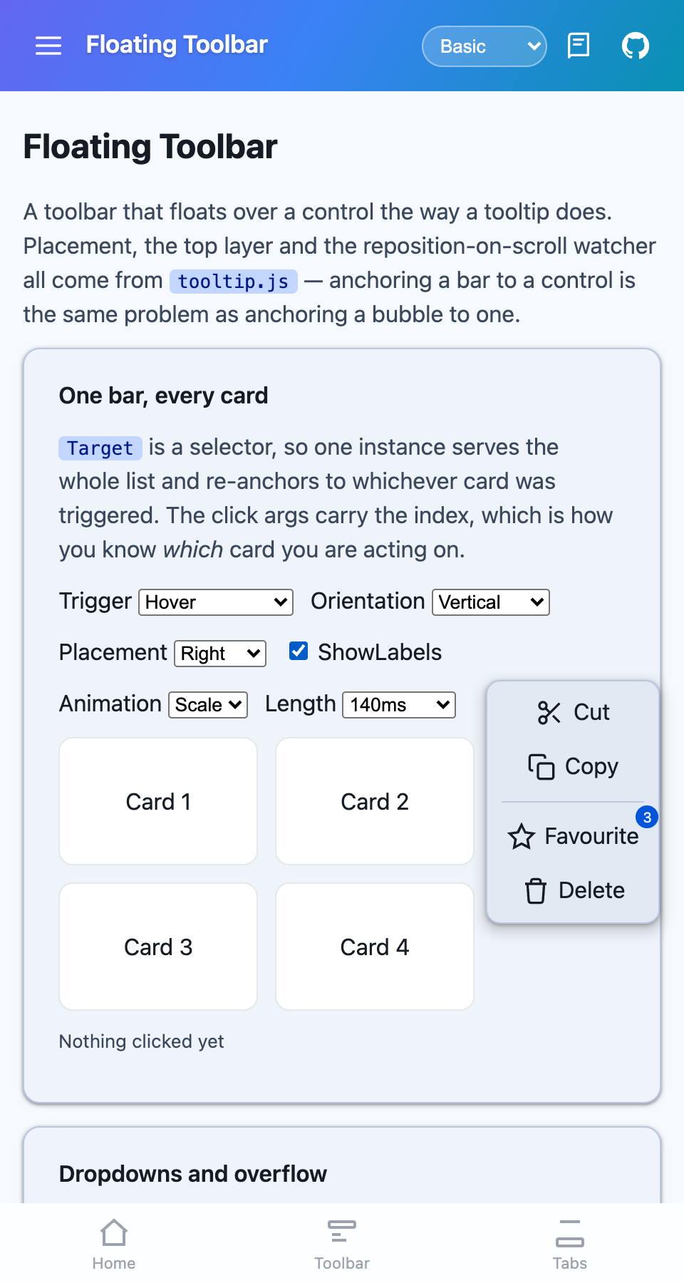
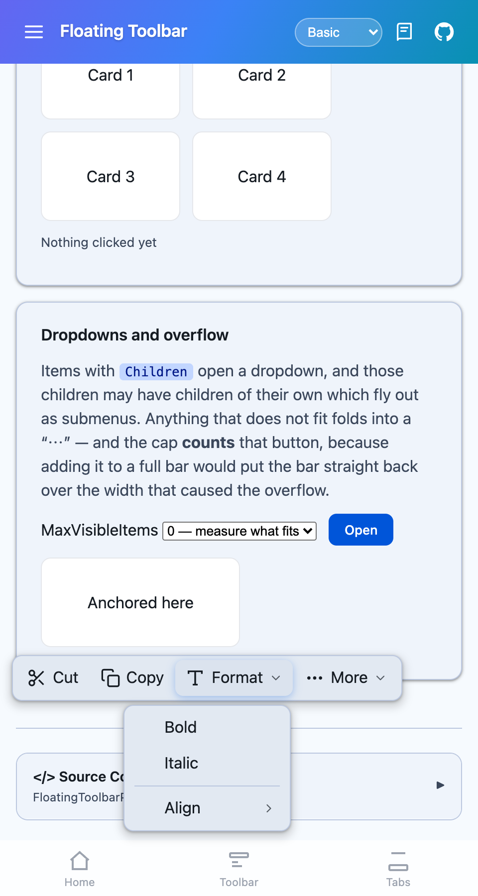
A toolbar that floats over a control the way a tooltip does — icons, labels, badges, dropdown menus and an overflow, laid out across or down, anchored to whichever control triggered it.


MAUI (iOS)
| Horizontal, with labels | Vertical | Dropdown |
|---|---|---|
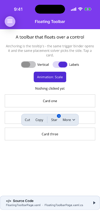 |
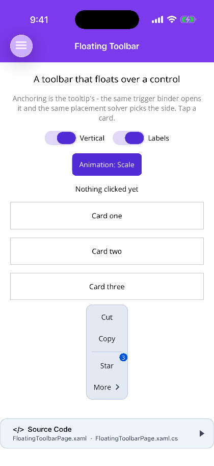 |
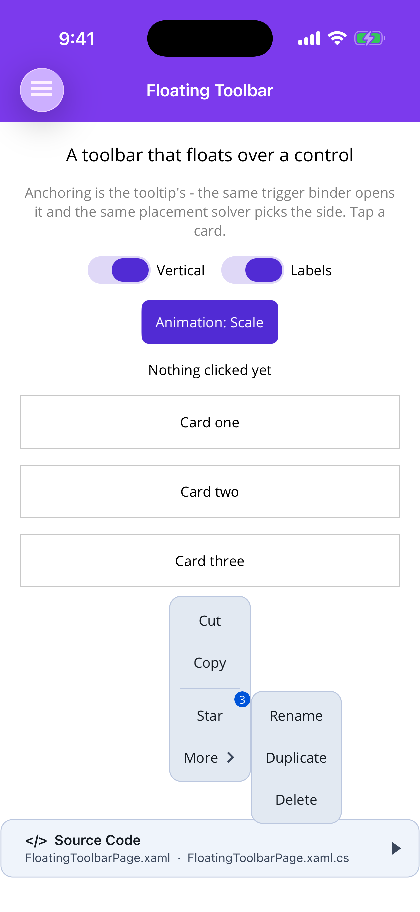 |
Blazor
| Horizontal, with labels | Vertical | Dropdown and overflow |
|---|---|---|
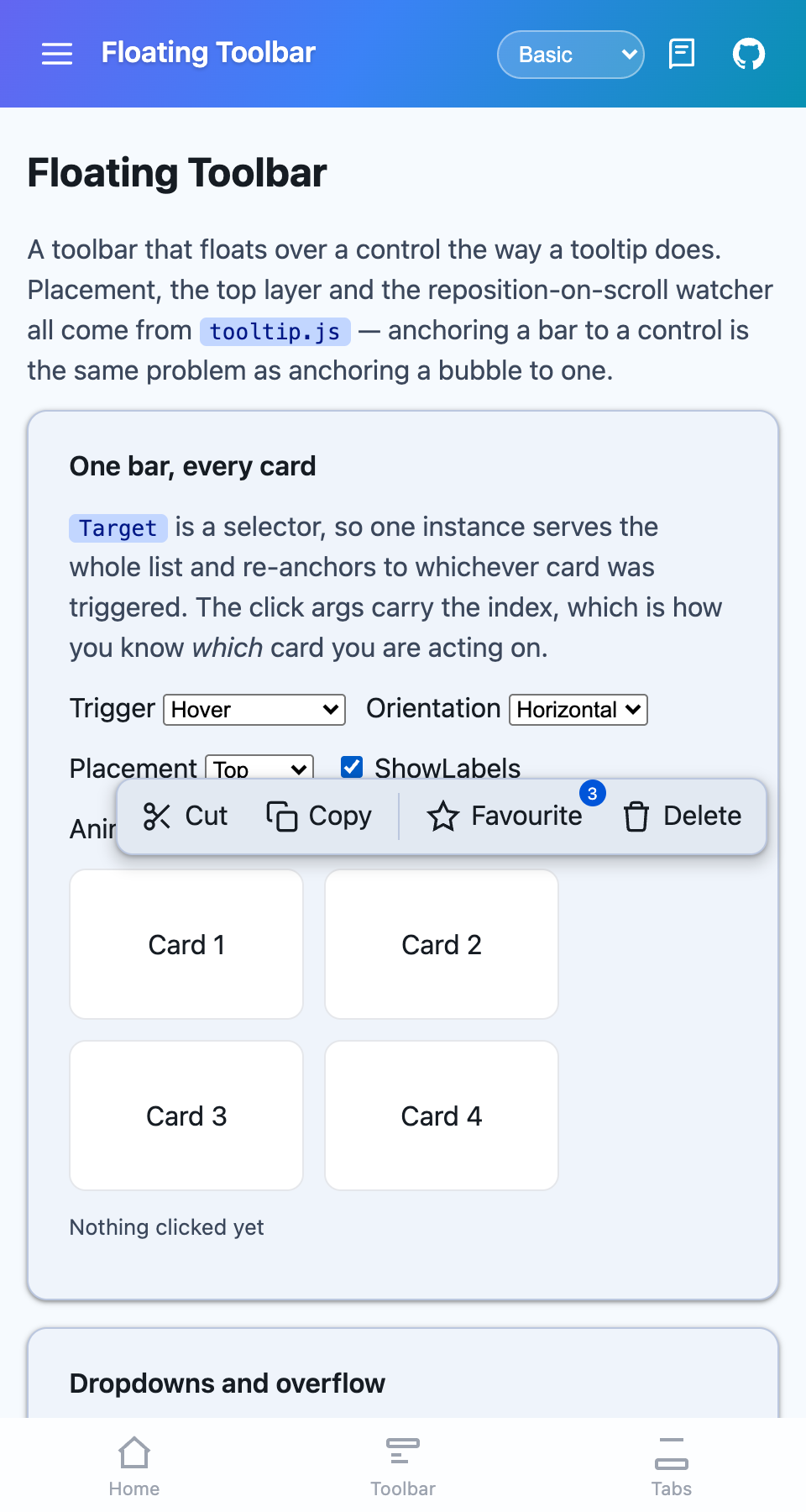 |
 |
 |
What it is
Section titled “What it is”Anchoring is the tooltip’s, not a second copy of it. On MAUI the same AnchorTriggerBinder opens it and the same TooltipPlacementSolver picks the side; on Blazor tooltip.js supplies the placement, the top layer and the reposition-on-scroll watcher. Anchoring a bar to a control is the same problem as anchoring a bubble to one, and two implementations would only drift apart.
What is added on top is the toolbar’s own half: orientation, dropdowns, overflow, and the grace period that lets the pointer actually reach the bar.
This is not the docked page-level bar — that is ShinyToolbar. Reach for this one when the bar belongs to a control.
MAUI
<Grid>    <ScrollView>        <VerticalStackLayout>            <!-- One bar, every row: each points at the same instance. -->            <Border BindingContext="{Binding Row1}" shiny:FloatingToolbar.AttachTo="{x:Reference bar}" />            <Border BindingContext="{Binding Row2}" shiny:FloatingToolbar.AttachTo="{x:Reference bar}" />        </VerticalStackLayout>    </ScrollView>
    <!-- Draws nothing itself; it is a handle the rows point at. -->    <shiny:FloatingToolbar x:Name="bar" Trigger="Tap" Orientation="Horizontal">        <shiny:FloatingToolbar.Items>            <shiny:ShinyToolbarItem Text="Cut" />            <shiny:ShinyToolbarItem IsSeparator="True" />            <shiny:ShinyToolbarItem Text="More">                <shiny:ShinyToolbarItem.Children>                    <shiny:ShinyToolbarItem Text="Rename" />                </shiny:ShinyToolbarItem.Children>            </shiny:ShinyToolbarItem>        </shiny:FloatingToolbar.Items>    </shiny:FloatingToolbar></Grid>
Blazor
<FloatingToolbar Target=".card" Trigger="TooltipTrigger.Hover" Orientation="ToolbarOrientation.Vertical" Items="@actions" ItemClicked="OnAction" />One bar, many controls
Section titled “One bar, many controls”A toolbar per row of a list means every row carries a live control that is almost never on screen. Instead one instance serves them all and re-anchors to whichever was triggered.
| Platform | Details |
|---|---|
| MAUI | set the attached FloatingToolbar.AttachTo on each control, pointing at one instance. CurrentTarget and the click args say which one it is acting on, and the args carry that view’s BindingContext — the row itself. |
| Blazor | give Target a selector that matches them all. The click args carry the index of the target that was triggered. |
Triggering a different control while the bar is open re-anchors rather than closing: the second row’s tap would otherwise read as “close”, and the bar would flicker off the very row it was asked for.
Reaching the bar
Section titled “Reaching the bar”A hover toolbar that closes on pointer-exit is unusable — the pointer has to cross the gap between the target and the buttons, and the bar is gone before it gets there. HideDelay (250 ms by default) is what makes it work: leaving the target schedules the close, and arriving on the bar cancels it. Do not set it to zero on a hover bar.
Appearing and disappearing
Section titled “Appearing and disappearing”Animation is the tooltip’s TooltipAnimation — None, Fade, Scale, Slide — rather than a second enum meaning the same four things, and AnimationLength sets the duration (zero snaps). On MAUI both controls run the same AnchoredPopoverAnimator.
Scale and Slide are directional: they grow out of, or travel away from, the edge nearest the target. That side is the one the placer actually chose, not the one asked for — a bar with no room above flips below, and its entry flips with it.
On Blazor the exit is a real animation rather than a removal: the bar is put back into its start state and held there for AnimationLength before it leaves the DOM, because an element removed outright has nothing left to animate.
Parameters
Section titled “Parameters”| Parameter | Type | Default | Notes |
|---|---|---|---|
Items |
item list | empty | ShinyToolbarItem (MAUI) / ToolbarItem (Blazor). Items with Children open a dropdown |
Target |
View (MAUI) / selector (Blazor) |
— | MAUI also has TargetName; both accept wrapping the target as content |
Trigger |
TooltipTrigger |
Tap / Click |
Manual, Tap/Click, LongPress, Hover, Focus; Blazor adds HoverOrFocus |
Orientation |
ToolbarOrientation |
Horizontal |
Also decides whether overflow is measured on width or height |
Placement |
TooltipPlacement |
Top |
Auto picks the side with room |
IsOpen |
bool |
false |
Two-way bindable |
ShowLabels |
bool |
false |
Text beside the icon. Menus are always labelled |
OverflowEnabled |
bool |
true |
Fold what does not fit into a ⋯ dropdown |
MaxVisibleItems |
int |
0 |
Zero measures what actually fits. The cap counts the overflow button |
Animation |
TooltipAnimation |
Scale |
None, Fade, Scale, Slide |
AnimationLength |
int |
140 |
Milliseconds. Zero snaps |
ShowDelay / HideDelay |
int |
0 / 250 |
HideDelay is the grace period above |
LongPressDelay / AutoDismissDelay |
int |
450 / 0 |
|
DismissOnItemClick |
bool |
true |
|
DismissOnTapOutside |
bool |
true |
MAUI only |
Offset / ScreenMargin |
double |
8 / 12 |
|
BarColor / ForegroundColor / CornerRadius |
theme |
Events — ItemClicked carries FloatingToolbarItemEventArgs (MAUI: the item, the target and that target’s BindingContext; Blazor: the item and the target index). Opened and Closed fire either side. MAUI adds the matching commands.
Methods — MAUI: Show(), ShowFor(view), Hide(), Toggle(). Blazor: ShowAsync(index), HideAsync().
Icon, Text, Tooltip, Badge, IconColor, IsEnabled, IsVisible, IsSeparator, Children, Tag — plus Command/CommandParameter on MAUI. An item with Children becomes a menu button, and those children may have children of their own which fly out as submenus. A separator on the bar is a rule across it; inside a menu it is a divider.
On MAUI the type is ShinyToolbarItem, not ToolbarItem: MAUI already has a ToolbarItem, and a second type of that name in a namespace XAML imports wholesale resolves to whichever the compiler saw first.
Platform notes
Section titled “Platform notes”- The bar draws in the page’s overlay layer (MAUI) or the browser’s top layer (Blazor), so no
overflow: hiddenancestor clips it and noz-indexoutranks it. - MAUI’s layer sits below the tooltip layer on purpose: the bar’s own buttons carry tooltips, and a tip rendering under the bar it names is worse than no tip.
- Put the MAUI element outside the
ScrollView, as a sibling in aGrid. It draws nothing, but it needs a home that does not scroll away. Hoverneeds a pointer, so it never fires on a phone. UseLongPressorTapfor touch.
Step 1 — Add the marketplace:
claude plugin marketplace add shinyorg/skillsStep 2 — Install the plugin:
claude plugin install shiny@shinyOne plugin installs all 48 Shiny skills. Your agent loads only the skill relevant to what you're building, so there's no cost to having them all available.
Step 1 — Add the marketplace:
copilot plugin marketplace add https://github.com/shinyorg/skillsStep 2 — Install the plugin:
copilot plugin install shiny@shinyOne plugin installs all 48 Shiny skills. Your agent loads only the skill relevant to what you're building, so there's no cost to having them all available.