Client v5: BLE, BLE Hosting, HTTP, Jobs - Linux, MacOS, & Blazor Support! Full AOT, RX on BLE only & MANY other features! Power up!
StaggeredGrid
A masonry (waterfall) grid layout that places items into columns of equal width and lets each item’s height vary naturally, eliminating the uniform-height constraint of standard grids. Native handlers deliver high-performance scrolling on every platform.


Frameworks
.NET MAUI
Blazor
| Two Columns | Three Columns |
|---|---|
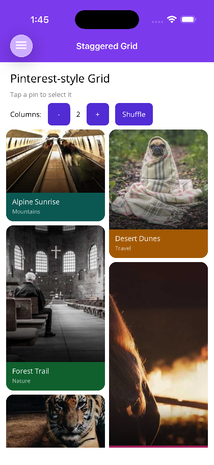 | 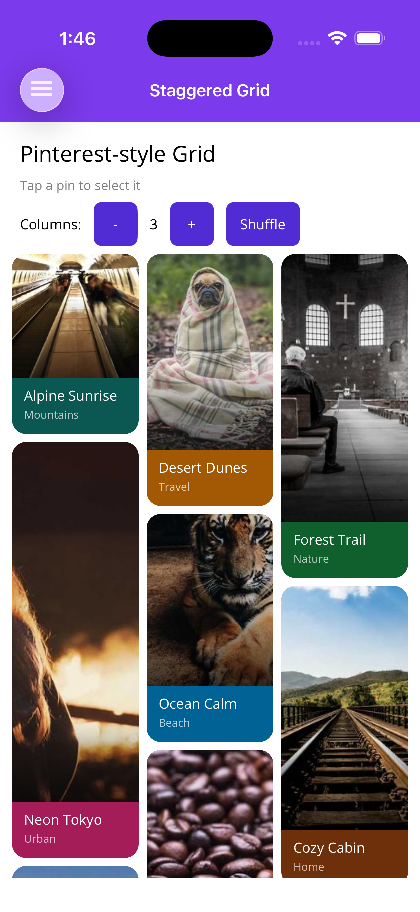 |
Features
Section titled “Features”- Variable-Height Items — Each item fills its natural height; the next item is placed in the shortest column, producing the classic Pinterest waterfall effect.
- Configurable Column Count — Set
ColumnCountto any integer to control the number of columns. - Native Handlers — Android:
RecyclerViewwithStaggeredGridLayoutManager; iOS: customWaterfallLayout(UICollectionViewLayout); Windows:WaterfallVirtualizingLayout; Blazor: CSScolumn-count. - Empty View — Provide an
EmptyViewTemplate/EmptyTemplateto render a placeholder when the data source is empty. - Item Selection —
ItemSelectedCommand(MAUI) andItemSelected(Blazor) surface tap/click interactions.
AI Skill
Section titled “AI Skill”Step 1 — Add the marketplace:
claude plugin marketplace add shinyorg/skills Step 2 — Install plugins:
claude plugin install shiny-client@shiny claude plugin install shiny-maui@shiny claude plugin install controls@shiny claude plugin install shiny-mediator@shiny claude plugin install shiny-data@shiny claude plugin install shiny-aspire@shiny claude plugin install shiny-extensions@shiny Step 1 — Add the marketplace:
copilot plugin marketplace add https://github.com/shinyorg/skills Step 2 — Install plugins:
copilot plugin install shiny-client@shiny copilot plugin install shiny-maui@shiny copilot plugin install controls@shiny copilot plugin install shiny-mediator@shiny copilot plugin install shiny-data@shiny copilot plugin install shiny-aspire@shiny copilot plugin install shiny-extensions@shiny Quick Start
Section titled “Quick Start”.NET MAUI
Section titled “.NET MAUI”<shiny:StaggeredGrid ItemsSource="{Binding Photos}" ColumnCount="2" ColumnSpacing="8" RowSpacing="8" ItemSelectedCommand="{Binding OpenPhotoCommand}"> <shiny:StaggeredGrid.ItemTemplate> <DataTemplate> <Border StrokeShape="{RoundRectangle CornerRadius=8}"> <Image Source="{Binding Url}" Aspect="AspectFill" /> </Border> </DataTemplate> </shiny:StaggeredGrid.ItemTemplate> <shiny:StaggeredGrid.EmptyViewTemplate> <DataTemplate> <Label Text="No photos yet" HorizontalOptions="Center" /> </DataTemplate> </shiny:StaggeredGrid.EmptyViewTemplate></shiny:StaggeredGrid>Blazor
Section titled “Blazor”<StaggeredGrid Items="photos" ColumnCount="2" ColumnSpacing="16" RowSpacing="16" ItemSelected="OnPhotoSelected"> <ItemTemplate Context="photo"> <div class="photo-card"> <img src="@photo.Url" alt="@photo.Title" /> </div> </ItemTemplate> <EmptyTemplate> <p>No photos yet.</p> </EmptyTemplate></StaggeredGrid>
@code { List<Photo> photos = [];
void OnPhotoSelected(Photo photo) { }}Properties
Section titled “Properties”| Property | MAUI Type | Blazor Type | Default | Description |
|---|---|---|---|---|
| ItemsSource / Items | IEnumerable | IReadOnlyList<TItem> | — | Collection of items to display |
| ItemTemplate | DataTemplate | RenderFragment<TItem> | — | Template for each grid item |
| EmptyViewTemplate / EmptyTemplate | DataTemplate | RenderFragment | — | Content shown when the source is empty |
| ColumnCount | int | int | 2 | Number of masonry columns |
| ColumnSpacing | double | double | — / 16 | Horizontal gap between columns in px |
| RowSpacing | double | double | — / 16 | Vertical gap between items in px |
Events & Commands
Section titled “Events & Commands”MAUI:
ItemSelectedCommand(ICommand) — Fired when a grid item is tapped; parameter is the selected item
Blazor:
ItemSelected(EventCallback<TItem>) — Fired when a grid item is clicked/tapped
Behavior
Section titled “Behavior”- Items are distributed into columns using a shortest-column-first algorithm so column heights stay balanced
- On iOS, if the root view of the
ItemTemplatehas an explicitHeightRequest, it is used directly for layout measurement. This is the most reliable approach for items with remote images or async content ColumnCountchanges at runtime trigger a full layout pass- When
ItemsSource/Itemsis null or empty,EmptyViewTemplate/EmptyTemplateis rendered in its place ColumnSpacingapplies between columns;RowSpacingapplies between items within a column