


NotchView
A Dynamic Island style surface that holds anything and morphs its width, height and corner radius to fit it. There are no compact or expanded states to manage. Put a view inside it and the notch sizes itself to that view. Swap the content, or let the content change its own size, and it springs to the new size.
-
-
(for the macOS camera-notch window)


Features
Section titled “Features”- Sizes to its content: content plus padding, clamped between a minimum and a maximum, with the parent’s width as a cap so wide content wraps
- Follows the content: a content swap, or content that grows or shrinks on its own, springs the notch to the new size, with no call needed
- The content is laid out once at its final size and the surface clips it while it animates, so text never re-wraps mid-morph
- Wrapping text inside content with a fixed
WidthRequestis measured at that width, so every line fits - New content fades in on a swap
Island(every corner rounded) orNotch(square top corners, flush with the top edge) shapes- Blazor: overlays the very top of the screen by default, in the browser’s top layer, above everything on the page;
Inlinelays it out in the page flow instead - Automatic corners: a full pill while short, capped at 28 as it grows tall, so it never turns into an oval
- Tap/click events, a
NotchSizeChangedevent when a morph starts, andMorphCompletedon MAUI - Blazor honours
prefers-reduced-motion - macOS: the Desktop add-on puts the notch in the MacBook camera notch, above the menu bar and every other app
<Grid>    <ScrollView>        <VerticalStackLayout Padding="16,120,16,16">            <!-- page content -->        </VerticalStackLayout>    </ScrollView>
    <!-- same Grid cell, so it floats over the page, top-centre by default -->    <shiny:NotchView x:Name="Notch" Margin="0,12,0,0" Tapped="OnNotchTapped">        <HorizontalStackLayout Spacing="8">            <Ellipse Fill="Red" WidthRequest="10" HeightRequest="10" VerticalOptions="Center" />            <Label Text="0:42" TextColor="White" FontAttributes="Bold" />        </HorizontalStackLayout>    </shiny:NotchView></Grid>
Notch.Content = new NowPlayingView(); // grows to fit; the new content fades inNotch.Content = null; // back to MinNotchWidth x MinNotchHeightBlazor
Section titled “Blazor”<NotchView ContentKey="@state" OnClick="Toggle" OnNotchSizeChanged="s => size = s"> @switch (state) { case "recording": <span style="font-weight:700">● 0:42</span> break; case "playing": <NowPlaying /> break; }</NotchView>Change ContentKey when you switch to different content, and the new content fades in. Content that only changes size needs no key; a ResizeObserver follows it.
The notch overlays the very top of the screen wherever the component sits: it opens as a manual popover, so it lives in the browser’s top layer, flush with the top edge of the viewport and centred, above the page, its scroll and any parent’s overflow, transform or z-index. An Island floats 8px below the edge (plus the safe-area inset), and --shiny-notch-offset moves either shape down. Set Inline="true" to put it back in the page flow, centred in its parent, for a notch inside a card or a device mock-up.
Properties
Section titled “Properties”| Property | Type (MAUI / Blazor) | Default | Description |
|---|---|---|---|
Content / ChildContent |
View / RenderFragment | null | Anything. The notch sizes itself to it |
ContentKey |
— / object | null | Blazor: change it on a content swap to fade the new content in |
Inline |
bool (Blazor) | false | false overlays the top of the screen; true lays it out in the page flow |
Shape |
NotchShape | Island (MAUI) / Notch (Blazor) | Island or Notch (square top corners) |
SurfaceColor |
Color / string | Black | The fill, black on every theme. Give the content light text. Blazor: --shiny-notch-surface |
Stroke / StrokeThickness |
Color / string, double | none | Optional outline |
ContentPadding |
Thickness / string | 14,8 / 8px 14px |
Space between the edge and the content |
MinNotchWidth / MinNotchHeight |
double | 120 / 36 | The smallest size, and the size with no content |
MaxNotchWidth / MaxNotchHeight |
double | unbounded | Caps. The parent’s width is also a cap |
CornerRadius |
double | -1 | -1 = automatic pill, capped at 28. Clamped to half the height |
MorphDuration |
ms | 420 | 0 snaps |
MorphEasing |
Easing (MAUI) | soft spring | Blazor uses a matching cubic-bezier |
HasShadow |
bool | true | Soft drop shadow |
Command / CommandParameter |
MAUI | null | Run on a tap of the surface |
NotchSize / Size |
read-only | The size it is at, or morphing towards |
Events: Tapped, NotchSizeChanged, MorphCompleted (MAUI); OnClick, OnNotchSizeChanged (Blazor). On Blazor, clicks inside the content bubble up to OnClick, so give inner buttons @onclick:stopPropagation when they should not count as a click on the notch.
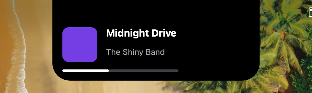
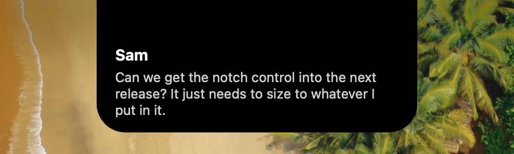
In the MacBook camera notch (macOS)
Section titled “In the MacBook camera notch (macOS)”Shiny.Maui.Controls.Desktop puts a NotchView into the hardware camera notch, in a borderless window above the menu bar and every other app. The empty notch is exactly the size of the cut-out, so it disappears into it. Give it content and it grows down out of the notch, with the content padded below the camera housing. On a display without a notch it floats as an island under the menu bar.
| Recording | Now playing | Message |
|---|---|---|
 |
 |
 |
#if MACOSbuilder    .UseShinyControls()    .UseDesktopNotch(o =>    {        o.MaxWidth = 520;        o.Configure = notch => notch.SurfaceColor = Colors.Black;    });
// INotchWindowService, injectedawait notchWindow.ShowAsync(new Label { Text = "Recording 0:42", TextColor = Colors.White });await notchWindow.SetContentAsync(new NowPlayingView()); // grows out of the notchawait notchWindow.SetContentAsync(null);                 // back into the notchnotchWindow.Hide();#endif
NotchWindowOptions |
Default | |
|---|---|---|
UseHardwareNotch |
true | Hug the camera notch when the screen has one |
TopMargin |
8 | Gap under the menu bar for the floating island |
MaxWidth / MaxHeight |
640 / 480 | Caps, in points |
MorphDuration |
300 | Window reshape time, ms |
JoinAllSpaces |
true | Stay on every Space and over full-screen apps |
Configure |
null | Styles each NotchView the service creates. Runs last, so it wins |