


Level Up Animation with Keyframes for MAUI & Blazor

Animation in .NET MAUI has always had the same shape: ViewExtensions.FadeTo, a Task, and a bool somewhere
tracking whether you are mid-animation. It works right up until someone asks for the thing every design tool
does for free — scrub it, reverse it halfway, hold the final pose, export it as a GIF for the marketing page.
This post covers three pieces that ship together and build on each other:
- Keyframe — the CSS
@keyframesmodel in XAML and a fluent C# timeline API, where evaluating an animation is a pure function of time. - Motion Icons — 42 animated icons authored once and compiled into a drawn scene
on MAUI and real CSS
@keyframeson Blazor. - ShinyButton — where the other two land in a real app: press a button, wait for the network, see whether it worked.




Layer 1 — Keyframes
Section titled “Layer 1 — Keyframes”dotnet add package Shiny.Maui.Controls.Keyframexmlns:kf="http://shiny.net/maui/keyframe"There is no builder.Use…() call. That one XAML namespace is the whole installation.
Animate.Keyframes is an attached property on any VisualElement, and it is deliberately a direct analogue of a
CSS @keyframes rule plus the animation-* properties that drive it — Duration, Delay, Iterations,
Direction, Fill, and per-key easing all behave the way the web spec says they do:
<Border>    <kf:Animate.Keyframes>        <kf:Keyframes Duration="0:0:1.2" Iterations="Infinite" Direction="Alternate" Fill="Both">
            <kf:Track Property="Scale">                <kf:Key Offset="0"   Value="1" />                <kf:Key Offset="0.5" Value="1.15" Easing="CubicOut" />                <kf:Key Offset="1"   Value="1" />            </kf:Track>
            <kf:Track Property="BackgroundColor">                <kf:Key Offset="0" Value="#2563EB" />                <kf:Key Offset="1" Value="#EC4899" />            </kf:Track>
        </kf:Keyframes>    </kf:Animate.Keyframes></Border>
The same thing in C#, because a designer-authored animation and a data-driven one should not be two different engines:
var timeline = TimelineBuilder    .Create(TimeSpan.FromSeconds(1.2))    .PingPong()    .RepeatForever()    .Fill(FillMode.Both)    .Animate(box, (v, x) => v.Scale = x, k => k        .From(1)        .Key(0.5, 1.15, Easings.CubicOut)        .To(1))    .Build();
var player = box.Play(timeline);
The one design constraint
Section titled “The one design constraint”IAnimationNode.Evaluate(t) computes the state at t from the keyframes alone. It never reads the previous
frame and it never accumulates. Everything interesting falls out of that single property:
| You want to… | Do this | Not this |
|---|---|---|
Scrub from a Slider or a gesture |
player.SeekProgress(x) |
Rebuild a timeline at the new position |
| Reverse mid-flight | player.Rate = -1 |
Build a second, reversed timeline |
| Export frames | Sample at exact frame times — identical bytes every run | Render off a real-time clock and hope |
| Test timing | Step a ManualClock |
Task.Delay and a tolerance |
Rate scales the per-frame delta rather than the position, so flipping it mid-flight carries on from wherever the
animation actually is instead of jumping to a rescaled position. That is the difference between “reverse” and
“restart backwards”, and it is the thing you cannot retrofit onto an accumulating animator.
Easing you can paste in
Section titled “Easing you can paste in”Curves are a plain delegate double EasingFunction(double t), there are 38 named ones, and the string form parses
CSS function syntax — because copying a curve out of a design tool or a devtools panel is by far the most common
way anyone arrives at one:
<kf:Key Offset="0" Value="-200" Easing="cubic-bezier(0.34, 1.56, 0.64, 1)" /><kf:Keyframes Easing="steps(8)" ... /><kf:Keyframes Easing="spring(0.35, 14)" ... />Easings.Spring is a closed-form solution of the spring ODE rather than a numeric integration — cheap enough
to evaluate per frame, and still a pure function of t, so a spring seeks and reverses like every other curve
here. An unrecognised easing string throws a FormatException listing every registered name at parse time,
rather than silently running linear at runtime.
Register your own for XAML in one line:
EasingCatalog.Register("Smoothstep", t => t * t * (3d - 2d * t));Details that bite in production
Section titled “Details that bite in production”A few deliberate choices worth knowing about:
- Oklab colour blending by default. sRGB interpolation dips through grey at the midpoint; Oklab does not.
ColorInterpolator.Srgband.LinearRgbare still there when you want them. - Shortest-arc angles.
Rotationfrom 350° to 10° turns forward 20°, not back 340°. UseSpinwhen multiple turns are the point. - Implicit keyframes. Omit
Valueon a key and it resolves to the target’s live value when playback starts, so a re-triggered animation continues from where it is instead of snapping. - AOT and trim safe. The animatable-property registry is hand-registered delegates — not reflection, not
compiled
Expressiontrees, both of which work in the emulator and vanish on device under Native AOT. - Weak targets. An
Iterations="Infinite"animation on a popped page goes inert and gets collected rather than pinning the visual tree, so infinite loops are safe to use freely. - One clock per window.
MauiClock.For(element)returns the clock shared by every animation on that element’s dispatcher, and it idles by itself when nothing is listening.Pause()detaches from the clock rather than ignoring ticks, so the platform can stop producing frames entirely.
Storyboards, scenes, and export
Section titled “Storyboards, scenes, and export”Storyboard composes timelines on a shared clock and is itself an IAnimationNode, so storyboards nest — a
staggered list entrance can be one item inside a larger sequence:
var storyboard = new Storyboard() .Add(introTimeline) .Then(mainTimeline, gap: TimeSpan.FromMilliseconds(200)) .Stagger(cardTimelines, interval: TimeSpan.FromMilliseconds(120));KeyframeScene runs the same timing model against a layer tree drawn onto a canvas rather than views in the
visual tree — the Lottie-shaped lane, for loaders, illustrated micro-animations, progress indicators and shape
morphs. Both are IAnimationNodes on the same clock, so one storyboard can sequence real views and scene layers
together, and KeyframeView.Progress is two-way, which gives you a scrubber for a Slider binding.
And because sampling is exact, a scene can be rendered offscreen, deterministically:
var exporter = new FrameExporter(scene);var options = new ExportOptions { Fps = 25, Scale = 2.0 };
GifEncoder.EncodeToFile("out.gif", exporter.Frames(options), options.Fps);
Frames are enumerated lazily, frame times are computed as index / fps in ticks so a long export cannot drift,
and the GIF encoder is pure managed code. Export is a separate package because it is the only part of Keyframe
that needs a rasterizer — and it targets plain .NET rather than the platform TFMs, so it runs from a console app,
a build step, or CI.
Layer 2 — Motion Icons
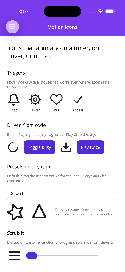
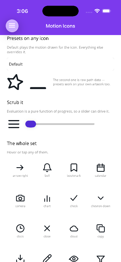
Section titled “Layer 2 — Motion Icons”42 hand-drawn icons that animate. A bell that swings from its crown with the clapper catching up late. A hamburger that morphs into a cross. A tick that draws itself on. A spinner whose arc chases its own tail.
MotionIconView on MAUI, <MotionIcon> on Blazor — both live in the core packages, so there is nothing extra
to install and nothing to register.
<shiny:MotionIconView Icon="bell" Trigger="Loop" Interval="0:0:1.5" WidthRequest="32" HeightRequest="32" /><MotionIcon Icon="bell" Trigger="MotionTrigger.Loop" Interval="TimeSpan.FromSeconds(1.5)" Size="32" />MAUI (iOS)
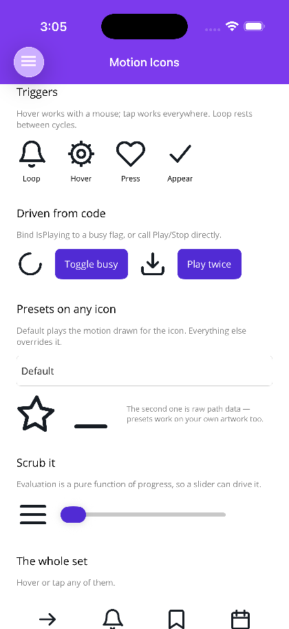
| Triggers & code-driven playback | Presets & scrubbing | The icon set |
|---|---|---|
 |
 |
 |
Blazor
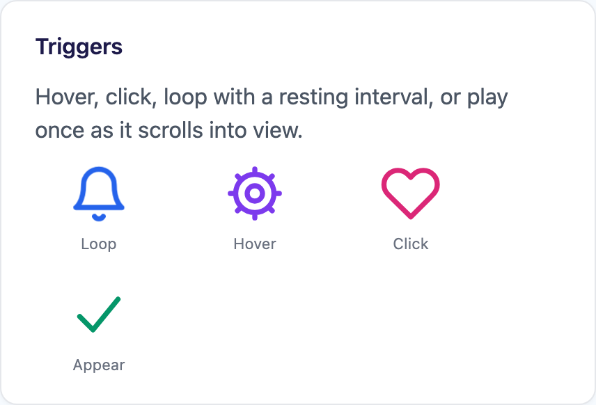
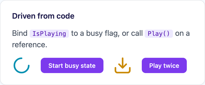
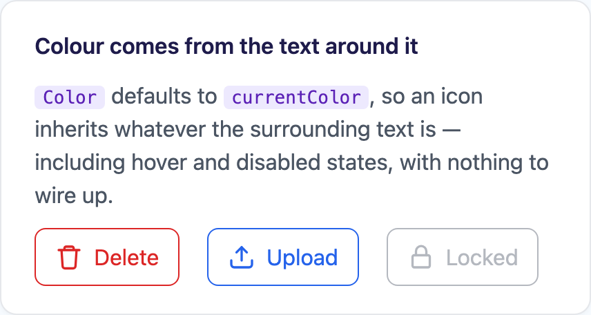
| Triggers | Driven from code | Two-tone & colour | Presets on any icon |
|---|---|---|---|
 |
 |
 |
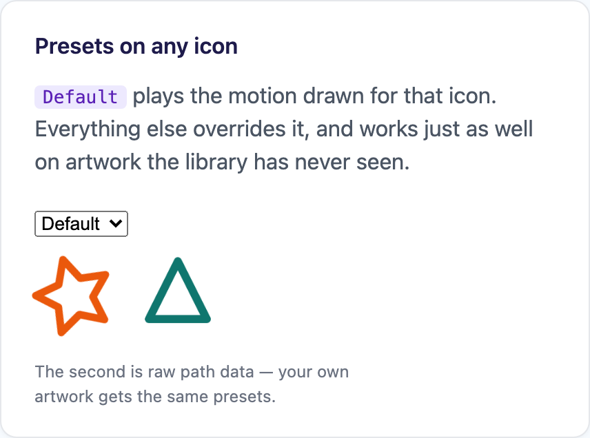 |
Those are single frames of things that only make sense in motion — the playground is the honest version.
One definition, two very different engines
Section titled “One definition, two very different engines”The artwork and its motion live in Shiny.Controls.MotionIcons.Shared, a dependency-free package both hosts
reference. What each host does with that definition could hardly be more different:
| .NET MAUI | Blazor | |
|---|---|---|
| Rendering | a KeyframeScene on a GraphicsView |
inline SVG |
| Animation | a keyframe Timeline, evaluated per frame |
compiled once to CSS @keyframes |
| Driven by | the Keyframe engine’s Player, on one shared timer per window |
the browser’s compositor |
| C# per frame | evaluate + redraw | none |
That split is the whole point. On the web nothing about a motion icon needs a render loop — once the keyframes are declared the browser composites them off the main thread, at the display’s refresh rate, and keeps going while WebAssembly is busy elsewhere. A C# ticker driving re-renders would be slower, jankier, and would stop dead the moment the app did some work.
On MAUI there is no compositor to hand the work to, so an icon is drawn — but by the Keyframe engine rather than by machinery of its own. Motion icons and hand-written timelines share one clock per window, one set of easing curves, and one implementation of position, rate and baselines. Because both sides compile the same spec, with the same easing curves, an icon looks and moves the same in a MAUI app and in a browser.
Where CSS has a keyword that means exactly the same thing as a MotionEase member, the generated stylesheet uses
it. Everything else — the overshoot and bounce curves CSS has no name for — is sampled into a linear() curve
rather than approximated with a “close enough” cubic-bezier, which is what would otherwise make a bounce bounce
differently in the browser than on the phone.
Triggers
Section titled “Triggers”Trigger is a [Flags] enum defaulting to Hover | Press — hover for desktop, press for touch, so an icon does
something sensible everywhere without being told.
| Trigger | Behaviour |
|---|---|
Loop |
Runs continuously. Interval inserts a resting gap between cycles — a bell that rings without pause reads as broken. |
Hover |
Runs while the pointer is over it, then finishes the cycle it is in, so a half-swung bell settles upright instead of snapping. |
Press |
One play per tap or click. |
Appear |
Plays once when the icon first becomes visible — an IntersectionObserver on the web, Loaded on MAUI. |
Manual |
No automatic trigger. Bind IsPlaying to a busy flag, or call Play() / Stop() / StopAtCycleEnd(). |
The Interval gap is folded into the animation itself rather than scheduled by a timer. A CSS animation has no
way to pause between iterations, so a spec that expressed the gap externally would need a JavaScript timer on the
web and a dispatcher timer on MAUI, and the two would drift. Squeezing the keys into the front of a longer cycle
and holding the resting pose through the remainder gets the same result out of
animation-iteration-count: infinite.
On MAUI, Progress is two-way, so an icon can be scrubbed from a slider or a gesture — dragging morphs the
hamburger into a cross and back:
<shiny:MotionIconView Icon="menu" Trigger="Manual"                      Progress="{Binding Source={x:Reference Scrubber}, Path=Value}" />
<Slider x:Name="Scrubber" Minimum="0" Maximum="1" />
Presets, and your own artwork
Section titled “Presets, and your own artwork”A preset is motion that does not need to know what it is animating — Pulse, Beat, Spin, Shake, Wobble,
Bounce, Float, Pop, Tada, Flip, Swing, Blink, Draw, Nudge, Jiggle. Every one works on a
built-in icon, on raw PathData of your own, and on a MotionIconDefinition you assembled:
<shiny:MotionIconView Icon="star" Motion="Tada" Trigger="Hover" /><shiny:MotionIconView PathData="M12 2 3 20h18z" Motion="Pop" Trigger="Press" />Default is a fallback chain rather than a preset: it asks the icon for its own motion first, which is why
Icon="bell" rings rather than merely pulsing, and lands on Pulse for artwork that has none.
For custom artwork, an icon splits into parts for exactly one reason — a part is the unit a track can target:
var toggle = new MotionIconDefinition(    "toggle",    [        new MotionIconPart("plate", "M3 8h18v8H3z"),        new MotionIconPart("knob", "M11 12a3 3 0 1 1 6 0 3 3 0 0 1-6 0z") { Origin = new MotionPoint(14f, 12f) }    ],    MotionSpecBuilder.Build(500, m => m        .MoveX("knob", k => k            .At(0d, 0d, MotionEase.BackOut)            .At(0.5d, -6d, MotionEase.BackInOut)            .At(1d, 0d))));
MotionIconLibrary.Register(toggle);
Register replaces a built-in as well as adding a new one, so an app with its own visual language swaps the
artwork for check once at startup rather than passing a definition in at every call site.
There is deliberately no path-morph channel. Every channel — Opacity, TranslateX/Y, Rotate, Scale,
ScaleX/Y, StrokeWidth, Trim, plus colour on Fill and Stroke — has a native, identically-behaving
implementation on both hosts, which is the only way one icon can be guaranteed to look the same in both.
Animating SVG’s d is not supported in every browser, so a morph channel would have meant hand-written fallbacks
the moment someone opened Firefox. Hinged and morphing icons are built from separate parts moved by transforms,
exactly as they would be in a design tool.
On the web, prefers-reduced-motion: reduce is honoured automatically — the icon still renders and still
responds to clicks, it just holds its resting pose. An icon with no Title is marked aria-hidden so a screen
reader announces the button’s text once rather than twice.
Layer 3 — ShinyButton
Section titled “Layer 3 — ShinyButton”Microsoft.Maui.Controls.Button renders text and one image. There is no way to put a spinner inside it, so the
most ordinary interaction in an app — press a button, wait for the network, see whether it worked — gets
hand-assembled on every page out of a Grid, an ActivityIndicator, a swapped label, and an IsBusy property on
the view model that exists purely for the UI’s benefit.
ShinyButton is that assembly, done once, on both hosts.
MAUI (iOS)
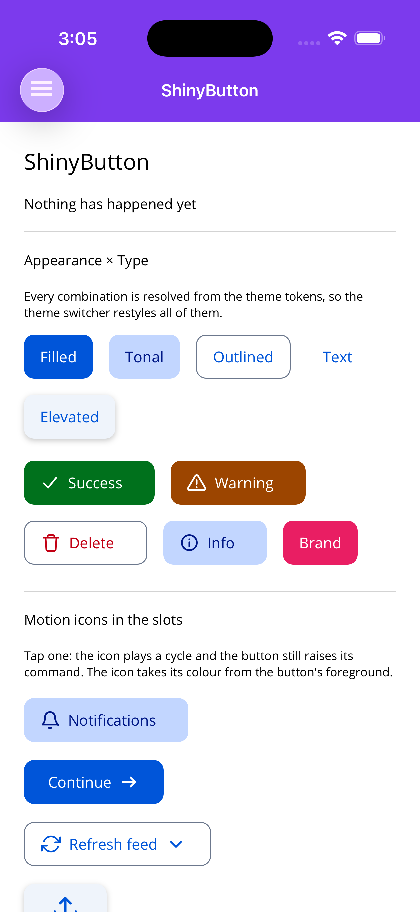
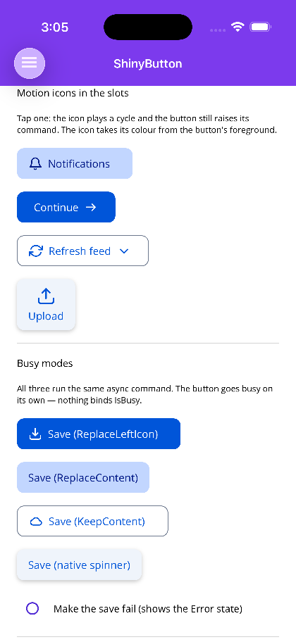
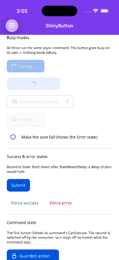
| Appearance × Type | Motion icons in the slots | All three busy modes at once |
|---|---|---|
 |
 |
 |
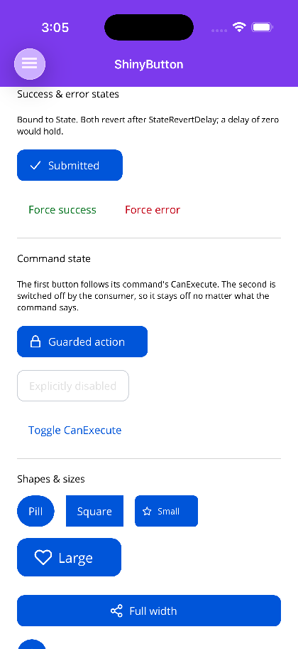
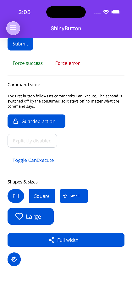
| Success state, command state | Shapes & sizes |
|---|---|
 |
 |
Blazor
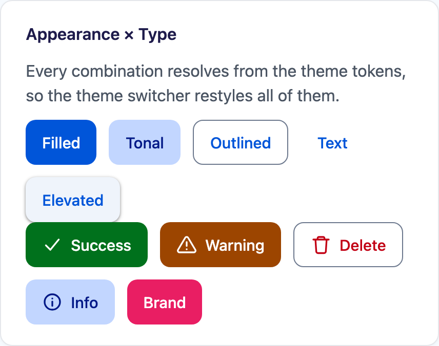
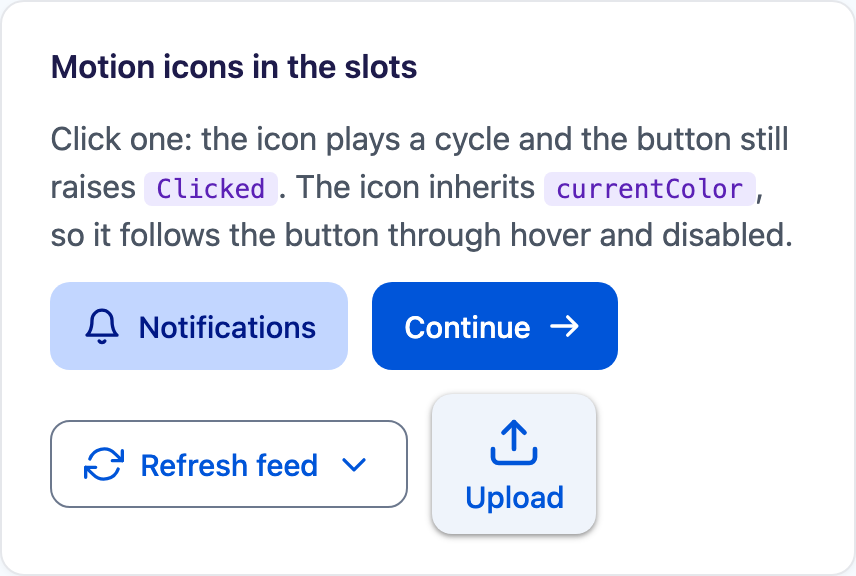
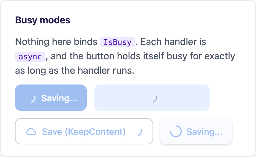
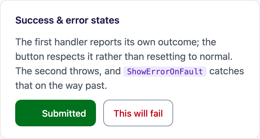
| Appearance × Type | Motion icons | Busy modes | Success |
|---|---|---|---|
 |
 |
 |
 |
Nothing binds IsBusy, because there is no IsBusy
Section titled “Nothing binds IsBusy, because there is no IsBusy”<!-- SaveCommand is an AsyncRelayCommand. That is the entire wiring. --><shiny:ShinyButton Text="Save" BusyText="Saving..." LeftMotionIcon="download" Command="{Binding SaveCommand}" />ButtonState is Normal, Busy, Success or Error. Each non-normal state stands in its own text and its own
icon, and Success/Error return to Normal on their own after StateRevertDelay:
<shiny:ShinyButton Text="Submit" State="{Binding SubmitState}" BusyText="Submitting..." SuccessText="Submitted" ErrorText="Failed" SuccessMotionIcon="check" ErrorMotionIcon="warning" StateRevertDelay="0:0:2" Command="{Binding SubmitCommand}" />Setting IsBusy false only unwinds Busy — it will not cut a Success or Error short. That matters more
than it sounds: a view model clearing its busy flag in a finally block is exactly the moment the outcome is on
screen, and the naive projection would wipe the tick before anyone saw it.
On Blazor there is no ICommand, so the equivalent is that Clicked is awaited — an async handler holds
the button busy for exactly as long as it runs:
<ShinyButton Text="Save" BusyText="Saving..." LeftMotionIcon="download" Clicked="SaveAsync" />
@code {    async Task SaveAsync() => await http.PostAsJsonAsync("/api/save", model);}
A synchronous handler never flickers — the returned task is checked for completion before any state change, so a handler that finished inline does not produce a one-frame spinner.
Motion icons in the slots
Section titled “Motion icons in the slots”Each side takes an ImageSource, a motion icon name, or any View. The motion icon is the path worth taking:
the button colours it from its own resolved foreground and plays it from its own tap, so a tap anywhere on the
button animates the glyph rather than only one that lands on it.
<shiny:ShinyButton Text="Refresh feed" LeftMotionIcon="refresh" RightMotionIcon="chevron-down" Appearance="Outlined" />This is exactly the case the motion-icon docs warn about: an icon inside a larger tap target should be
Manual, with the host playing it. ShinyButton sets that up on both hosts, and
MotionIconPlayOnClick="false" turns it off.
On Blazor the icons default to currentColor, so they inherit the button’s CSS color — including hover and
disabled — with nothing wired up at all.
Busy modes, and why they are about layout
Section titled “Busy modes, and why they are about layout”| Mode | Behaviour |
|---|---|
ReplaceLeftIcon (default) |
The indicator takes the left icon’s place and the text stays put. Both are IconSize square, so the button cannot change width and a row of buttons cannot reflow. |
ReplaceContent |
The content fades to opacity zero — keeping its layout space — and a centred indicator takes over. |
KeepContent |
The indicator appears after the right icon and nothing else moves. |
ReplaceContent uses opacity rather than visibility deliberately. Hiding the content would collapse the button
to the width of the spinner and shove the rest of the row sideways mid-operation; keeping it laid out but
invisible pins the width with no measuring on your part.
The indicator is, in order: BusyIconView if you set one, a motion icon if BusyMotionIcon is set (default
loader), or a platform ActivityIndicator if you clear it.
Appearance is emphasis, Type is meaning
Section titled “Appearance is emphasis, Type is meaning”They stay orthogonal on purpose — that is what lets a destructive action be loud (Filled + Critical) or quiet
(Text + Critical) without an enum member for every pairing. Appearance is Filled, Tonal, Outlined,
Text or Elevated; Type is Primary, Secondary, Success, Warning, Critical or Info.
Everything resolves through the theme tokens — SetDynamicResource on MAUI,
--shiny-color-* custom properties on Blazor — so a live theme swap restyles a button with no re-render. Any
explicit colour short-circuits its token, which means it survives every theme change; leave them unset unless you
mean to pin the colour.
The command integration (MAUI)
Section titled “The command integration (MAUI)”Two behaviours, both on by default, and both with a sharper edge than they look:
CanExecute → disabled goes through MAUI’s own IsEnabledCore — the same mechanism
Microsoft.Maui.Controls.Button uses — rather than writing IsEnabled. A button that wrote IsEnabled would
overwrite your binding, and a command becoming executable again would silently re-enable a button you had
deliberately switched off.
AutoBusy solves the fact that ICommand.Execute returns void, so a button handed an async command has no
handle on the work it just started. Every async command implementation exposes an ExecutionTask or an
IsRunning/IsExecuting flag — MVVM Toolkit’s, Prism’s, ReactiveUI’s, most hand-rolled ones — but there is no
shared interface to type against. Rather than put an MVVM framework dependency into the core controls package
(landing it in every consumer’s app, whichever framework they actually use), the shape is discovered once per
command type and cached. Set AutoBusy="False" and own State yourself for a fully trimmed or NativeAOT build.
Where to go next
Section titled “Where to go next”| Topic | Description |
|---|---|
| Blazor Playground | motion icons and ShinyButton, live, right now. |
| Keyframe | XAML, easing, timelines & playback, drawn scenes, offscreen export. |
| Motion Icons | the icon set, triggers, presets, custom artwork. |
| ShinyButton | states & commands, Blazor usage. |