SecurityPin
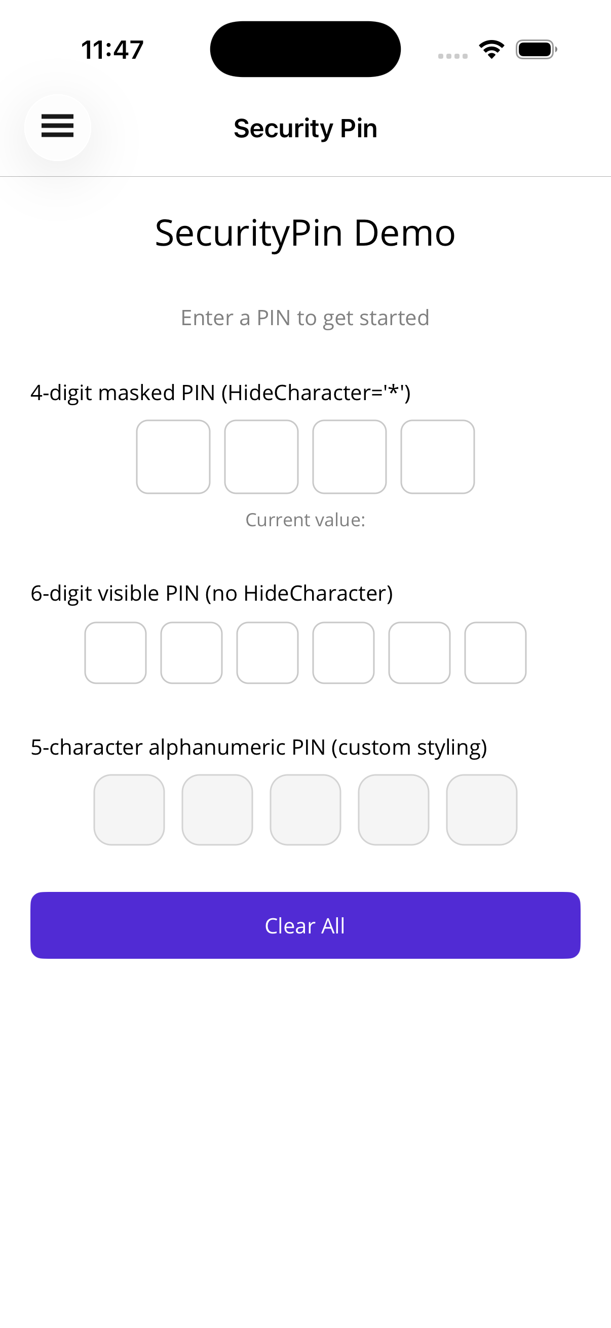
A PIN entry control with individually rendered cells that captures input through a hidden Entry. Digits are visible by default and can optionally be masked with any character for password-style entry.

Basic Usage
Section titled “Basic Usage”<!-- Visible 4-digit numeric PIN --><shiny:SecurityPin Length="4" Value="{Binding Pin}" Keyboard="Numeric" />
<!-- Masked 6-digit PIN with '*' --><shiny:SecurityPin Length="6" HideCharacter="*" Value="{Binding Pin}" Keyboard="Numeric" />
<!-- Alphanumeric PIN masked with bullets --><shiny:SecurityPin Length="5" HideCharacter="●" Value="{Binding Pin}" Keyboard="Default" />Completion Event
Section titled “Completion Event”<shiny:SecurityPin x:Name="Pin" Length="4" Value="{Binding Pin}" Completed="OnPinCompleted" />void OnPinCompleted(object? sender, SecurityPinCompletedEventArgs e){ var enteredValue = e.Value; // verify the PIN}Properties
Section titled “Properties”| Property | Type | Default | Description |
|---|---|---|---|
Length | int | 4 | Number of PIN cells |
Value | string | "" | Current PIN value (TwoWay) |
Keyboard | Keyboard | Numeric | Keyboard type for input |
HideCharacter | string? | null | When set, masks entered characters; when null or empty, shows actual values |
CellSize | double | 50 | Width/height of each cell |
CellSpacing | double | 8 | Space between cells |
CellCornerRadius | double | 8 | Border corner radius |
CellBorderColor | Color? | null | Cell border color |
CellFocusedBorderColor | Color? | null | Border color for the active cell |
CellBackgroundColor | Color? | null | Cell fill color |
CellTextColor | Color? | null | Entered character color |
FontSize | double | 24 | Character font size |
Events
Section titled “Events”| Event | Args | Description |
|---|---|---|
Completed | SecurityPinCompletedEventArgs | Fires when the entered value length reaches Length |
Methods
Section titled “Methods”| Method | Description |
|---|---|
Focus() | Focus the hidden Entry and bring up the keyboard |
Unfocus() | Dismiss the keyboard |
Clear() | Reset the value to empty |
Styling
Section titled “Styling”<shiny:SecurityPin Length="4" HideCharacter="●" CellSize="48" CellSpacing="10" CellCornerRadius="12" CellBorderColor="LightGray" CellFocusedBorderColor="DodgerBlue" CellBackgroundColor="#F5F5F5" CellTextColor="Black" FontSize="22" Value="{Binding Pin}" />Behavior Notes
Section titled “Behavior Notes”- A hidden
Entrycaptures keyboard input; tapping any cell focuses it and brings up the keyboard MaxLengthon the internal Entry is kept in sync withLength- Changing
Lengthrebuilds the cells; a longerValueis truncated - The currently focused cell shows
CellFocusedBorderColorwhen set - When
HideCharacteris null or empty, the actual entered character is displayed
AI Skill
Section titled “AI Skill”Step 1 — Add the marketplace:
claude plugin marketplace add shinyorg/skills Step 2 — Install the plugin:
claude plugin install shiny-maui@shiny Coming soon — Copilot plugin install instructions will be added here.