PillView
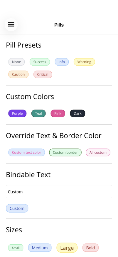
A status badge/label control with 6 preset color themes, custom color support, and WCAG luminance calculations for accessible text contrast.

Basic Usage
Section titled “Basic Usage”<!-- Preset types --><shiny:PillView Text="Active" Type="Success" /><shiny:PillView Text="Pending" Type="Warning" /><shiny:PillView Text="Error" Type="Critical" /><shiny:PillView Text="Info" Type="Info" /><shiny:PillView Text="Notice" Type="Caution" />
<!-- Custom color (auto-calculates text and border) --><shiny:PillView Text="Custom" PillColor="#6366F1" />
<!-- Full override --><shiny:PillView Text="Manual" PillColor="#1E1E1E" PillTextColor="White" PillBorderColor="#444" />Properties
Section titled “Properties”| Property | Type | Default | Description |
|---|---|---|---|
Text | string | "" | Text displayed in the pill |
Type | PillType | None | Preset theme |
PillColor | Color? | null | Custom background (overrides Type) |
PillTextColor | Color? | null | Text color override (auto-calculated if null) |
PillBorderColor | Color? | null | Border color override (auto-calculated if null) |
FontSize | double | 12 | Text font size |
CornerRadius | double | 12 | Corner radius |
FontAttributes | FontAttributes | None | Bold, Italic, None |
Preset Types
Section titled “Preset Types”| Type | Background | Text | Border |
|---|---|---|---|
None | #F3F4F6 | #374151 | #D1D5DB |
Success | #DCFCE7 | #166534 | #86EFAC |
Info | #DBEAFE | #1E40AF | #93C5FD |
Warning | #FEF9C3 | #854D0E | #FDE047 |
Caution | #FFEDD5 | #9A3412 | #FDBA74 |
Critical | #FEE2E2 | #991B1B | #FCA5A5 |
Color Behavior
Section titled “Color Behavior”- Setting
PillColorauto-calculates contrast text color (WCAG luminance) and a darkened border color - Setting
PillTextColoroverrides auto-calculated text color - Setting
PillBorderColoroverrides auto-calculated border color - Setting
Typeapplies the preset;PillTextColor/PillBorderColorstill override if set
AI Skill
Section titled “AI Skill”Step 1 — Add the marketplace:
claude plugin marketplace add shinyorg/skills Step 2 — Install the plugin:
claude plugin install shiny-maui@shiny Coming soon — Copilot plugin install instructions will be added here.