BottomSheet
A bottom sheet overlay that slides up from the bottom of the screen with configurable snap positions (detents), backdrop dimming, pan gestures, and automatic keyboard handling.

| Closed | Open |
|---|---|
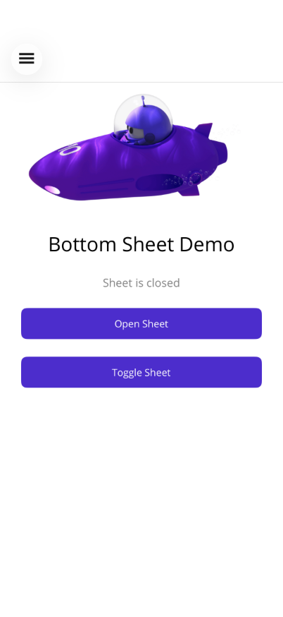 | 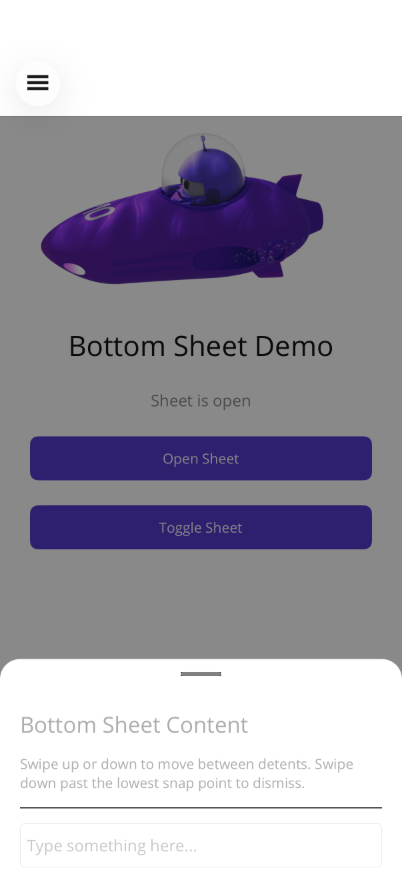 |
Basic Usage
Section titled “Basic Usage”<shiny:BottomSheetView IsOpen="{Binding IsSheetOpen, Mode=TwoWay}"> <VerticalStackLayout Padding="20" Spacing="10"> <Label Text="Sheet Content" FontSize="18" FontAttributes="Bold" /> <Label Text="Drag the handle or tap the backdrop to close." /> <Button Text="Close" Command="{Binding CloseSheetCommand}" /> </VerticalStackLayout></shiny:BottomSheetView><ContentPage> <Grid> <!-- Main page content --> <ScrollView> <VerticalStackLayout> <Button Text="Open Sheet" Command="{Binding OpenCommand}" /> </VerticalStackLayout> </ScrollView>
<!-- Bottom sheet overlays on top --> <shiny:BottomSheetView IsOpen="{Binding IsOpen, Mode=TwoWay}"> <Label Text="Sheet content" /> </shiny:BottomSheetView> </Grid></ContentPage>Properties
Section titled “Properties”| Property | Type | Default | Description |
|---|---|---|---|
IsOpen | bool | false | Show/hide the sheet (TwoWay bindable) |
SheetContent | View? | null | Content displayed in the sheet (ContentProperty) |
Detents | ObservableCollection<DetentValue> | Quarter, Half, Full | Snap positions as ratios of available height |
SheetBackgroundColor | Color | White | Background of the sheet panel |
HandleColor | Color | Grey | Drag handle indicator color |
SheetCornerRadius | double | 16 | Top corner radius |
HasBackdrop | bool | true | Show dimming backdrop behind the sheet |
CloseOnBackdropTap | bool | true | Tap backdrop to close |
AnimationDuration | double | 250 | Animation speed in ms |
ExpandOnInputFocus | bool | true | Auto-expand when an input is focused |
DetentValue
Section titled “DetentValue”Predefined snap points:
| Static Property | Ratio | Description |
|---|---|---|
DetentValue.Quarter | 0.25 | 25% height |
DetentValue.Half | 0.50 | 50% height |
DetentValue.ThreeQuarters | 0.75 | 75% height |
DetentValue.Full | 1.0 | Full height |
Custom detent: new DetentValue(0.33) for 33%.
Custom Detents Example
Section titled “Custom Detents Example”<shiny:BottomSheetView IsOpen="{Binding IsOpen, Mode=TwoWay}" SheetBackgroundColor="#1E1E1E" HandleColor="#888888" SheetCornerRadius="24"> <shiny:BottomSheetView.Detents> <shiny:DetentValue Ratio="0.33" /> <shiny:DetentValue Ratio="0.66" /> <shiny:DetentValue Ratio="1.0" /> </shiny:BottomSheetView.Detents> <VerticalStackLayout Padding="20"> <Label Text="Custom Sheet" TextColor="White" /> </VerticalStackLayout></shiny:BottomSheetView>Events
Section titled “Events”| Event | Args | Description |
|---|---|---|
Opened | EventArgs | Sheet finished opening |
Closed | EventArgs | Sheet finished closing |
DetentChanged | DetentValue | Sheet snapped to a different detent |
Features
Section titled “Features”- Pan gesture — Drag up/down between detents; swipe past the lowest to close
- Keyboard handling — Auto-expands when an Entry/Editor is focused, restores on dismiss
- ScrollView integration — Scroll enabled only at the highest detent; disabled at lower detents for pan
- Backdrop — Semi-transparent overlay that dims proportionally to sheet position
AI Skill
Section titled “AI Skill”Step 1 — Add the marketplace:
claude plugin marketplace add shinyorg/skills Step 2 — Install the plugin:
claude plugin install shiny-maui@shiny Coming soon — Copilot plugin install instructions will be added here.