ImageViewer
A full-screen image overlay with pinch-to-zoom, pan when zoomed, double-tap to toggle zoom, animated open/close transitions, and a close button.

| Gallery | Viewer |
|---|---|
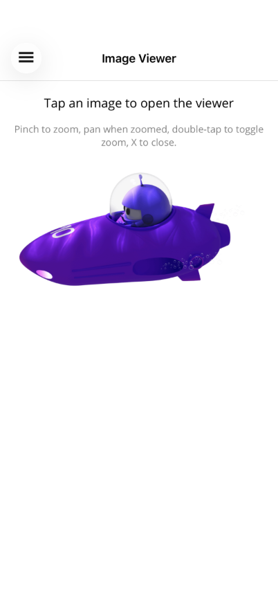 | 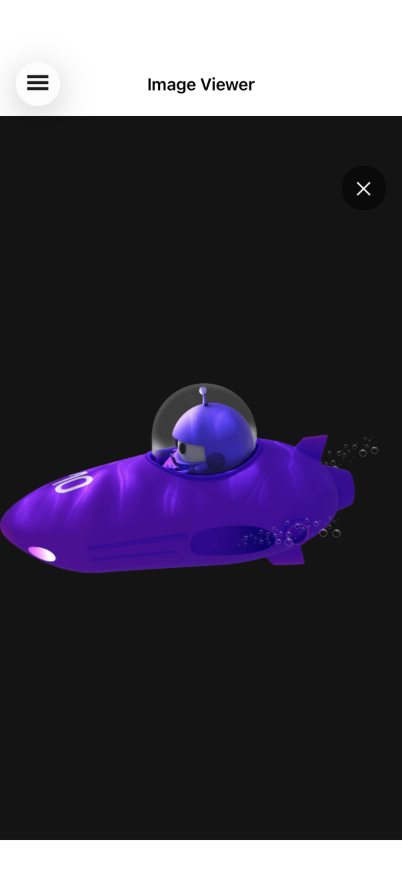 |
Basic Usage
Section titled “Basic Usage”<Grid> <!-- Page content with tappable images --> <ScrollView> <VerticalStackLayout> <Image Source="photo.png"> <Image.GestureRecognizers> <TapGestureRecognizer Command="{Binding OpenViewerCommand}" CommandParameter="photo.png" /> </Image.GestureRecognizers> </Image> </VerticalStackLayout> </ScrollView>
<!-- ImageViewer overlays on top --> <shiny:ImageViewer Source="{Binding SelectedImage}" IsOpen="{Binding IsViewerOpen}" /></Grid>Properties
Section titled “Properties”| Property | Type | Default | Description |
|---|---|---|---|
Source | ImageSource? | null | The image to display |
IsOpen | bool | false | Show/hide the viewer (TwoWay bindable) |
MaxZoom | double | 5.0 | Maximum pinch zoom scale |
Features
Section titled “Features”- Pinch-to-zoom — Two-finger pinch scales around the pinch origin, clamped between 1x and MaxZoom
- Pan when zoomed — One-finger pan enabled after zooming in, translation clamped to image bounds
- Double-tap to zoom — Double-tap zooms to 2.5x centered on the tap point; double-tap again resets
- Animated open/close — Backdrop, image, and close button fade together (250ms)
- Close button — ”✕” button in the top-right corner
- Backdrop — Black overlay that swallows touches so nothing passes through to the page behind
ViewModel Pattern
Section titled “ViewModel Pattern”public partial class ImageViewerViewModel : ObservableObject{ [ObservableProperty] ImageSource? selectedImage; [ObservableProperty] bool isViewerOpen;
[RelayCommand] void OpenViewer(string imageSource) { SelectedImage = imageSource; IsViewerOpen = true; }}AI Skill
Section titled “AI Skill”Step 1 — Add the marketplace:
claude plugin marketplace add shinyorg/skills Step 2 — Install the plugin:
claude plugin install shiny-maui@shiny Coming soon — Copilot plugin install instructions will be added here.